viumbiGo
Complete brand system for a ride-hailing app launching across LATAM in 2026.
The challenge
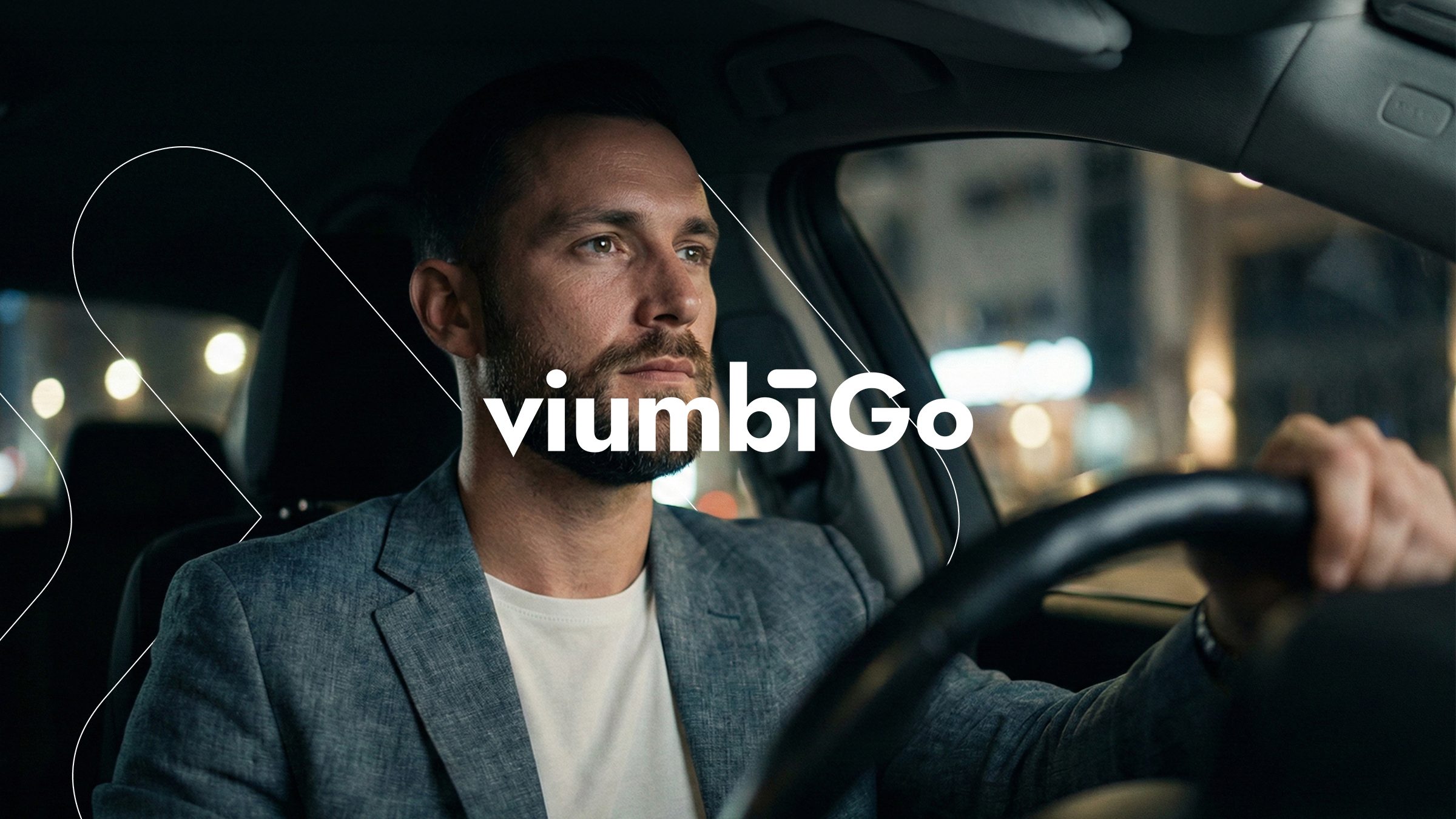
Viumbi was preparing the launch of viumbiGo in a category where nearly every mobility app looks and sounds the same. It needed an identity that holds up on a small screen and on a billboard, and an architecture able to carry the services coming next without rebuilding the brand each time: delivery, wallet and fleets.
The approach
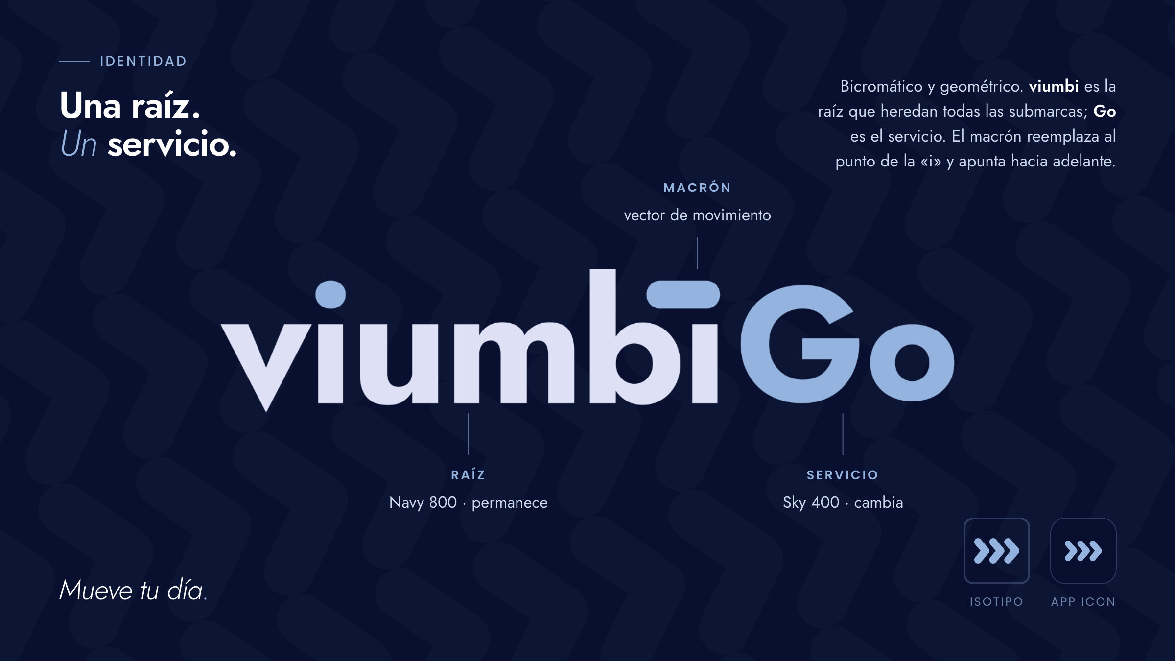
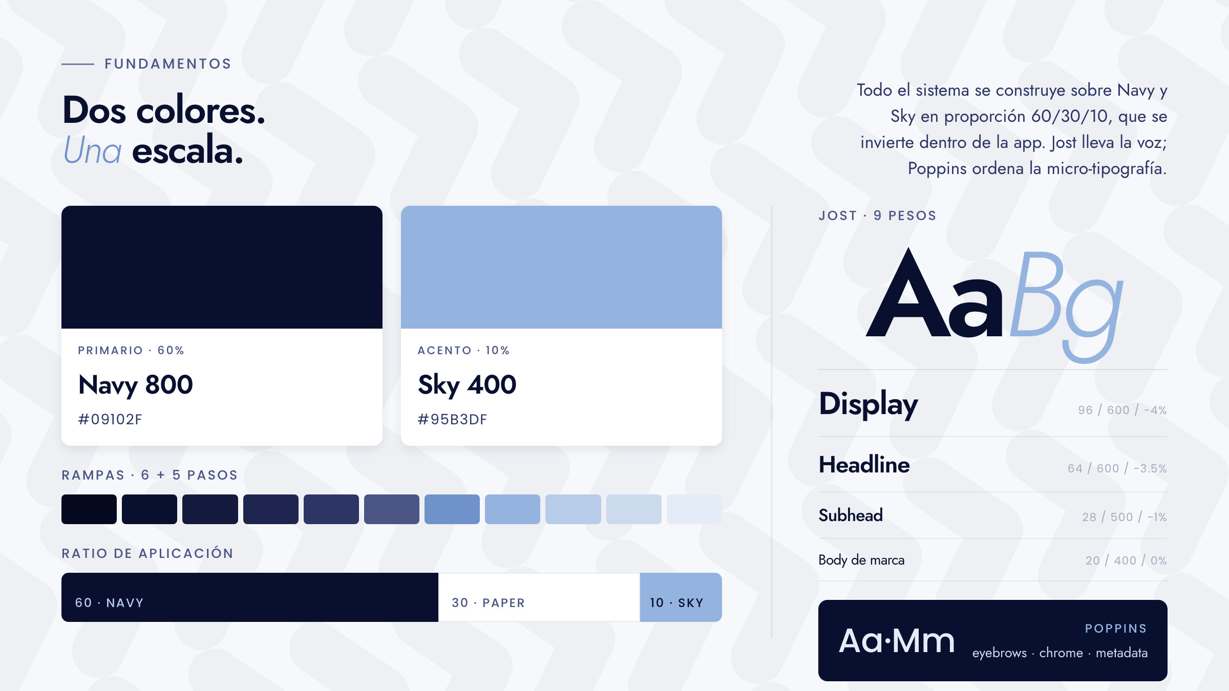
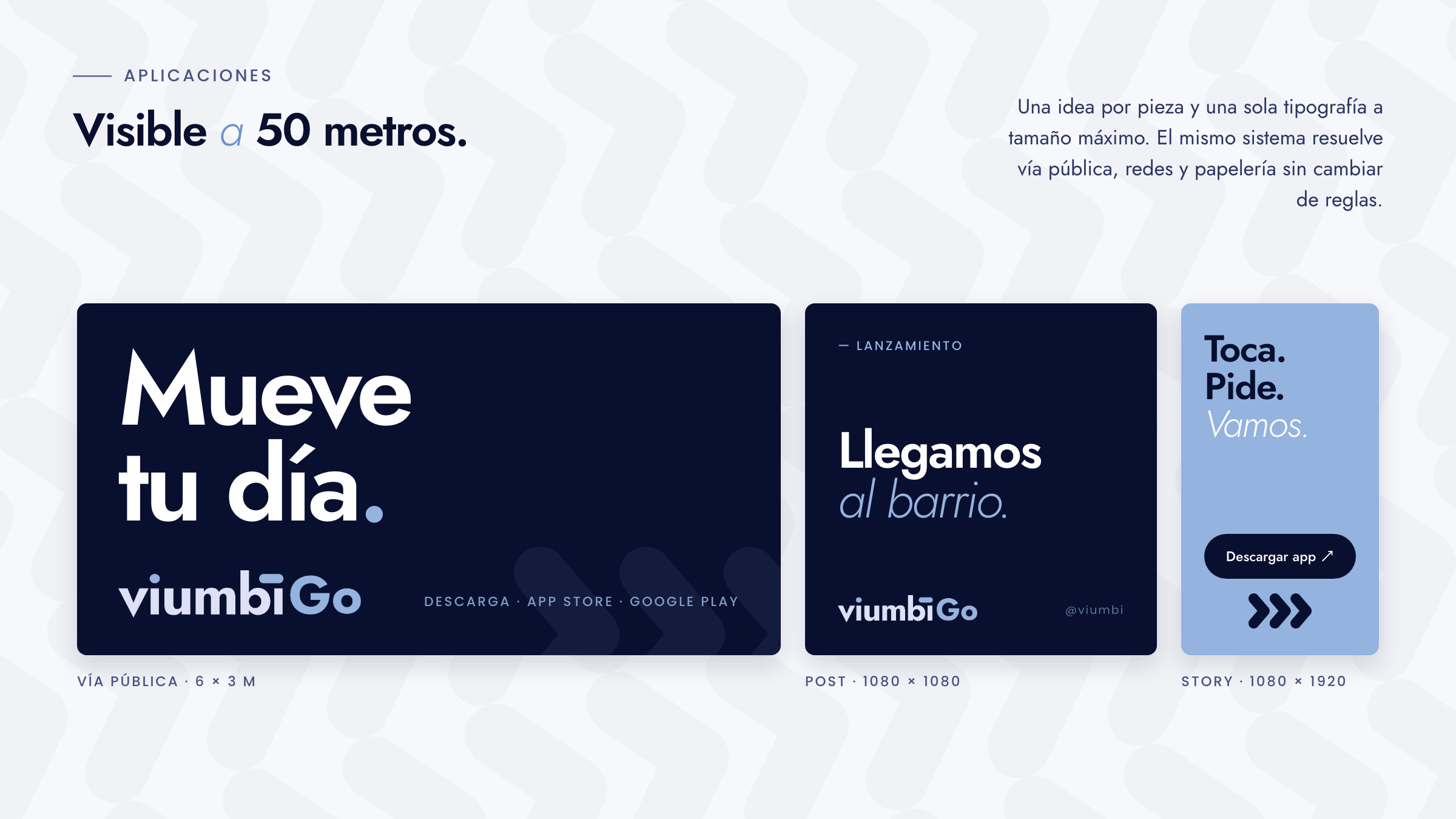
We started from one idea: viumbi is the root, Go is the service. The macron over the i replaces the dot and reads as a vector of motion; the isotype repeats that gesture in three chevrons growing in a single direction. On top of that, two colors and nothing more, Jost with Poppins, and a voice that speaks to you directly, gets to the point and never shouts. Three words: Mueve tu día.
The results
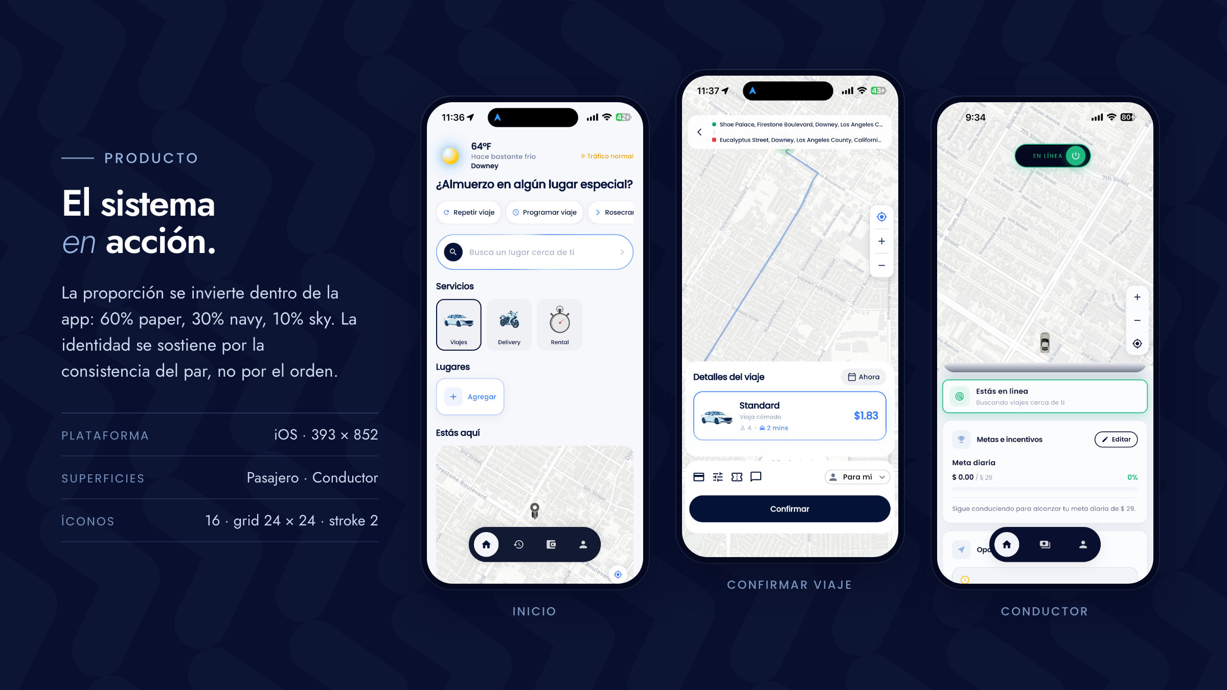
Viumbi closed the project with a 30-page manual covering the full system: the wordmark and its variants, the isotype, the app icon, the pattern, a seven-role type scale, 16 UI icons, three key app screens, billboard, stationery and social templates. The architecture already accounts for viumbiEats, viumbiPay and viumbiPro: same root, new suffix. viumbiGo reaches the market in 2026.