viumbiEats
Brand and product design for viumbiEats, the food app and sister to viumbiGo.
The challenge
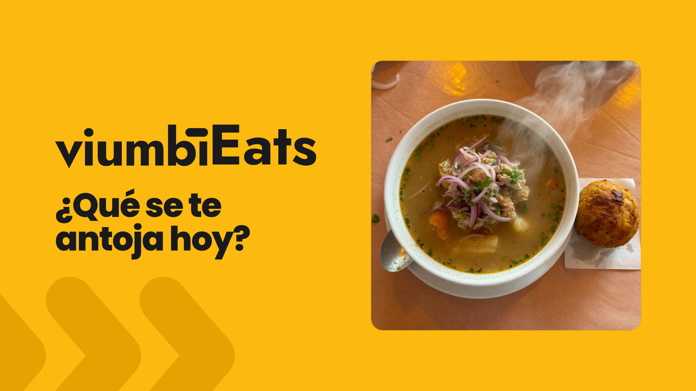
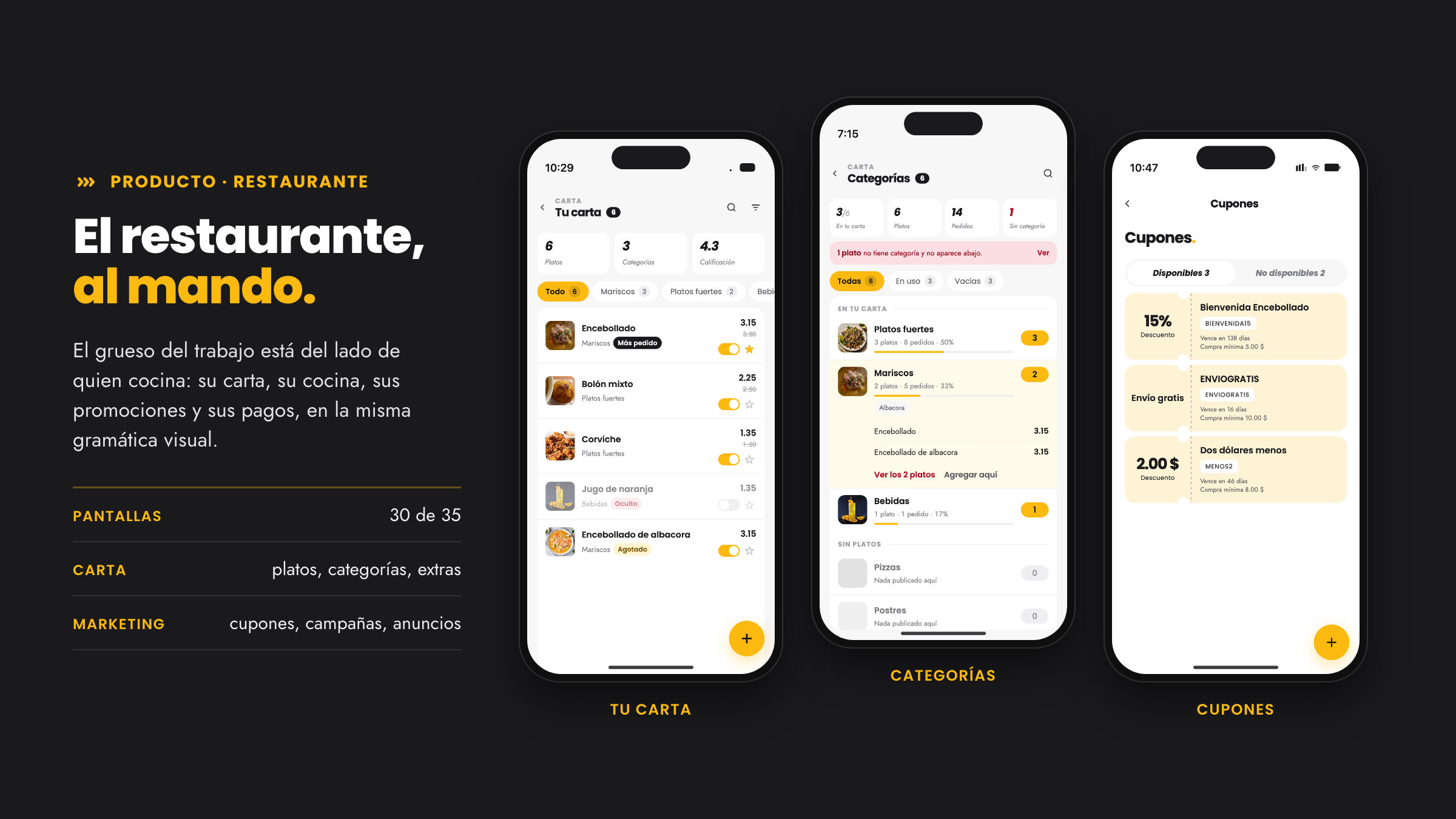
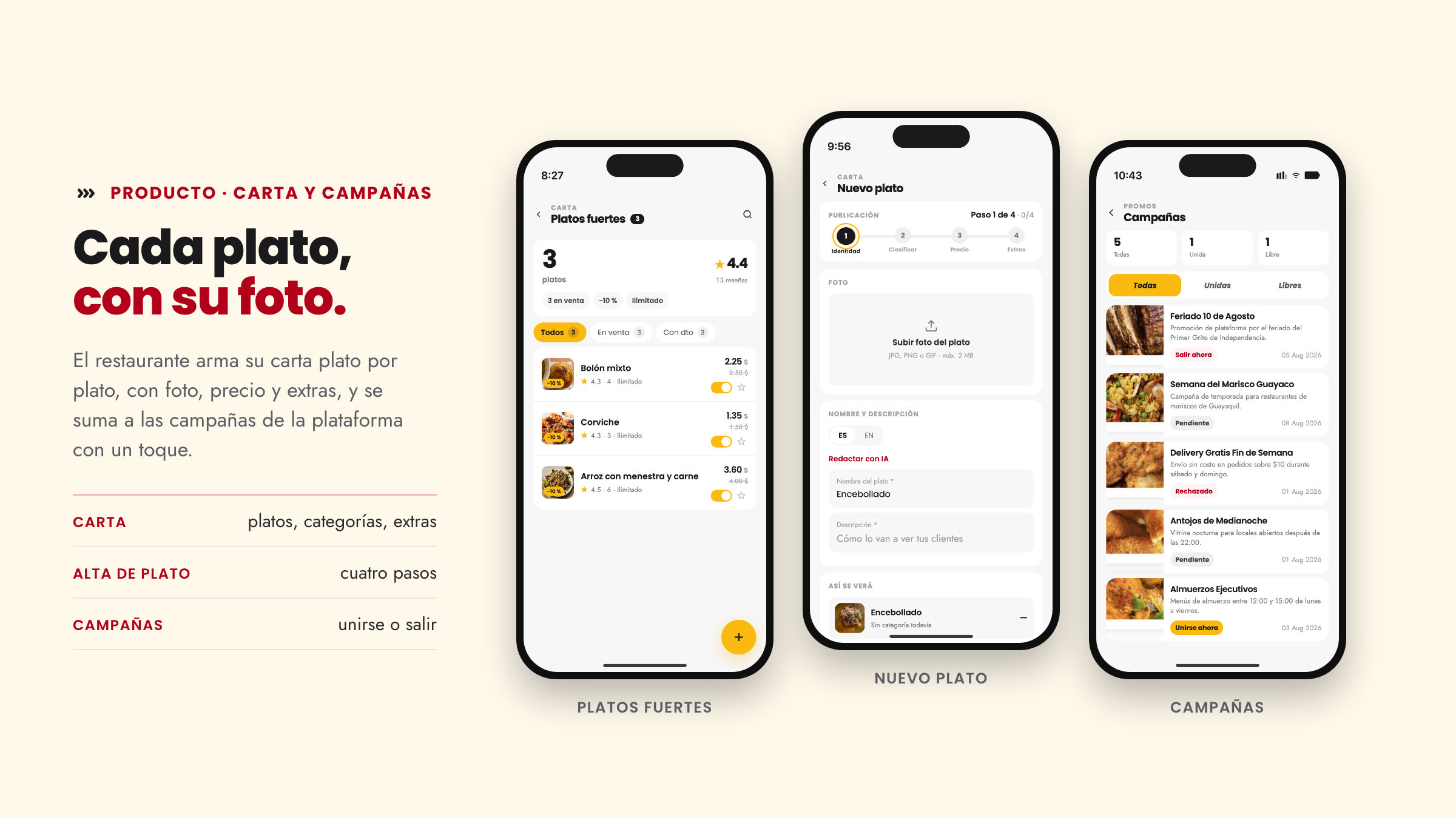
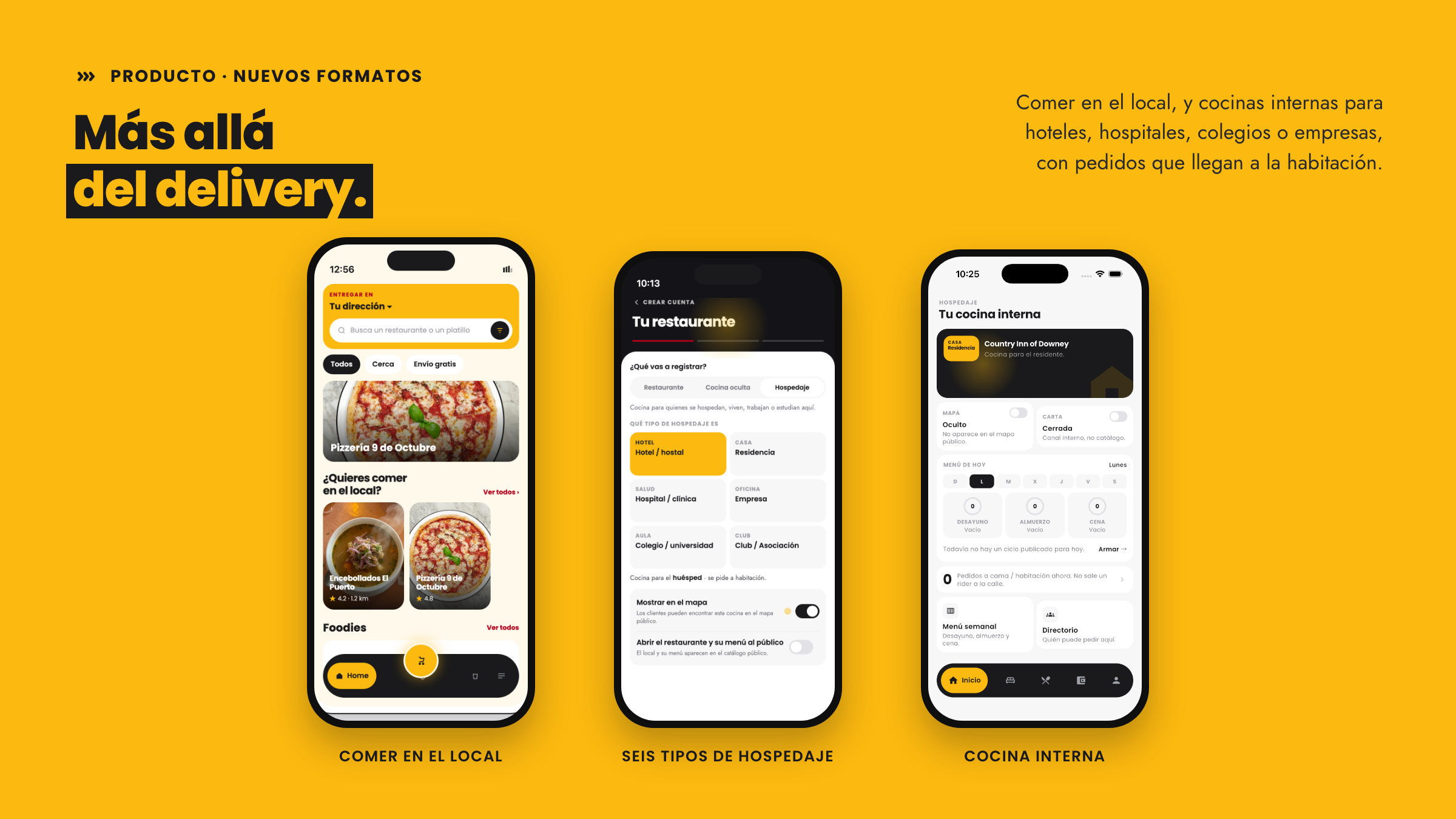
viumbiEats already had dozens of working screens for a restaurant to manage its menu, orders, coupons and ads, and it needed a visual direction worthy of the brand. The brief was to give Viumbi's food app an identity of its own without breaking its kinship with viumbiGo, and to carry it screen by screen into formats the category rarely covers: dining in, and in-house kitchens for lodging.
The approach
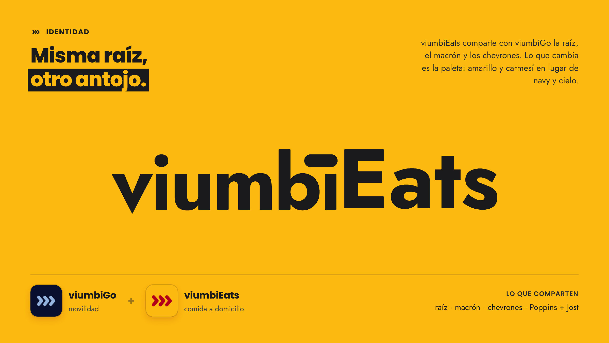
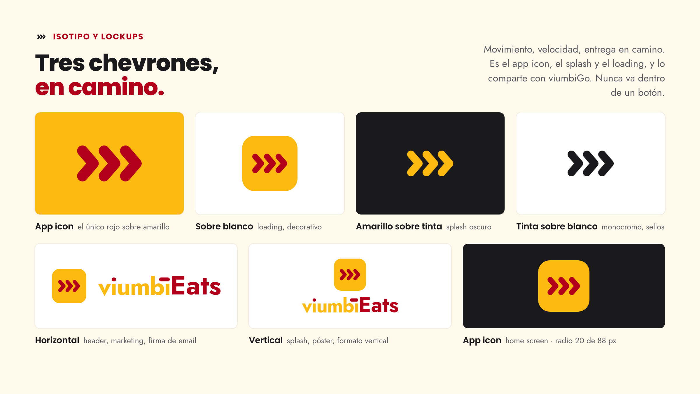
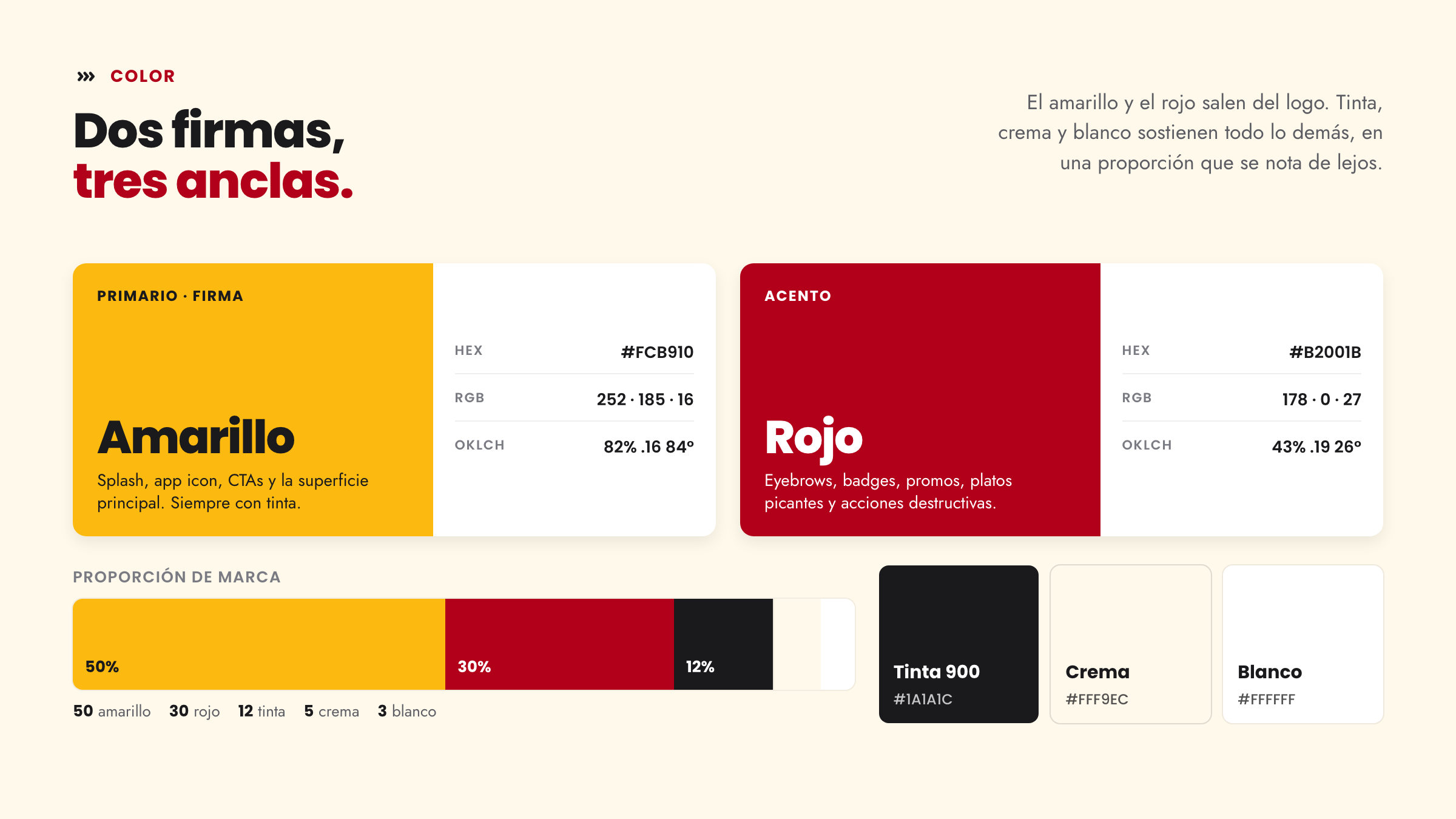
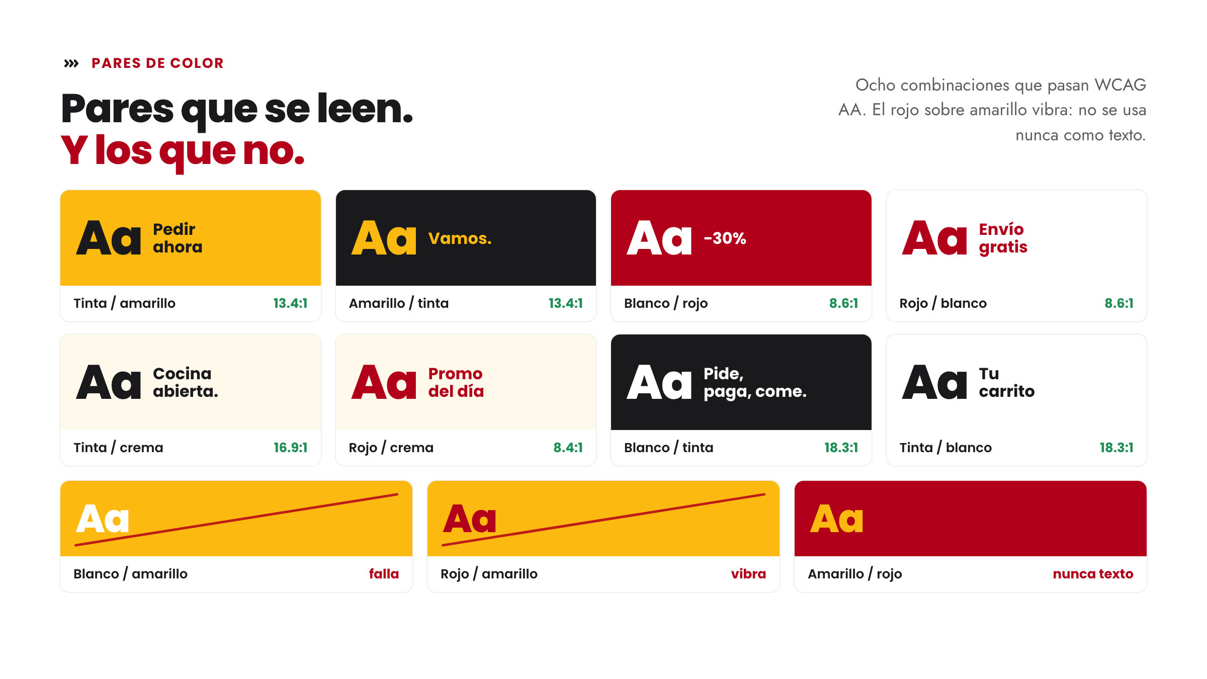
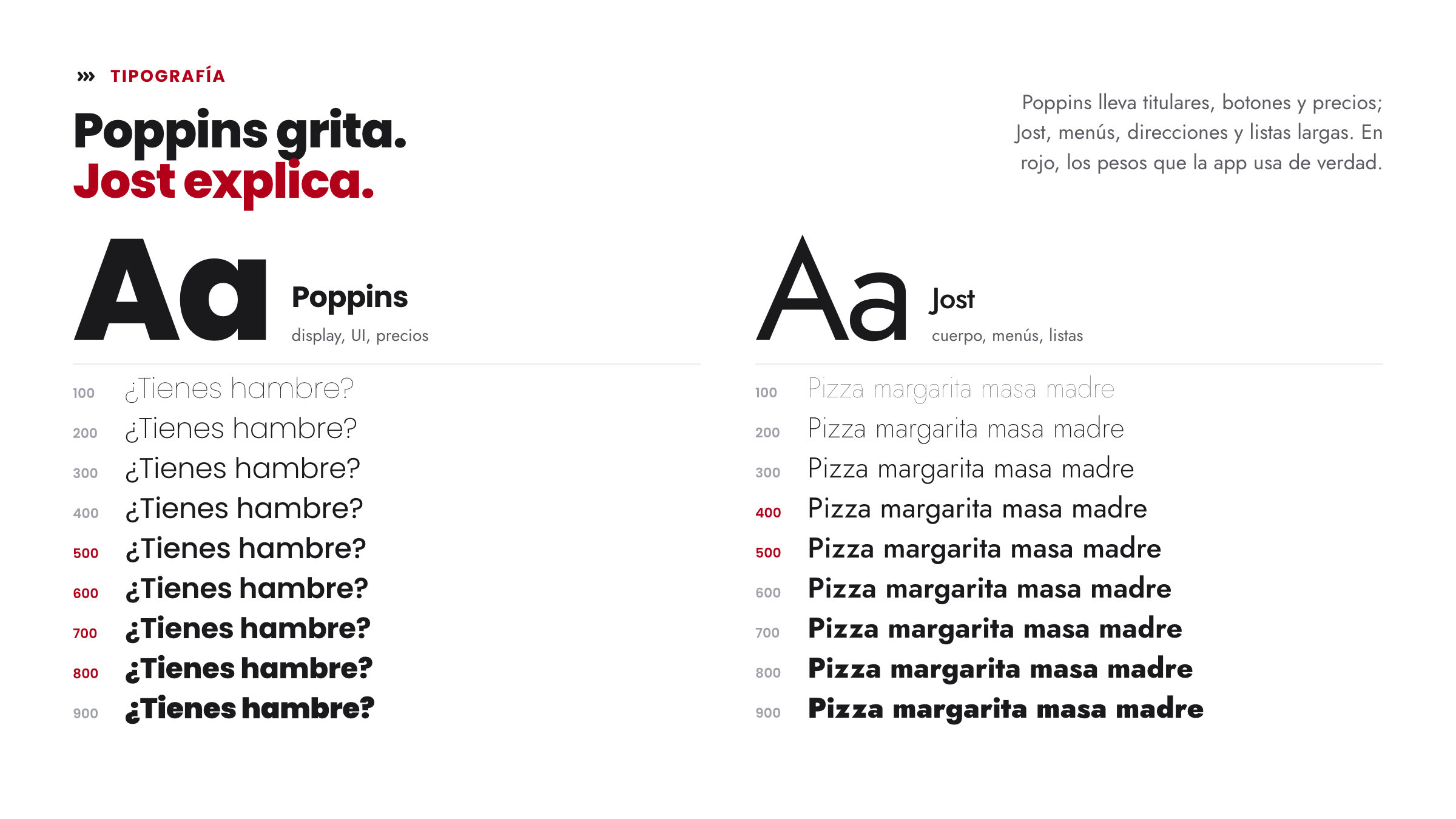
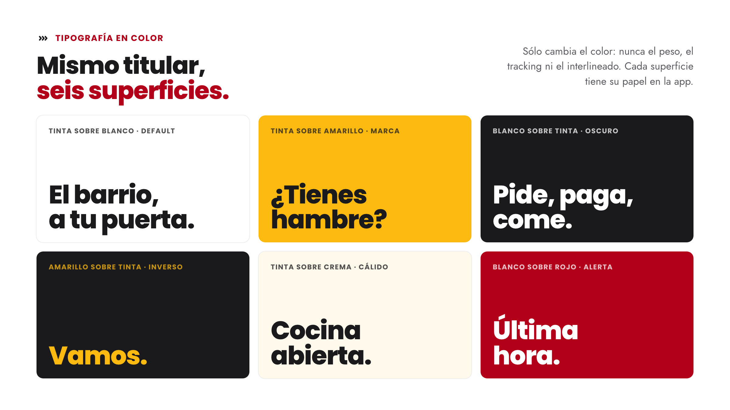
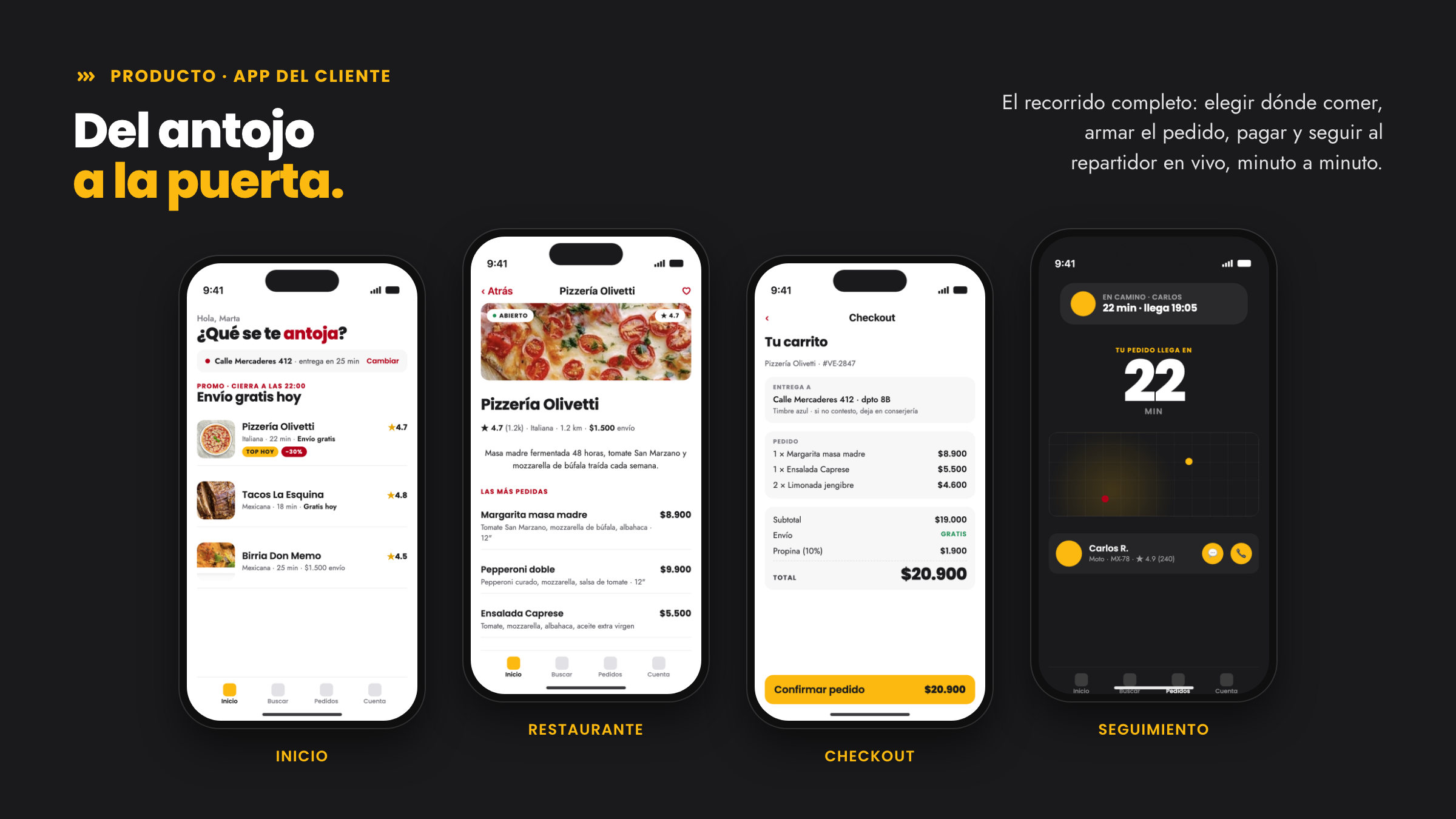
We started from what the family already shared with viumbiGo: the viumbi root, the macron and the three chevrons, with Poppins and Jost. On top of that, a palette of its own: yellow leads, crimson punctuates, and yellow always takes black ink. With that grammar we worked through the product: menu and categories, kitchen queue, coupons, campaigns, ads and payouts; on the customer side, dining in, foodies and reels; and for lodging, a vocabulary of its own.
The results
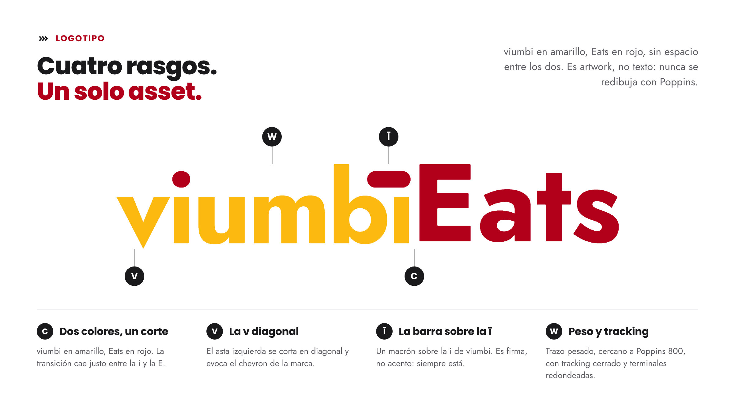
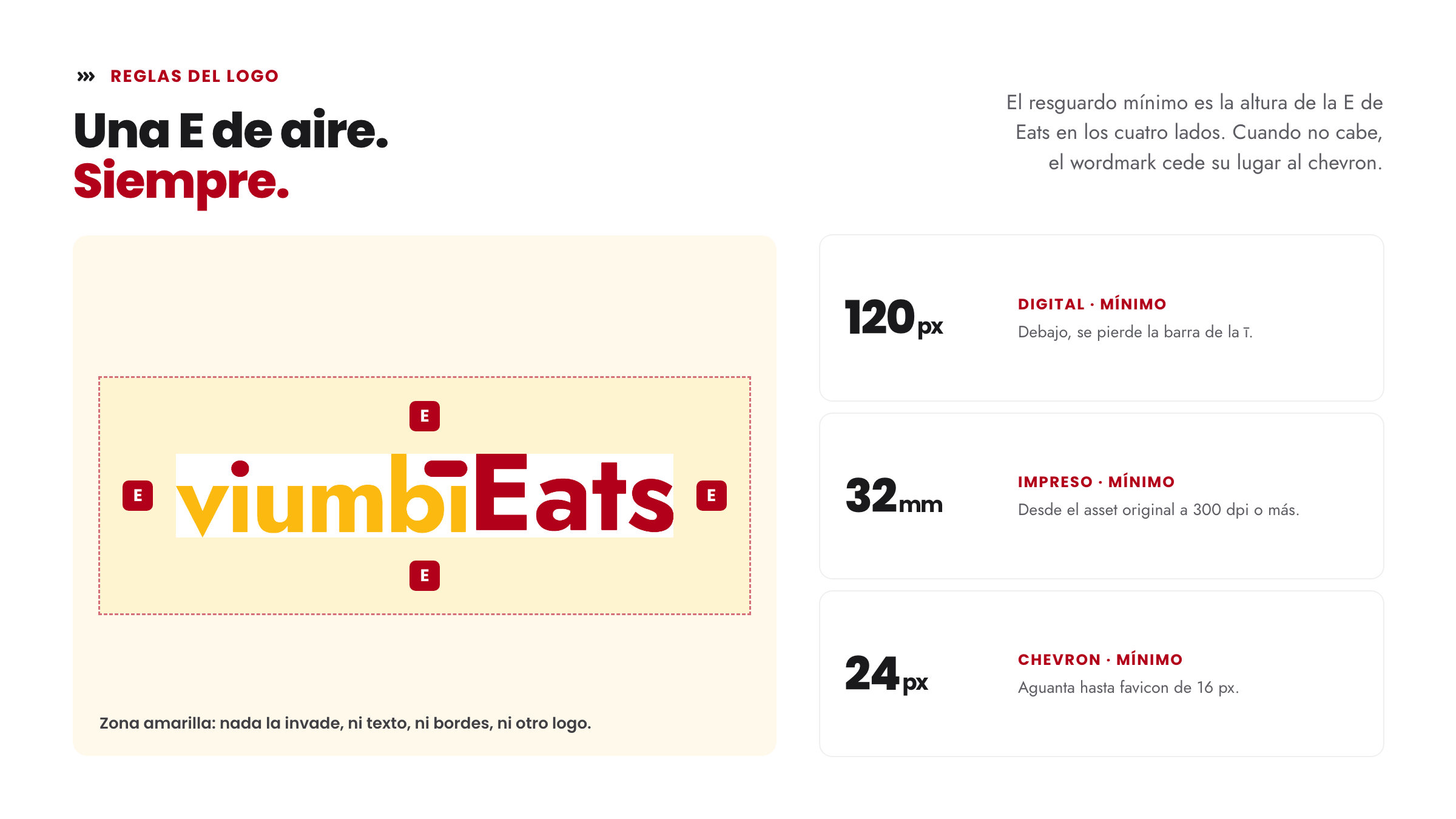
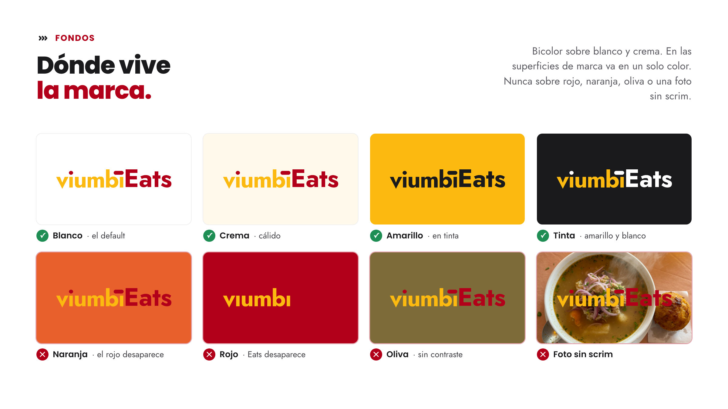
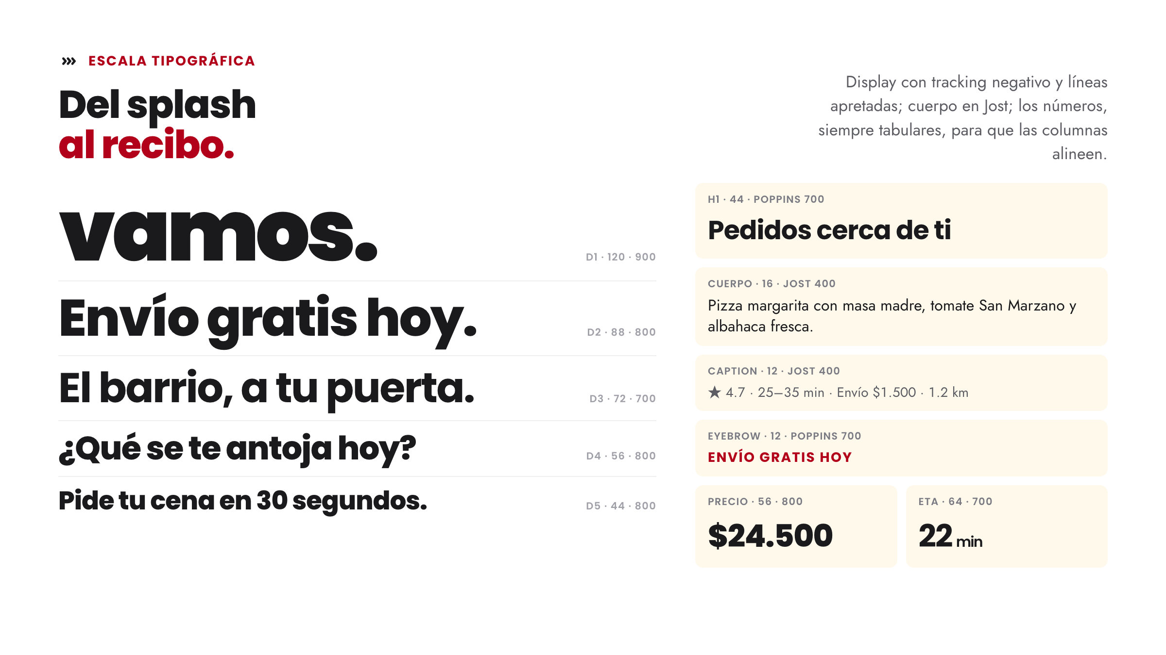
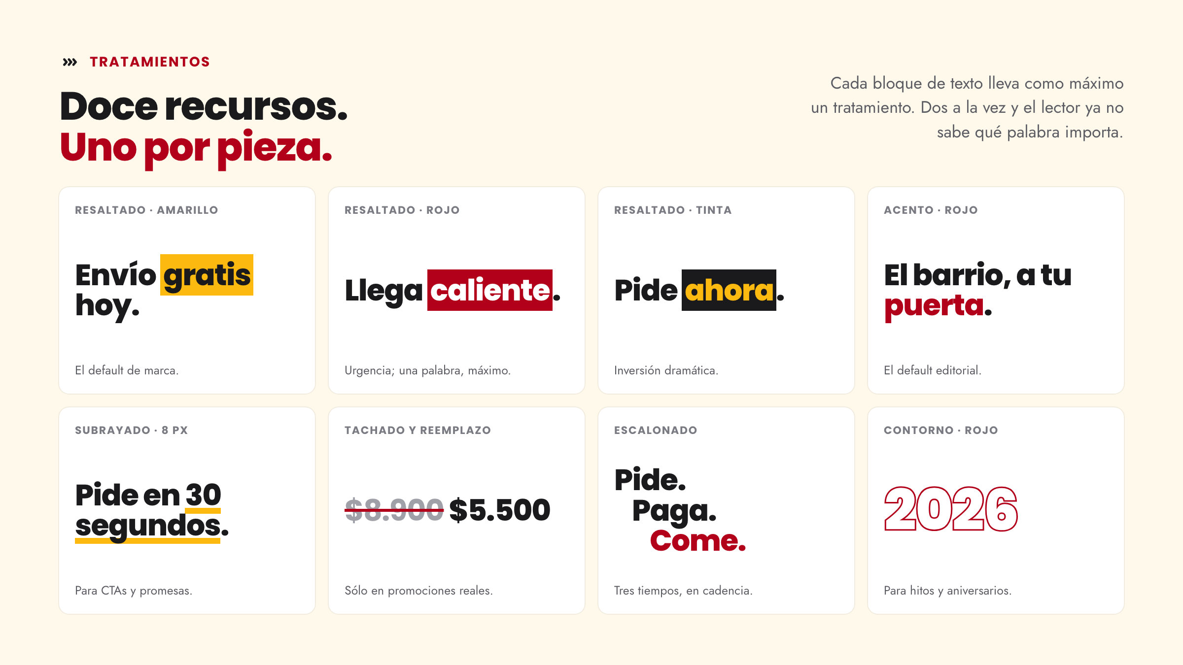
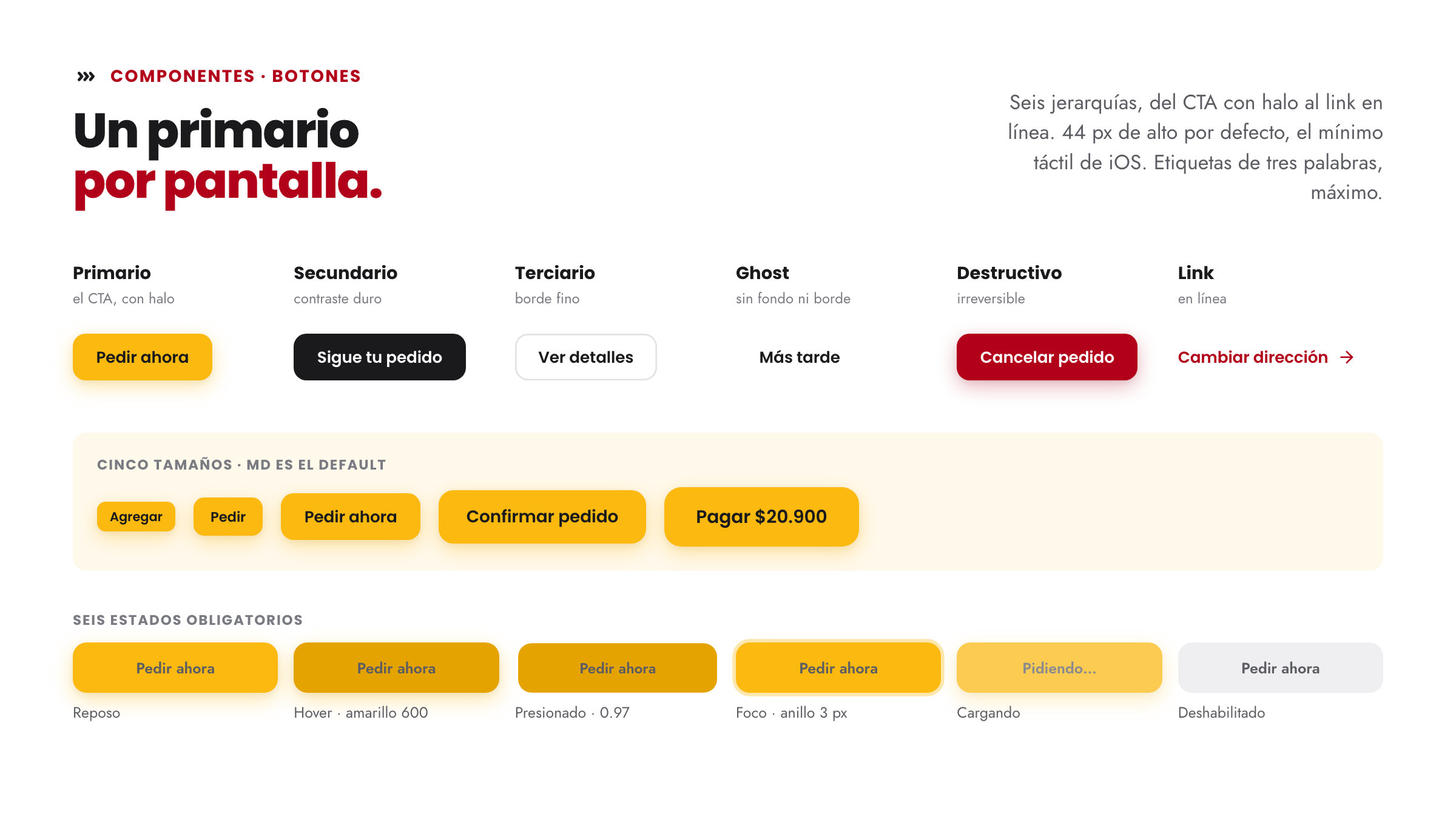
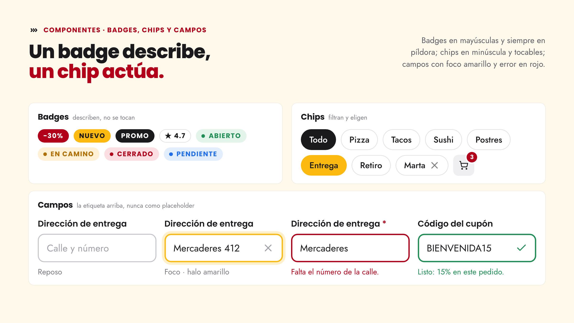
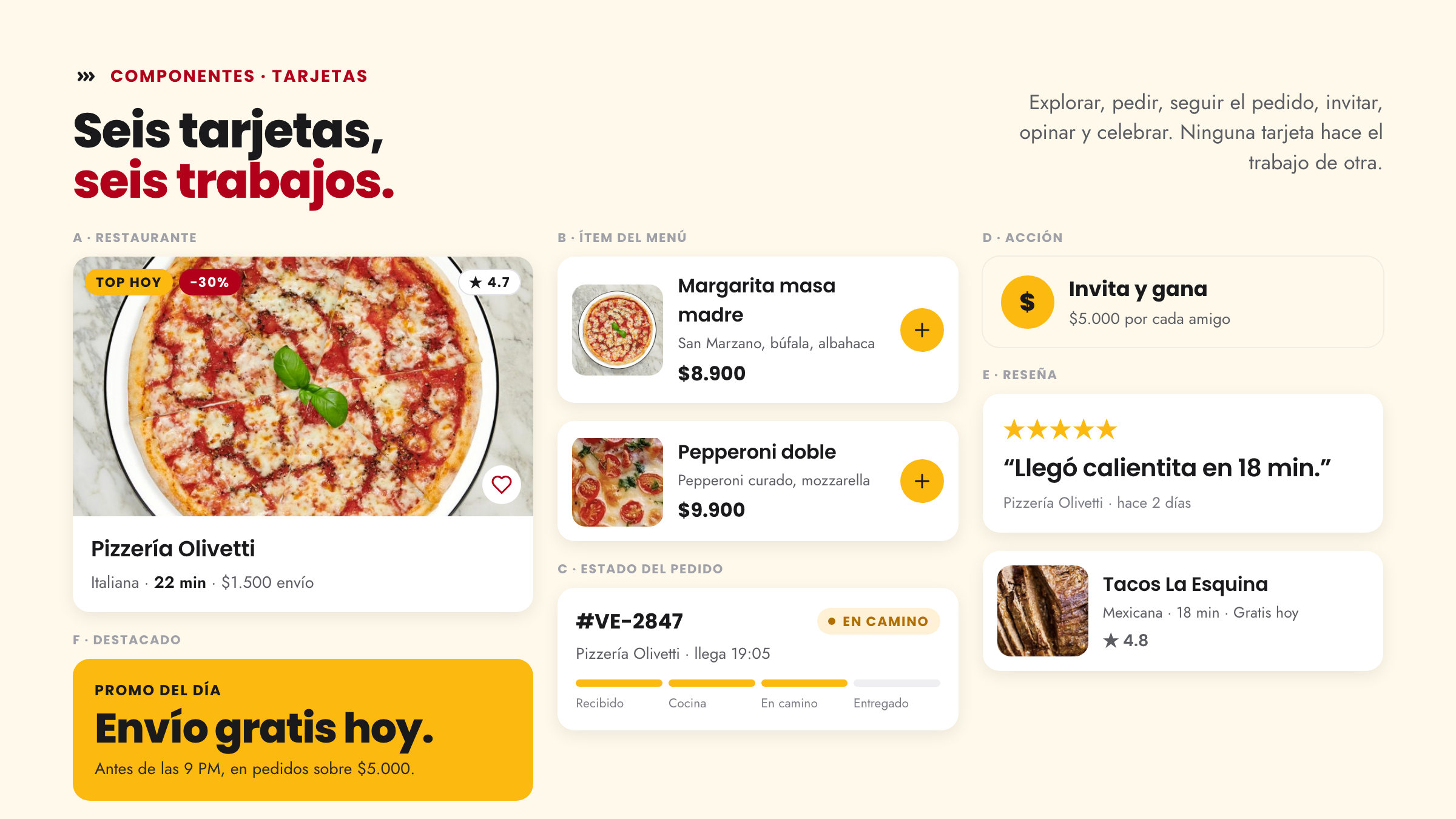
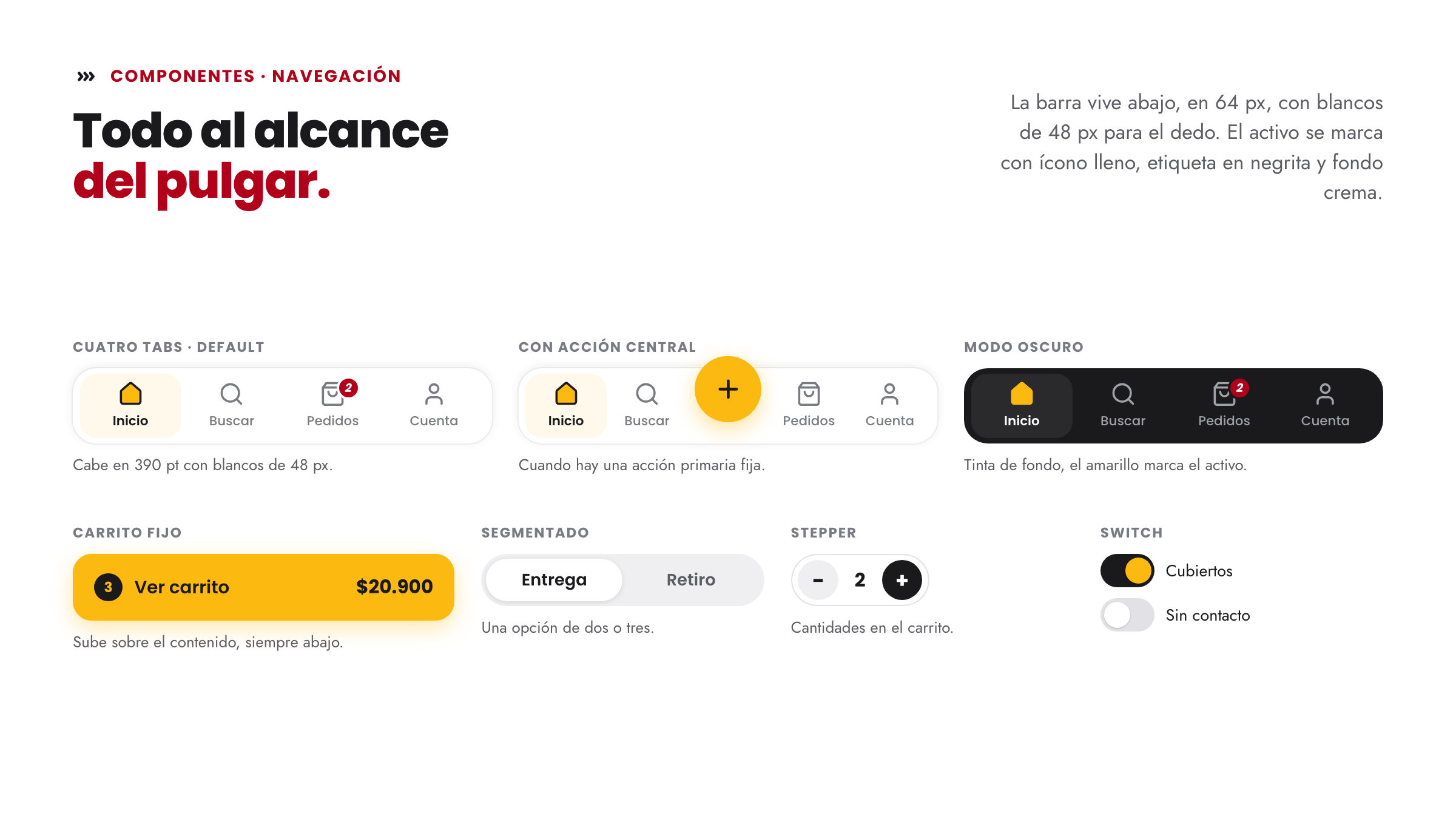
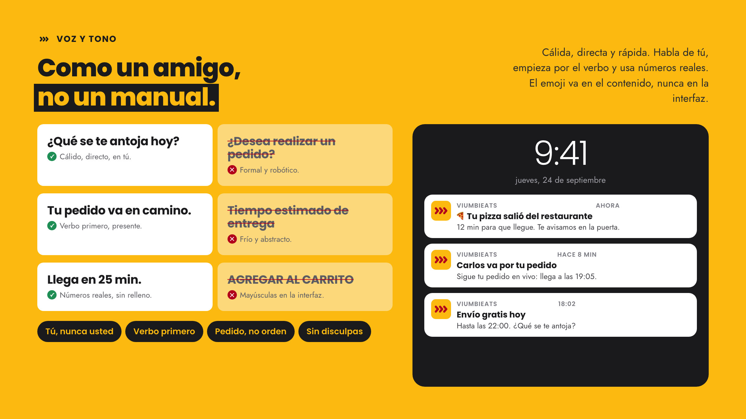
The result is a complete system: logo rules, colour with eight approved pairs, a type scale with twelve treatments, and components for the whole app, from buttons to the tab bar. On top of it, 35 art-directed screens: 30 for whoever cooks, restaurants and lodging, and 5 for whoever orders. viumbiEats ends up with a palette of its own and the same root as viumbiGo.