
viumbiBuy
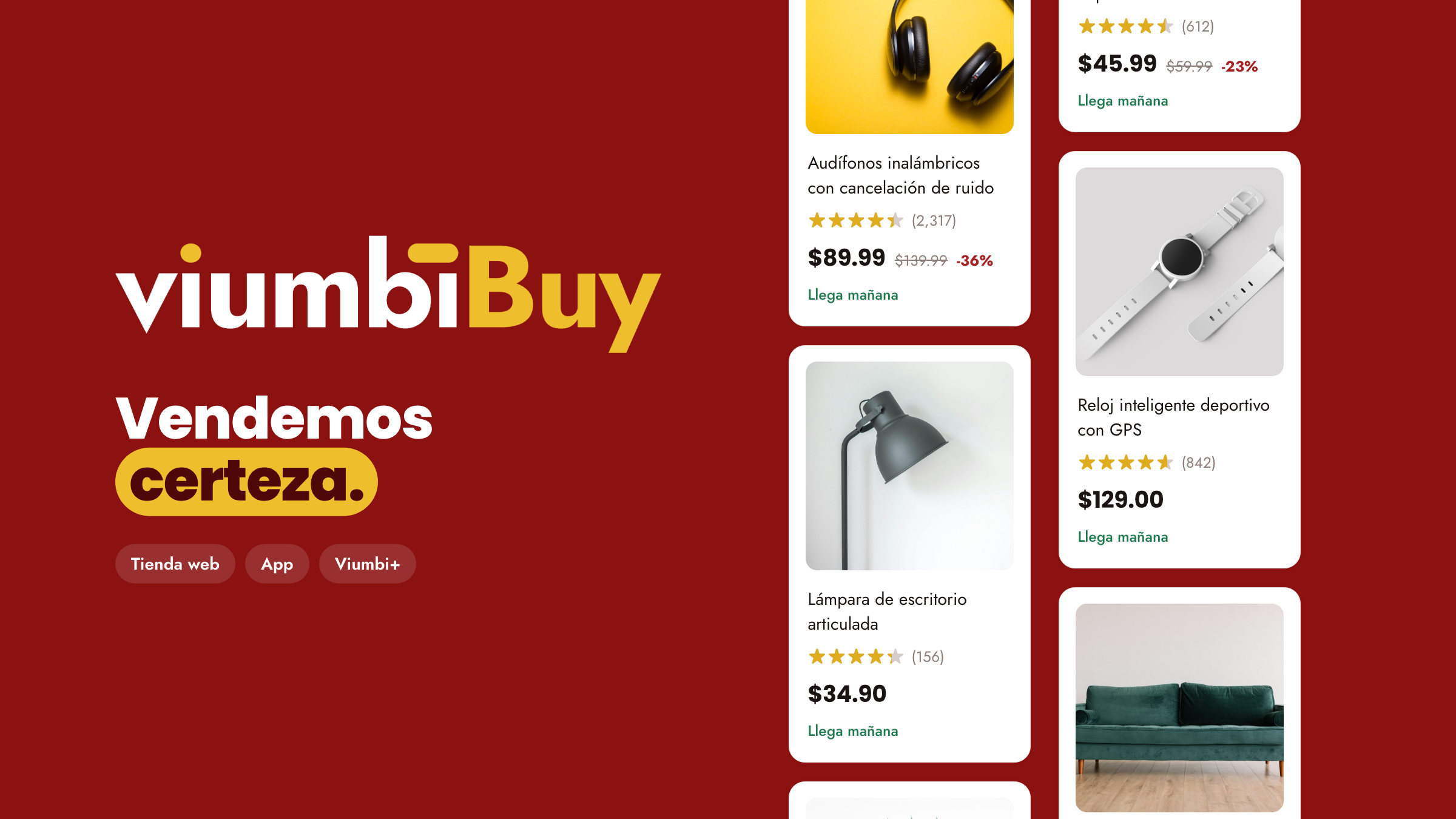
Design system for viumbiBuy, Viumbi's marketplace, across its web store and app.
The challenge
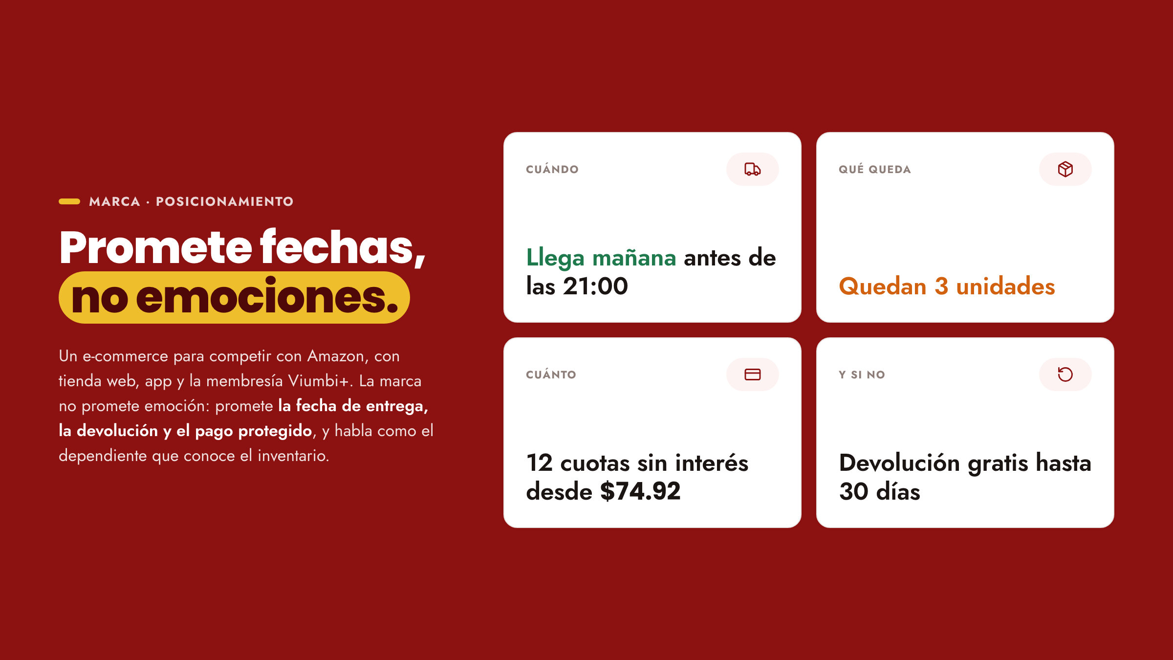
viumbiBuy was built to compete with Amazon, with a web store, an app and the Viumbi+ membership. Of the brand there was only the wordmark and two typefaces; everything else was missing, in a category where shoppers compare price, delivery date and returns in seconds.
The approach
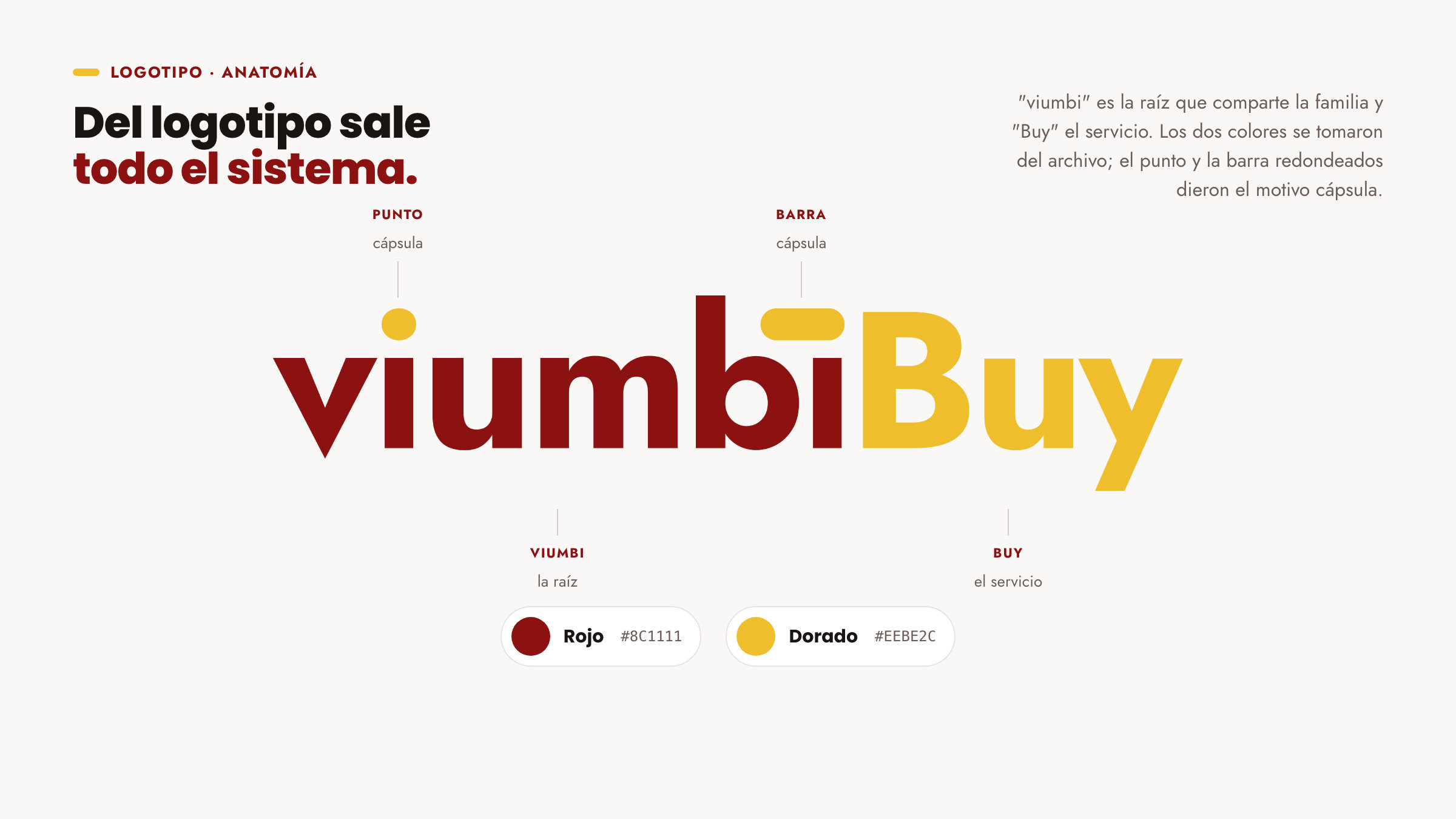
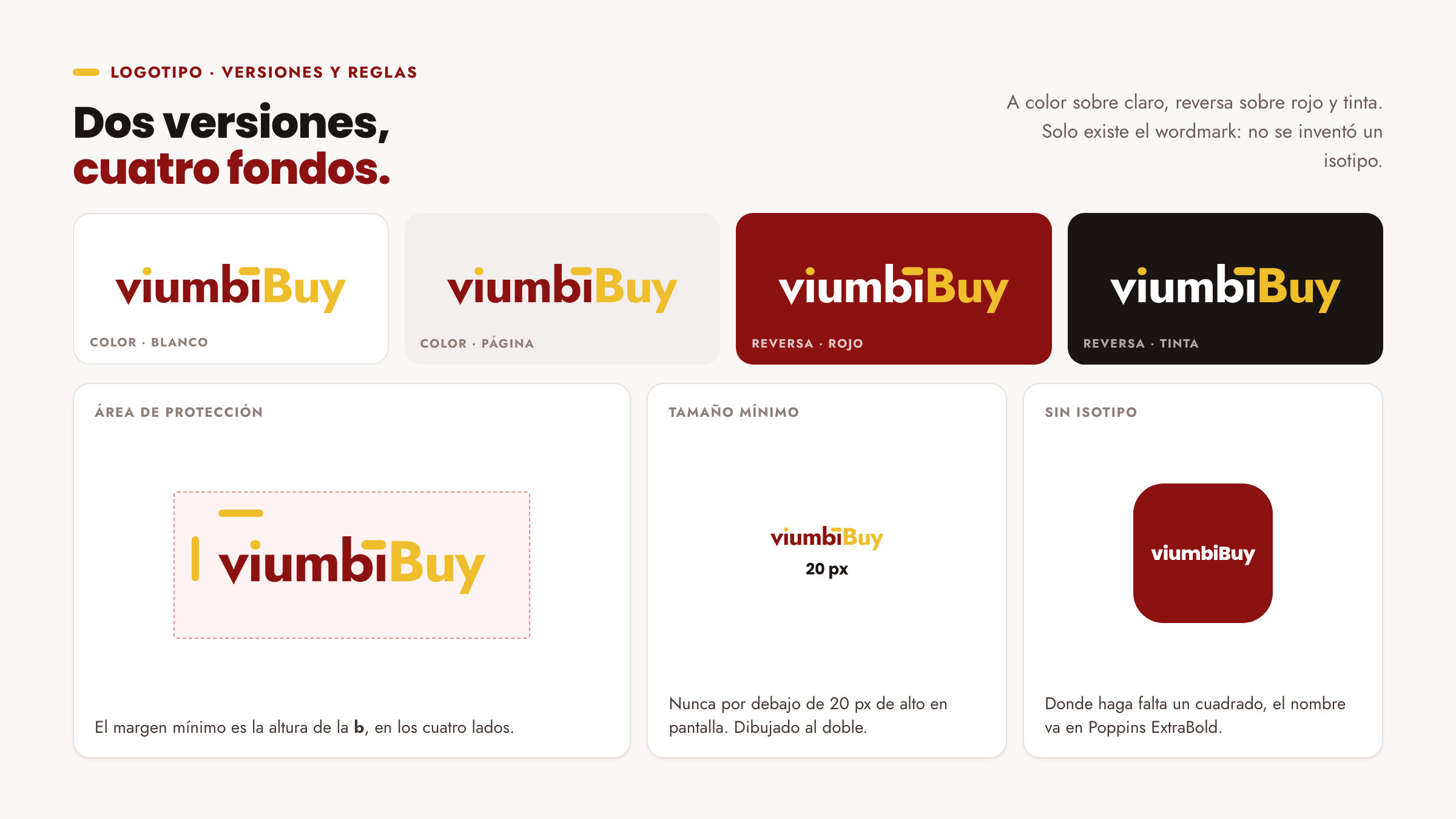
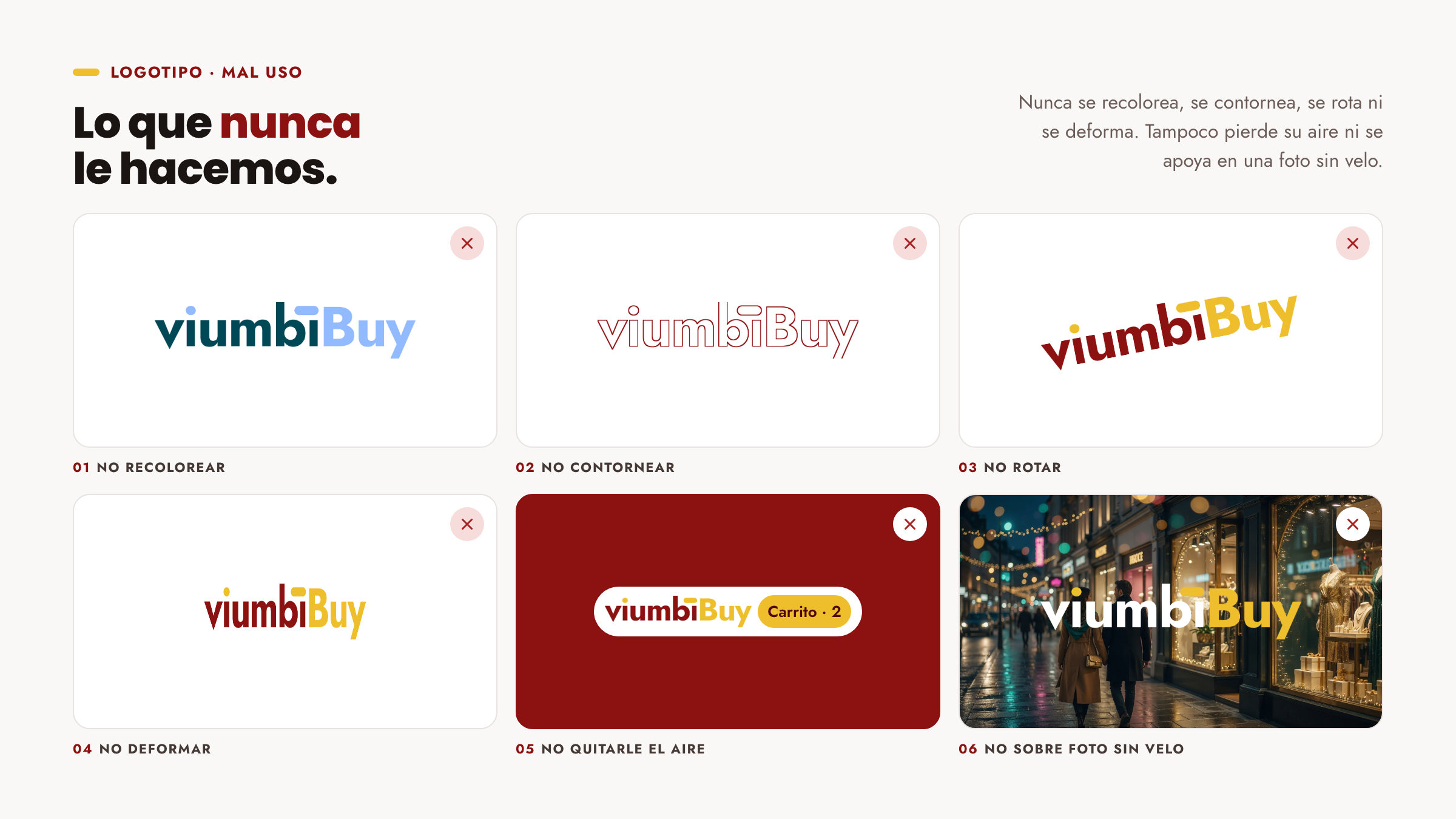
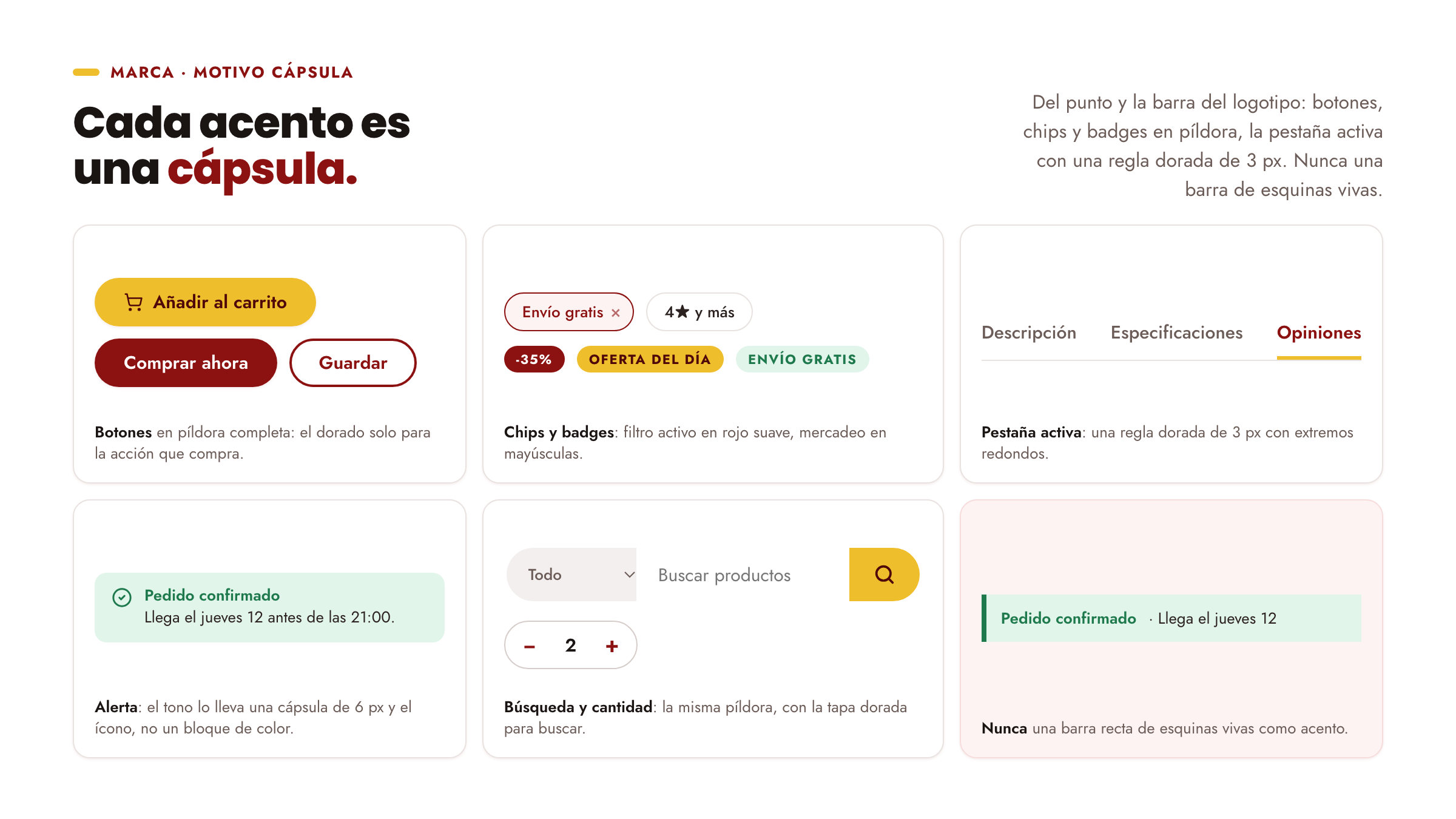
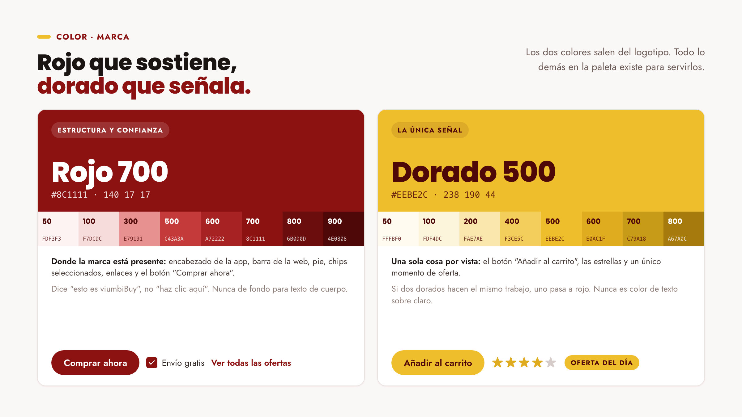
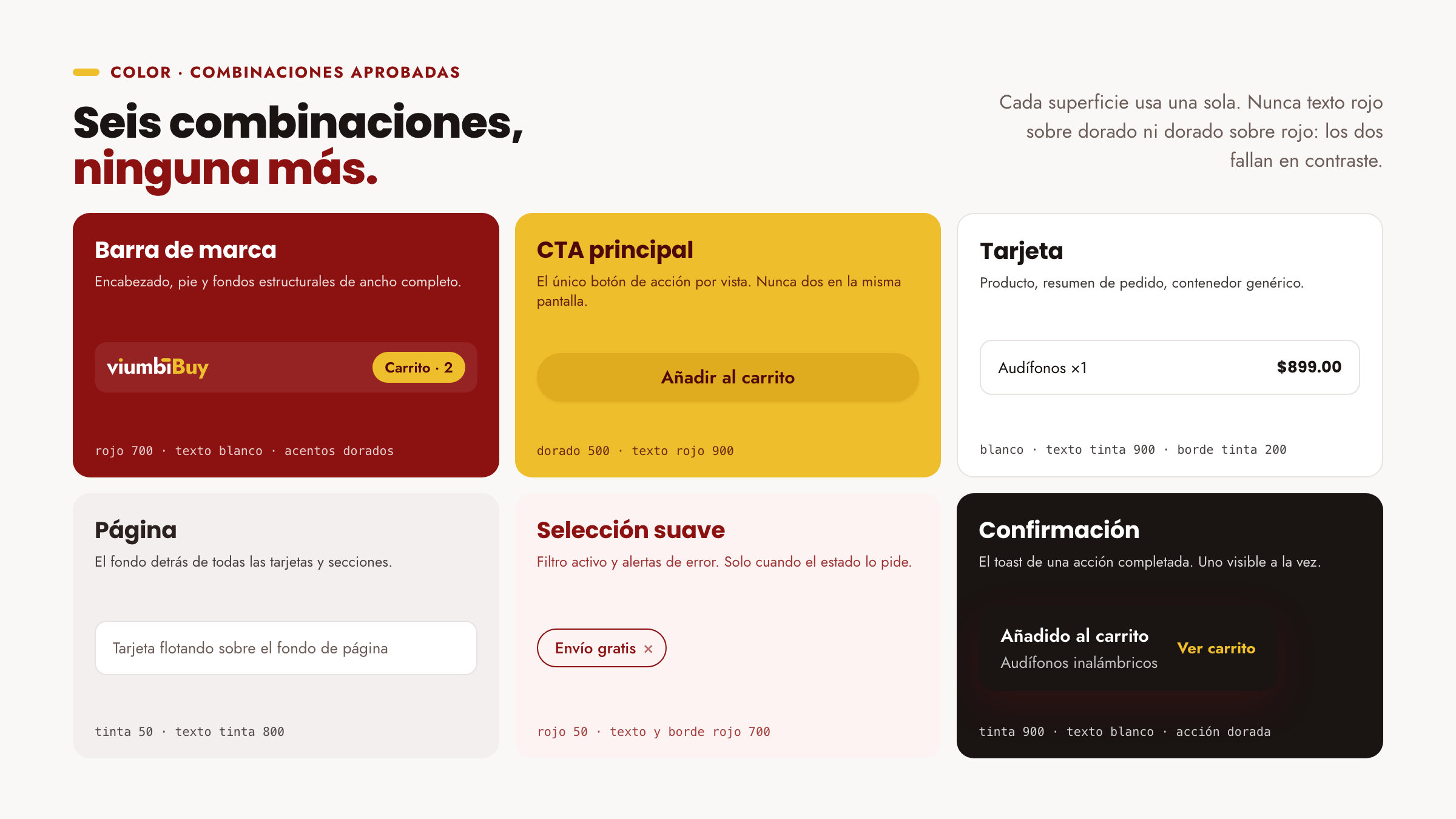
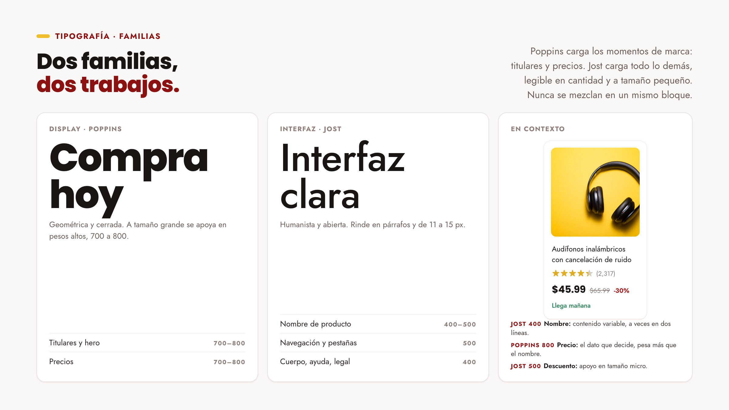
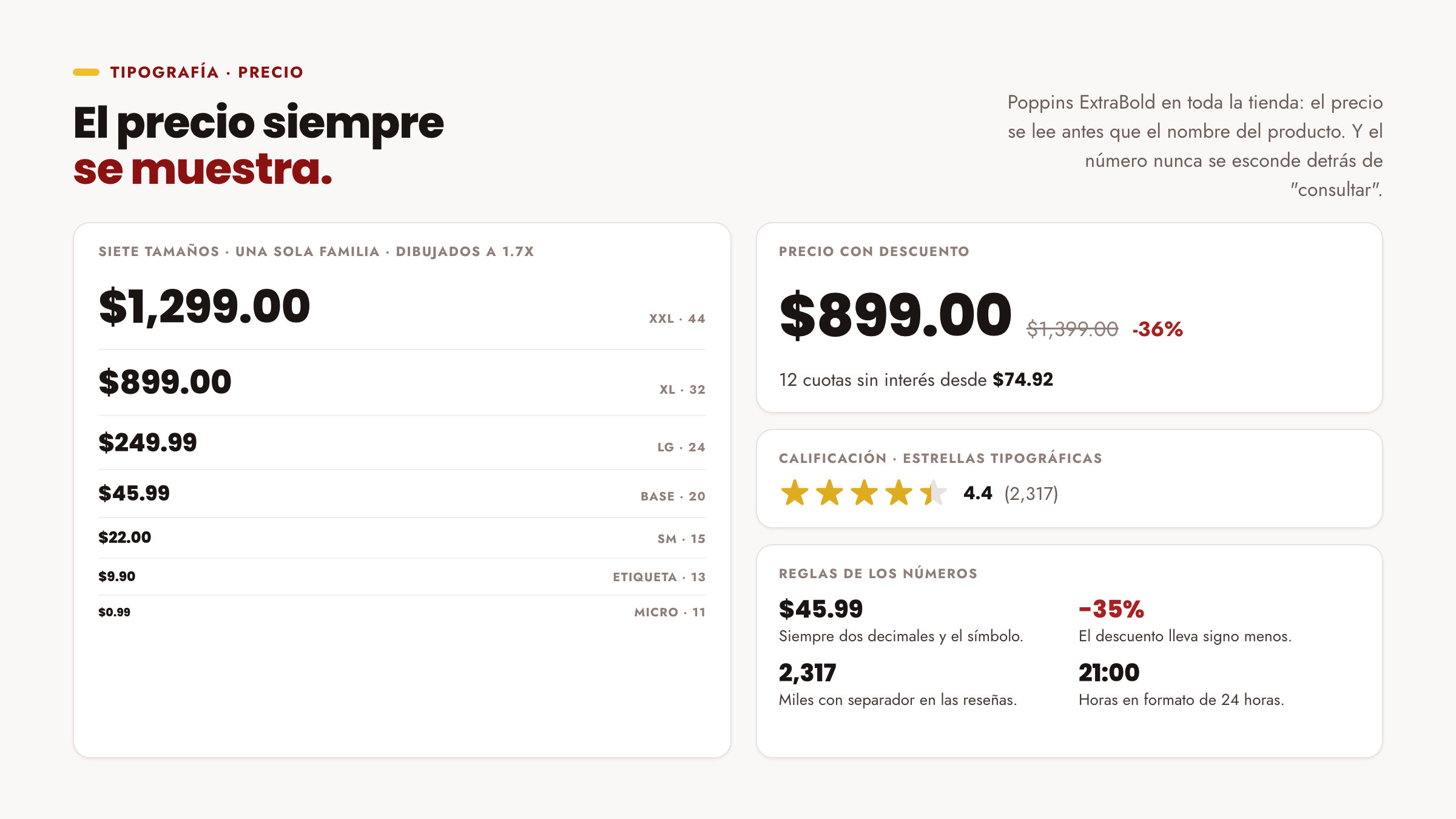
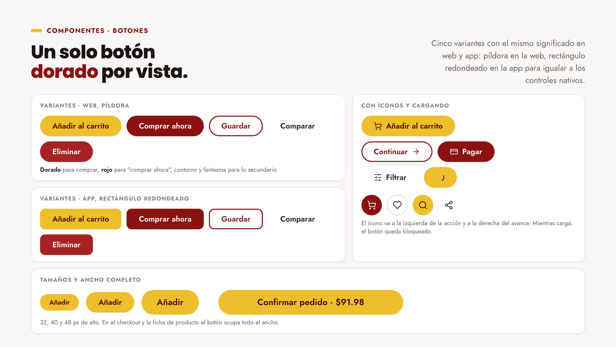
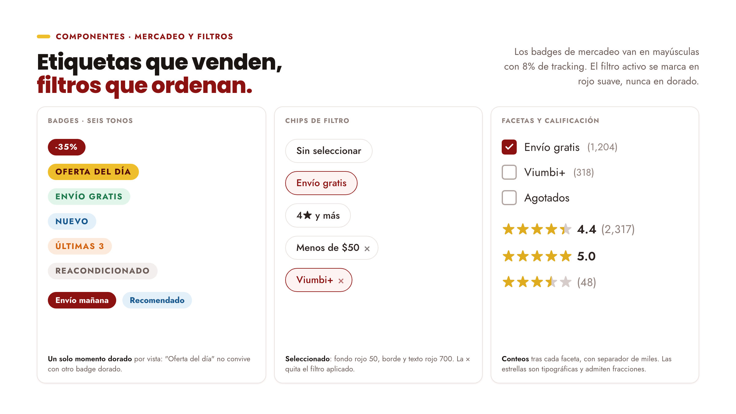
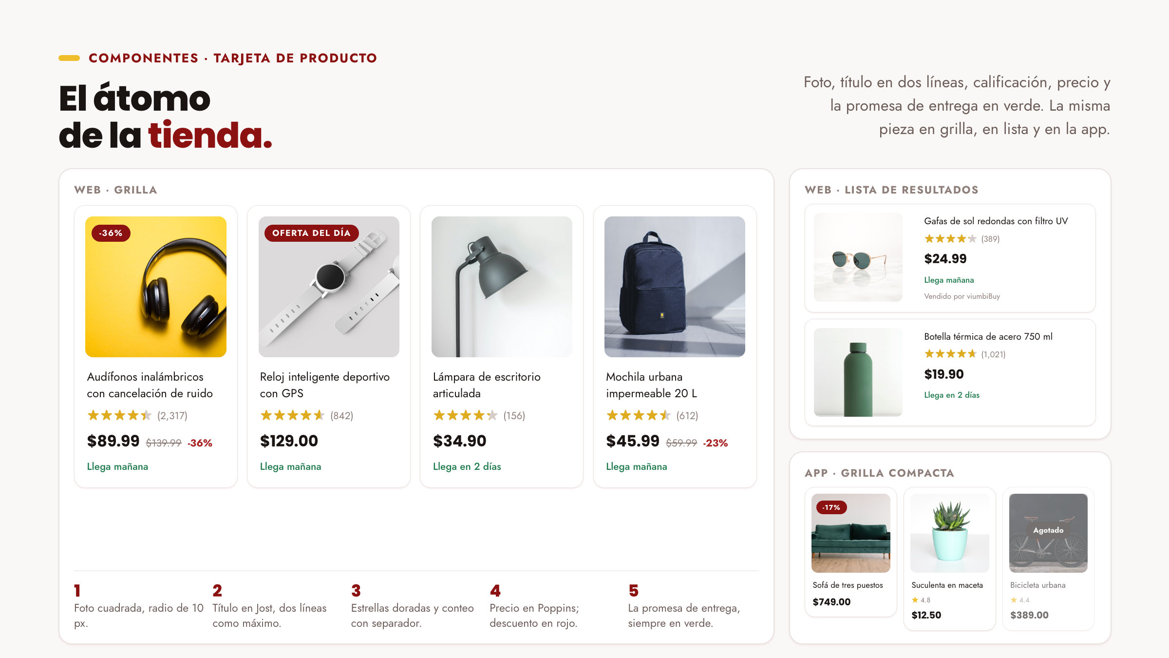
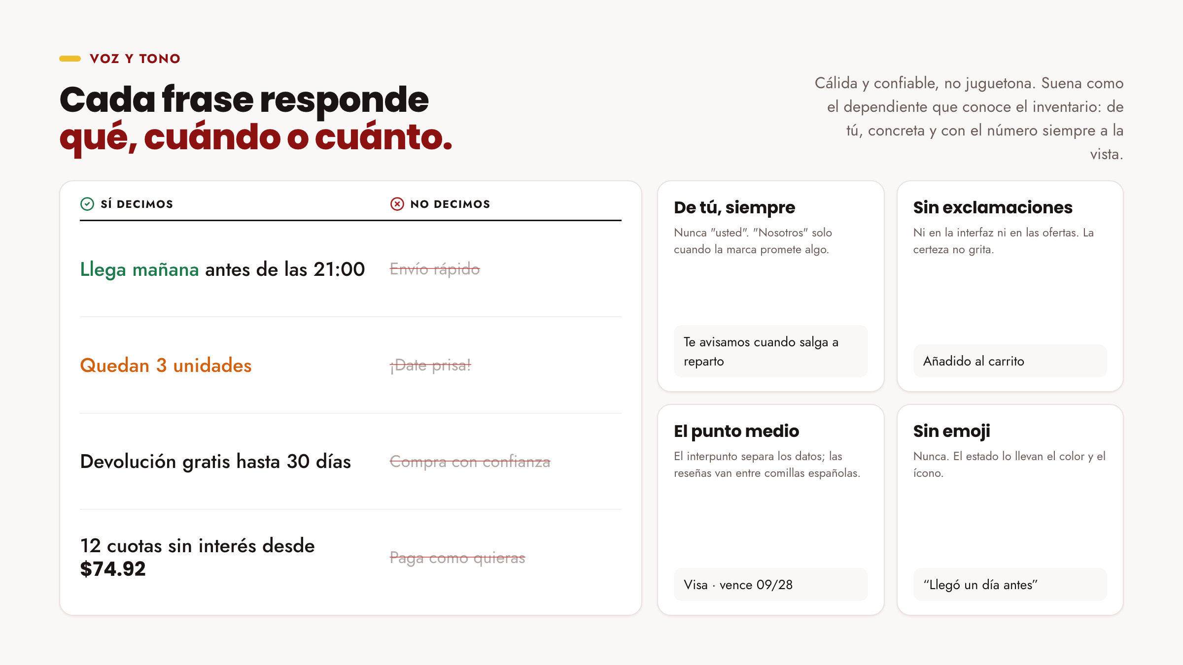
We took both colours from the wordmark and gave each a job: red carries the brand in bars, footers and selections; gold is the single signal, kept for the buying action, the stars and one offer per view. The rounded dot and bar over the i's became the capsule motif for buttons, chips and badges. Poppins carries headlines and prices, Jost the whole interface, and the voice always answers what, when or how much.
The results
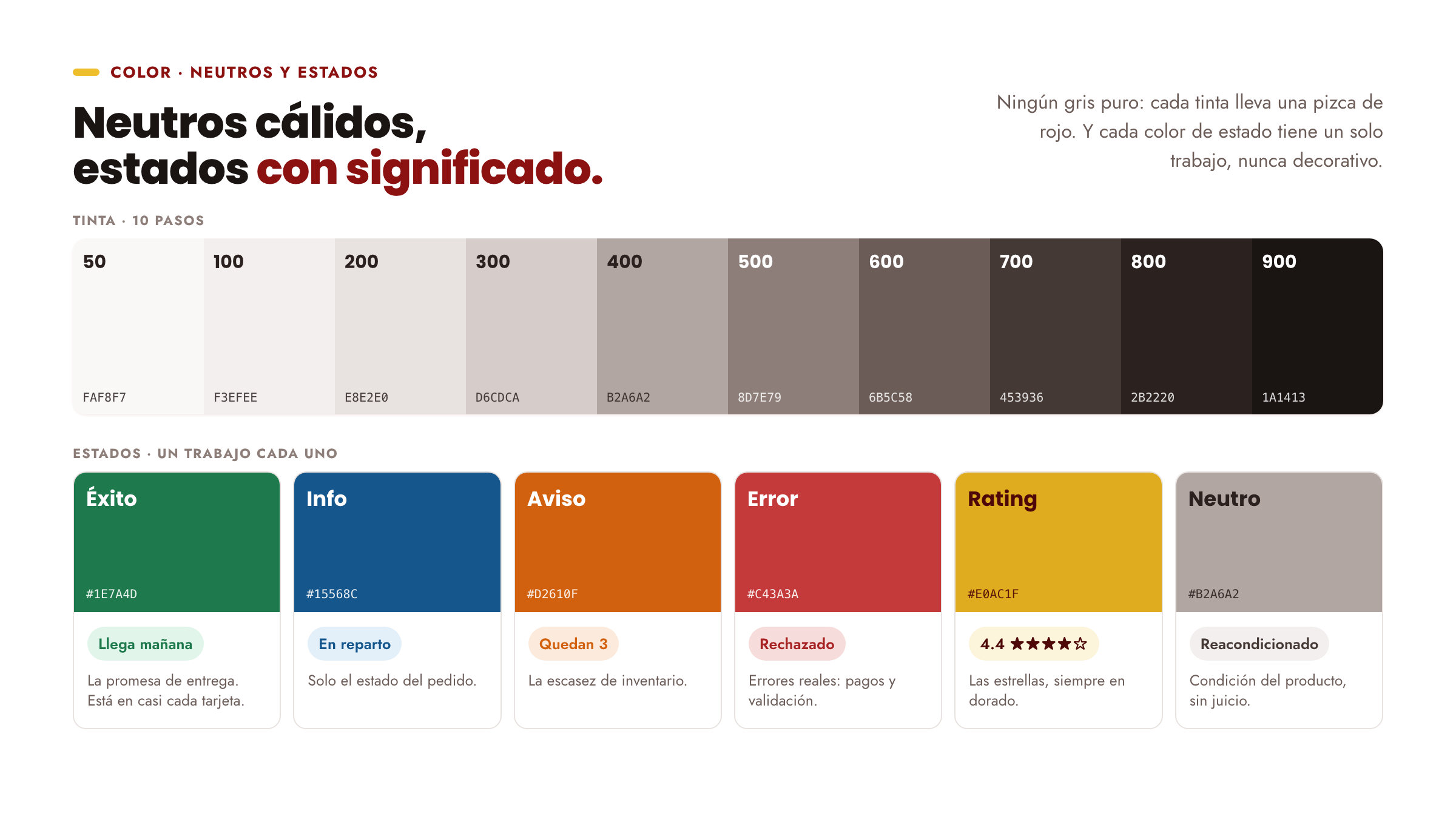
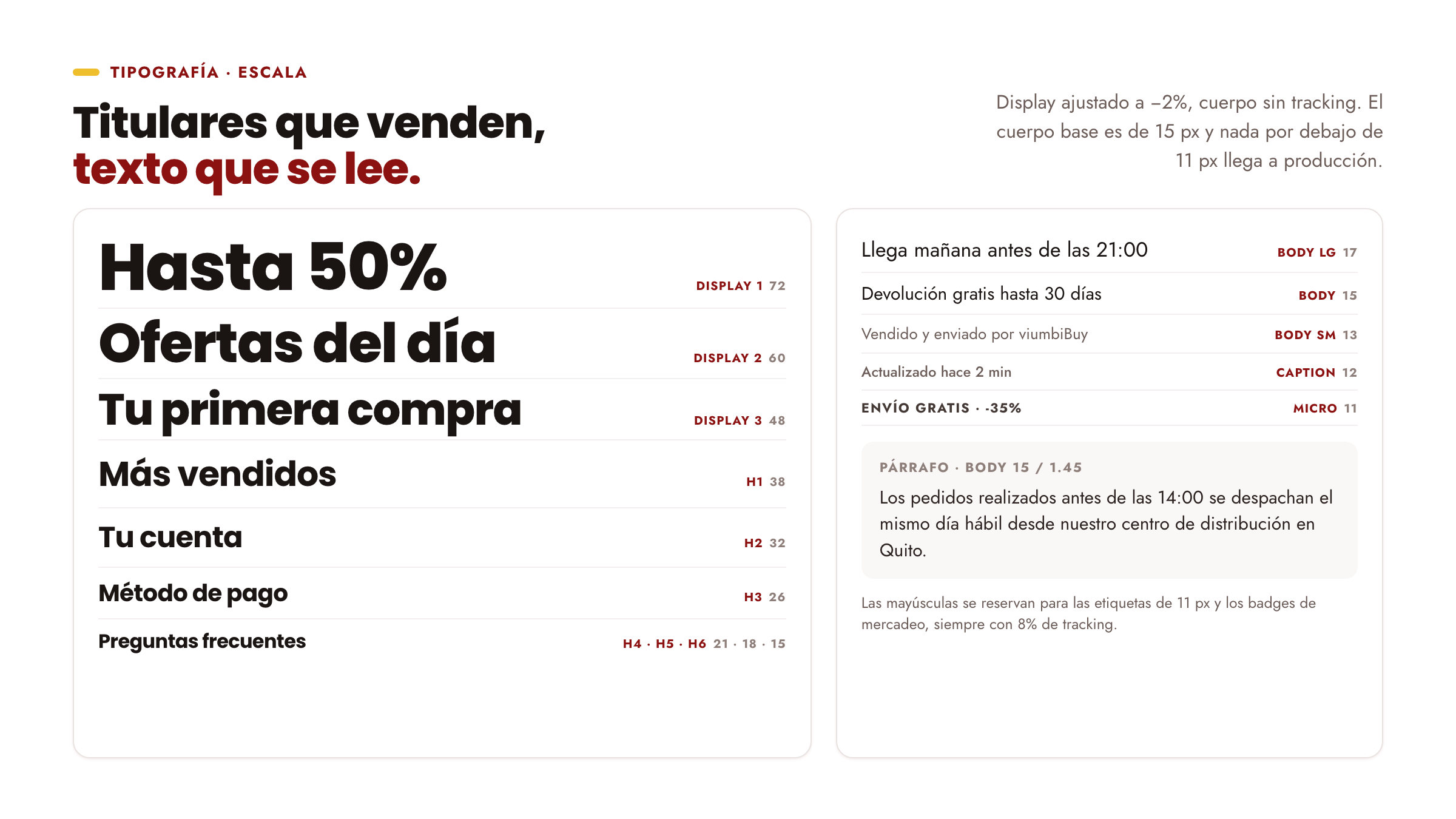
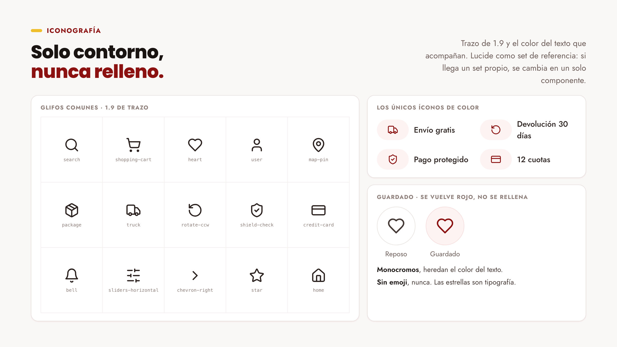
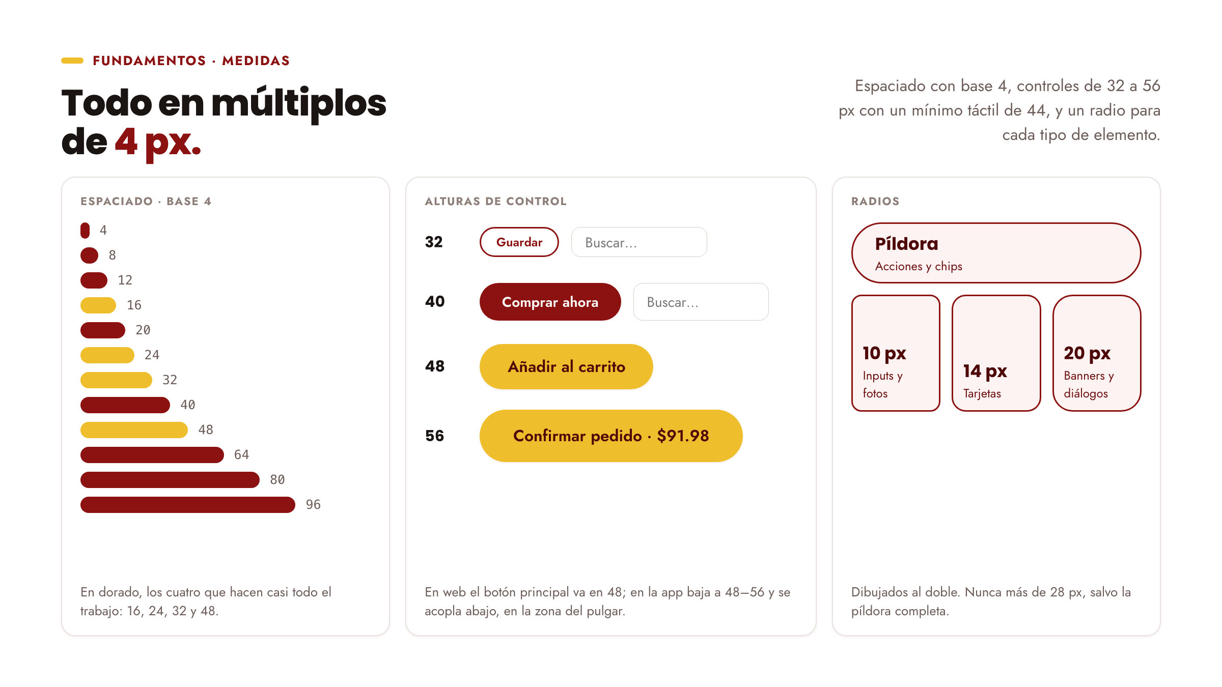
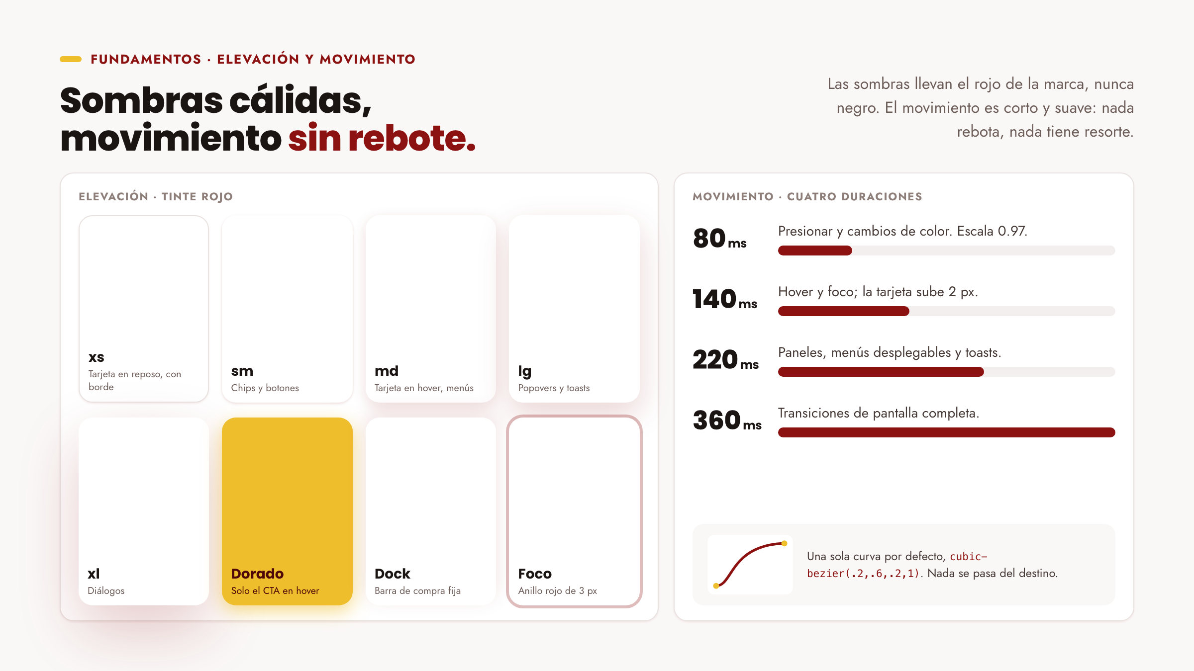
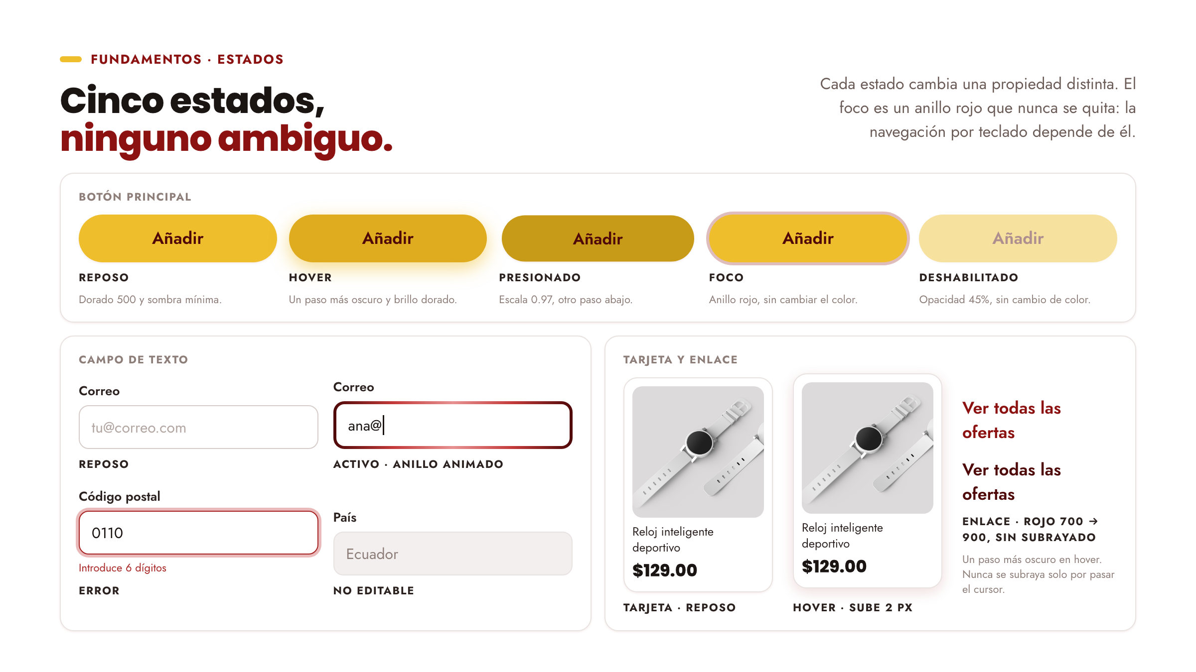
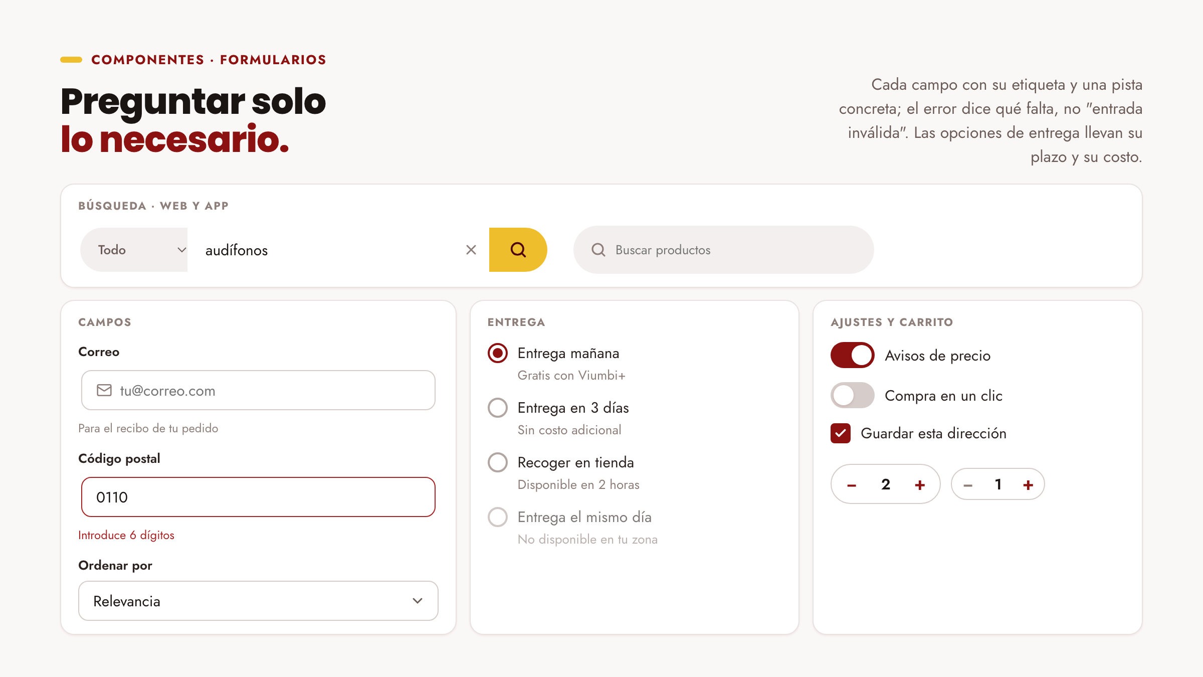
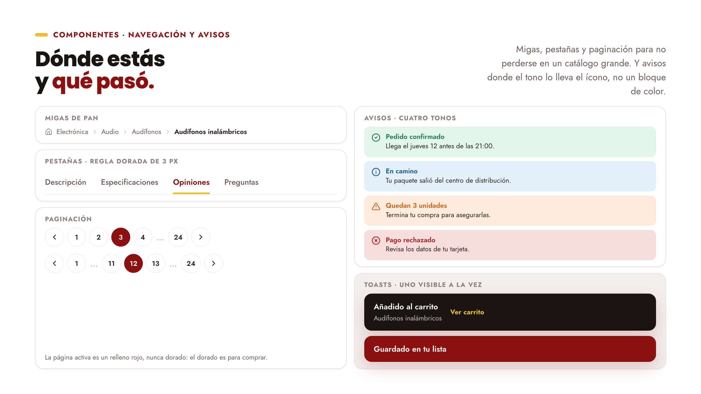
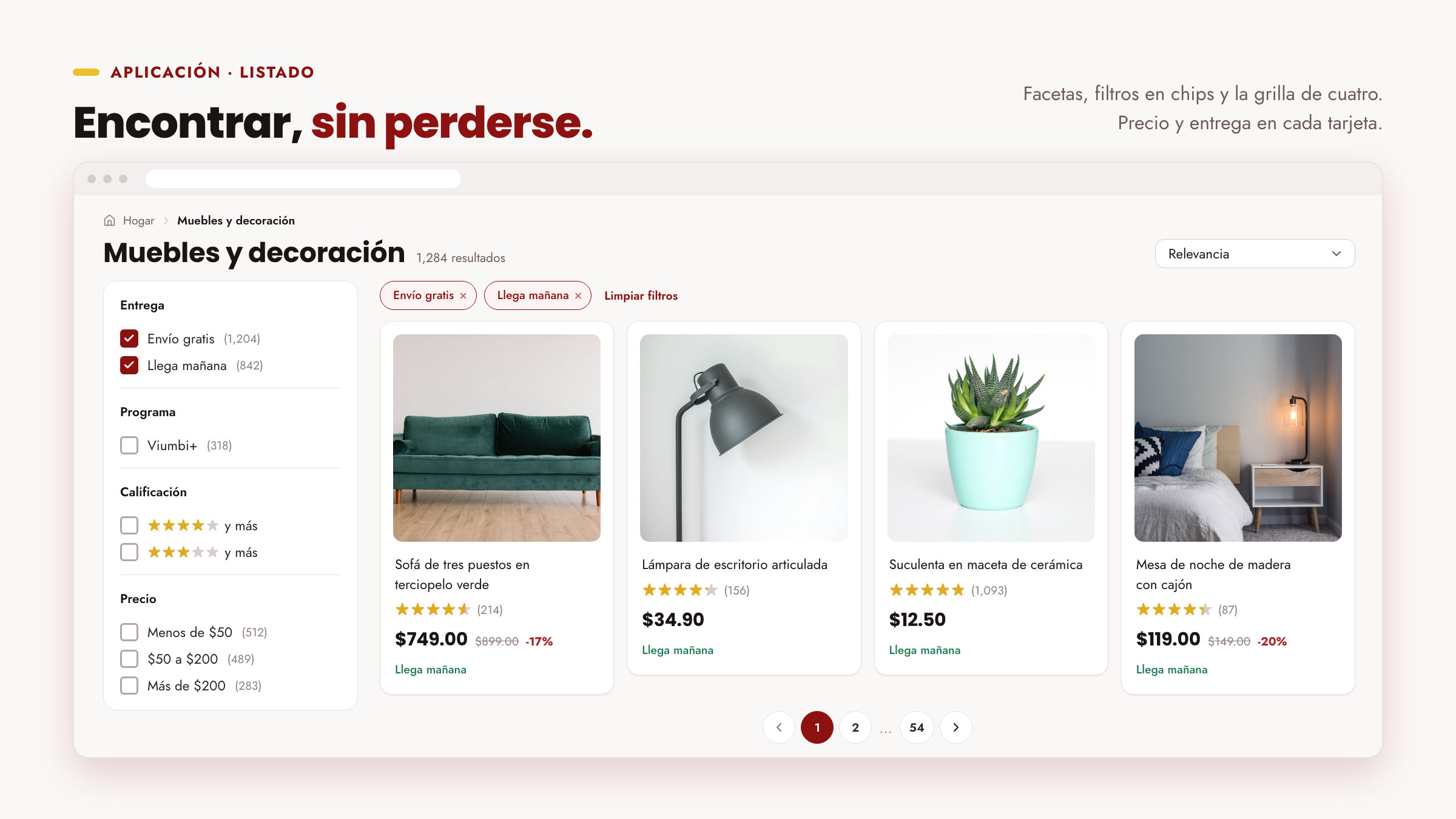
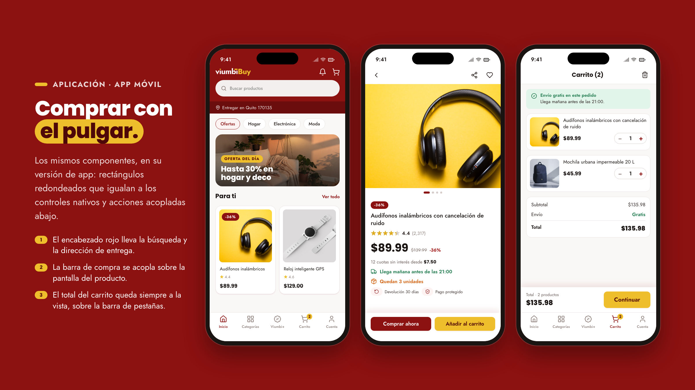
The result is a complete system: a 35-tone palette with six approved pairings, two families with seven price sizes, spacing, radius, elevation and motion tokens, and 24 components for web and app, from the product card to the cart. They assemble the store's key screens: home, listing, product and cart.