
The Quijije Organization
Brand identity for The Quijije Organization, the private holding behind Oxtrovo and its eight brands.
The challenge
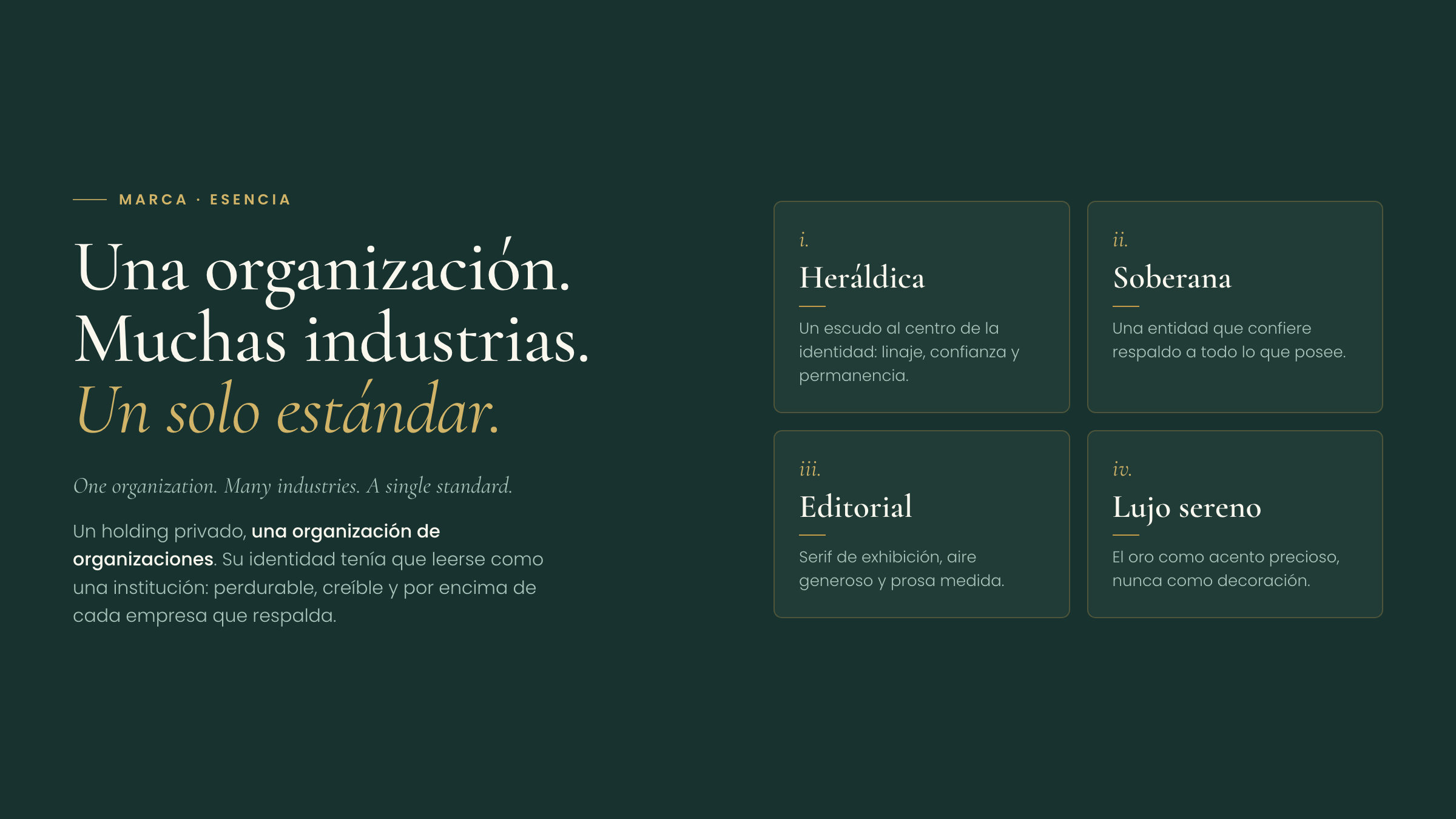
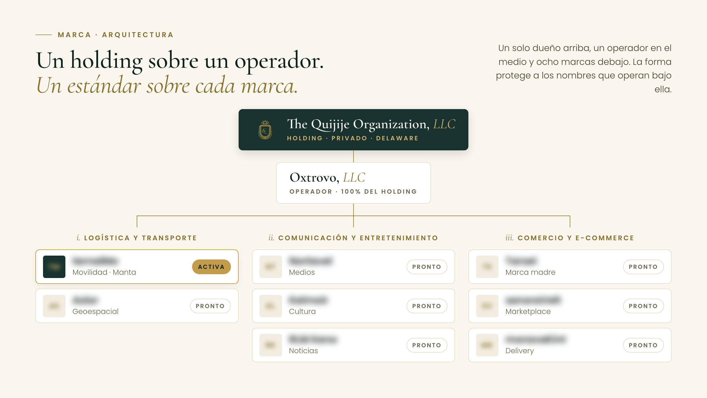
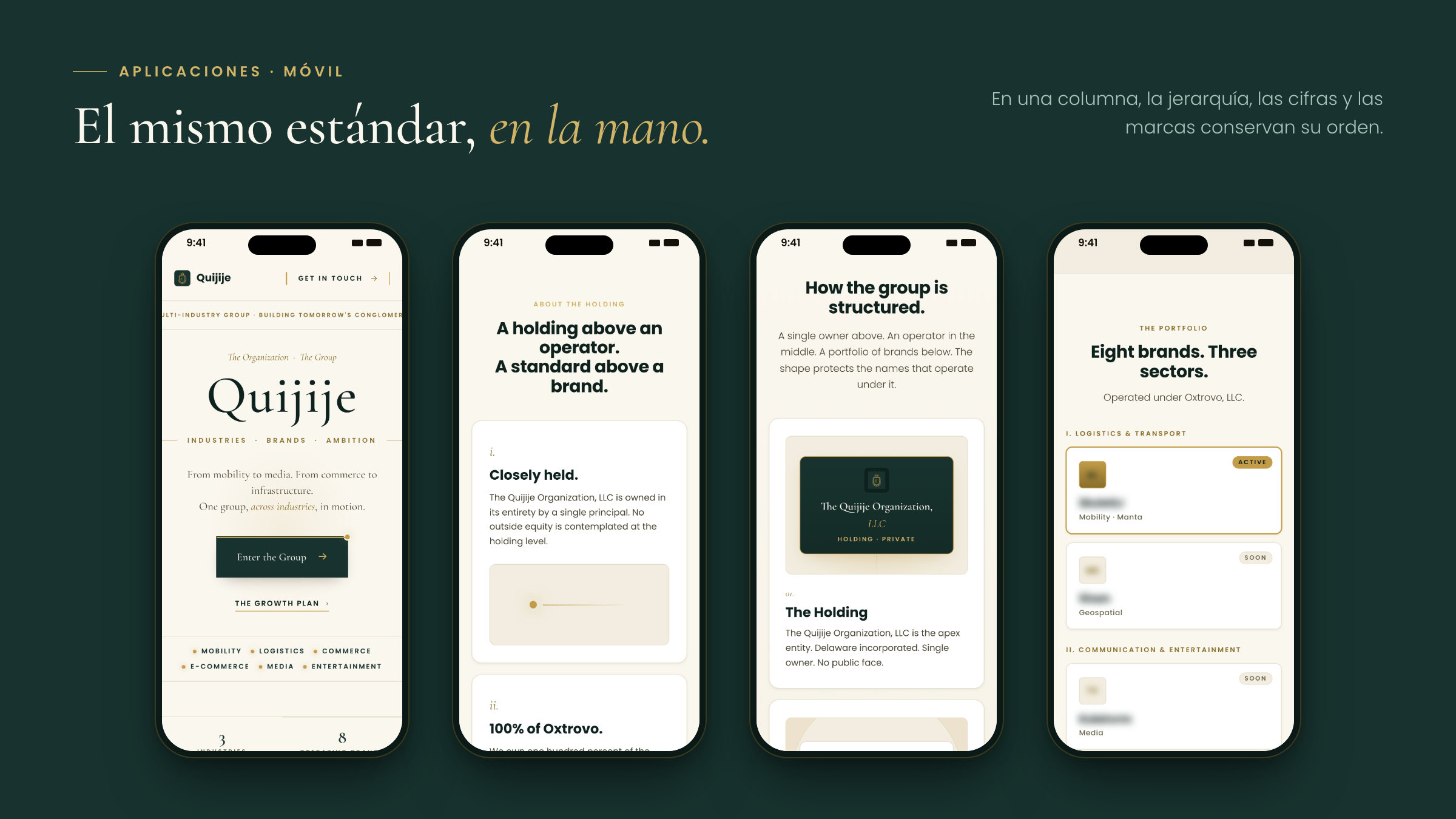
The Quijije Organization is a private holding, an organization of organizations: it owns Oxtrovo, the operator of eight brands across three sectors. Its identity could not look like an app, or like any of those brands. It had to read as an institution, enduring and credible, able to stand behind everything the group adds.
The approach
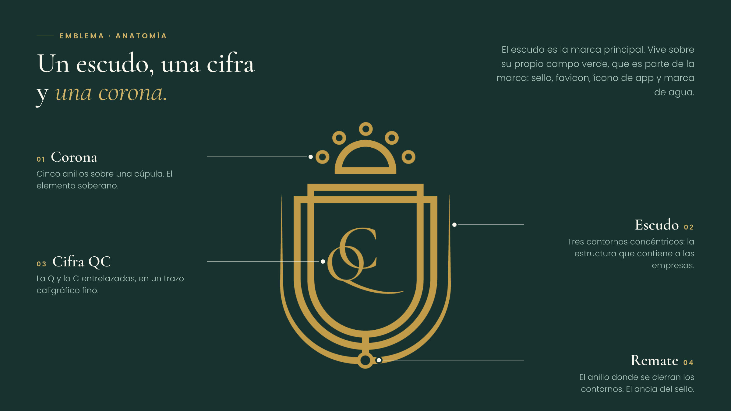
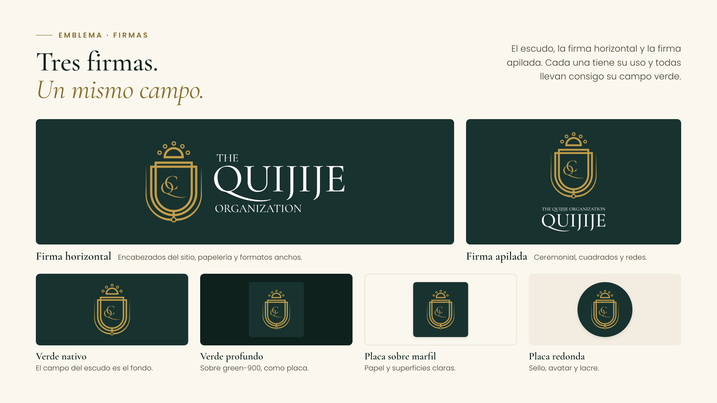
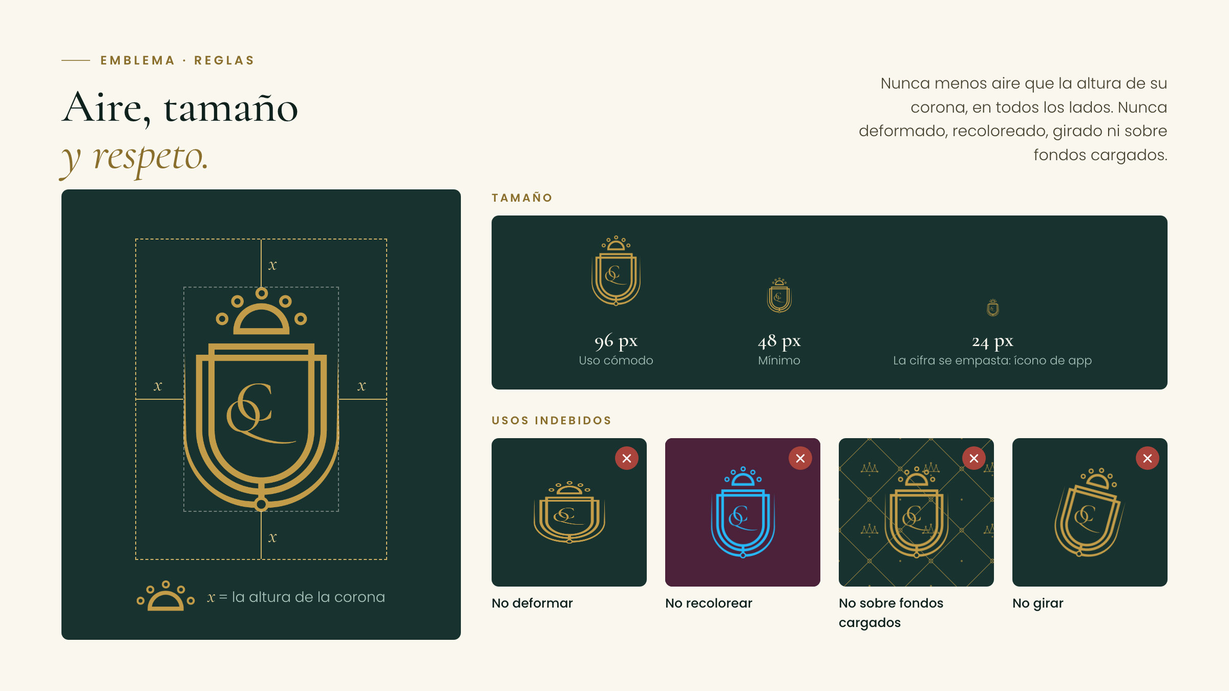
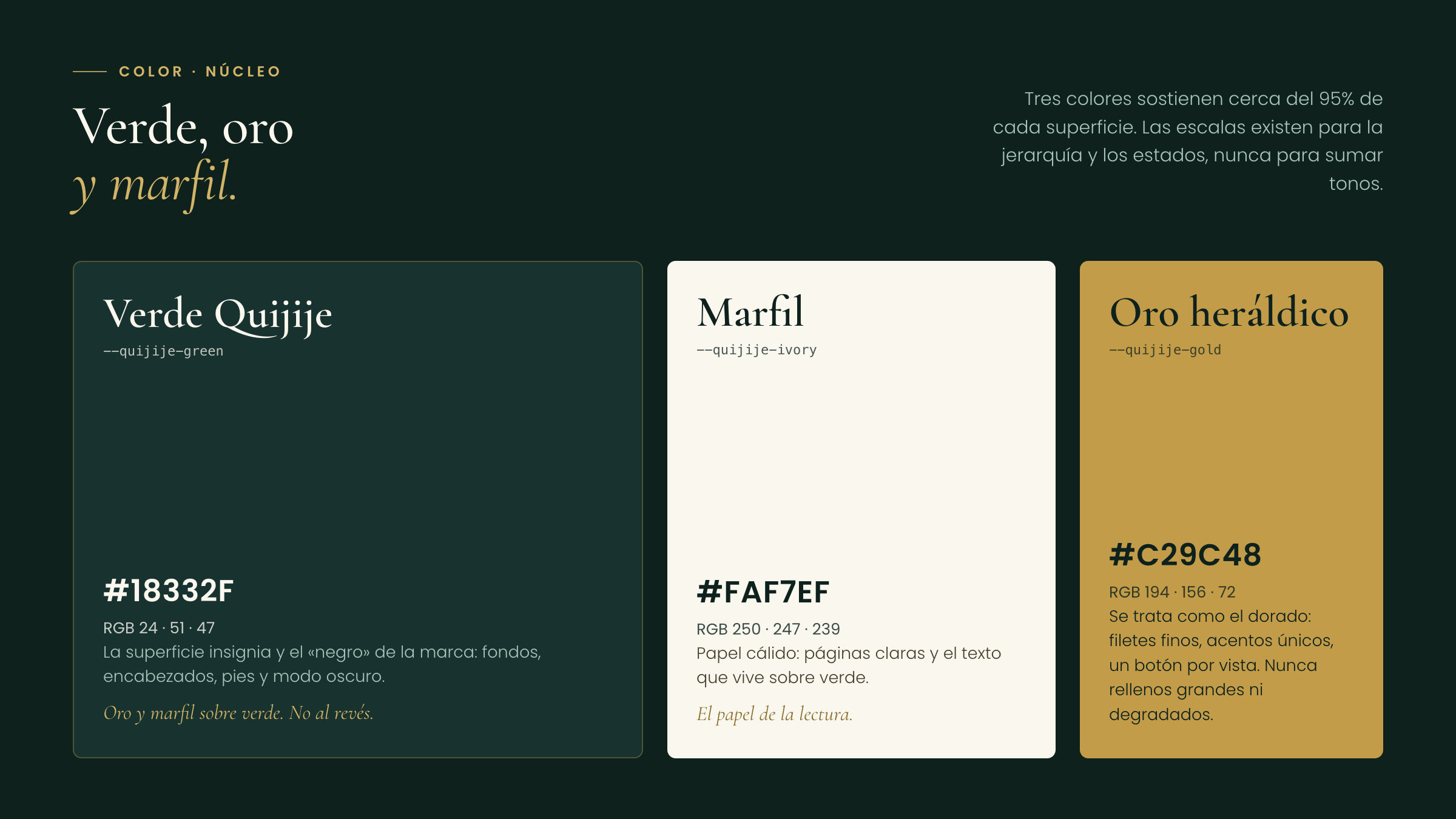
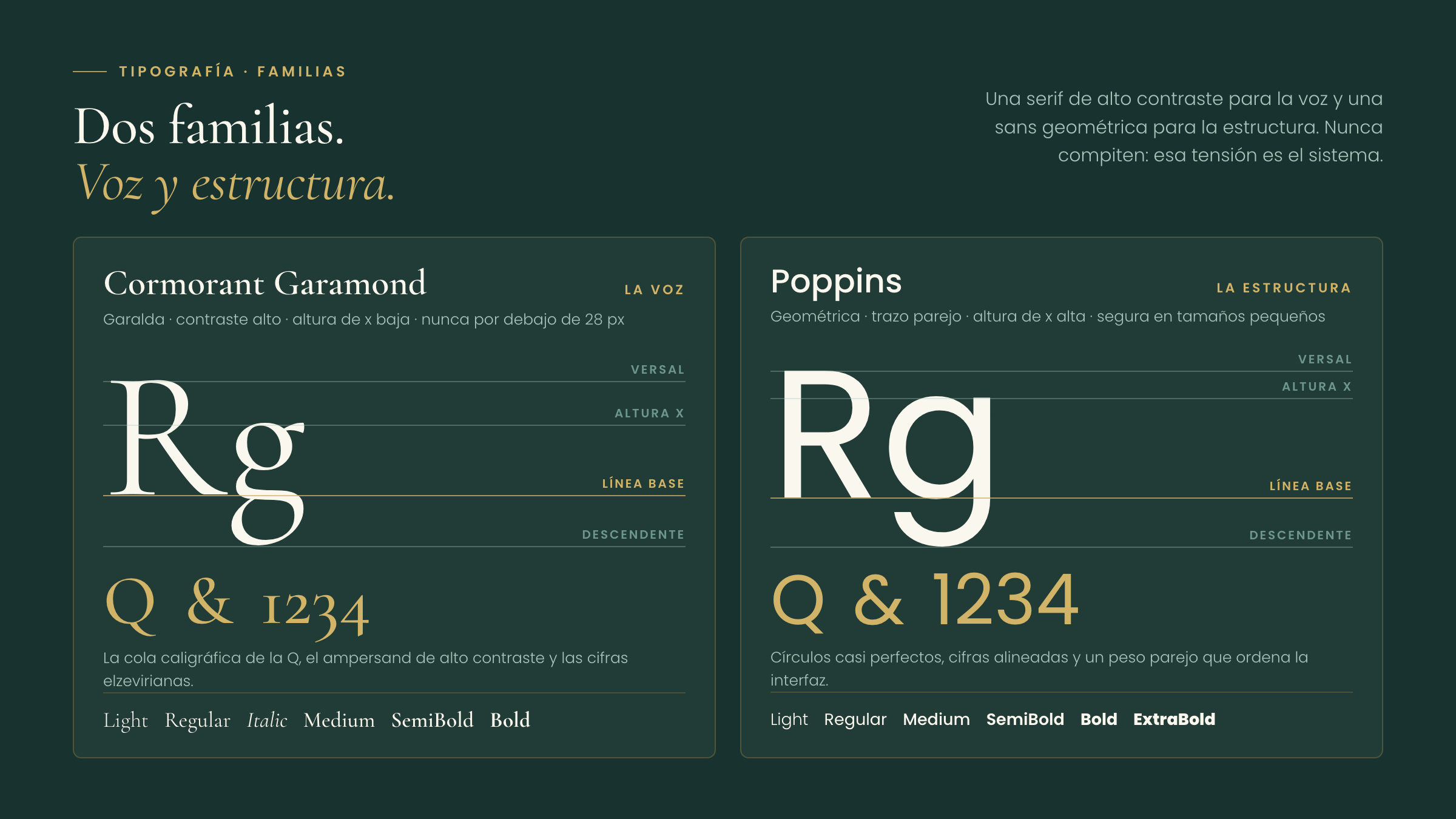
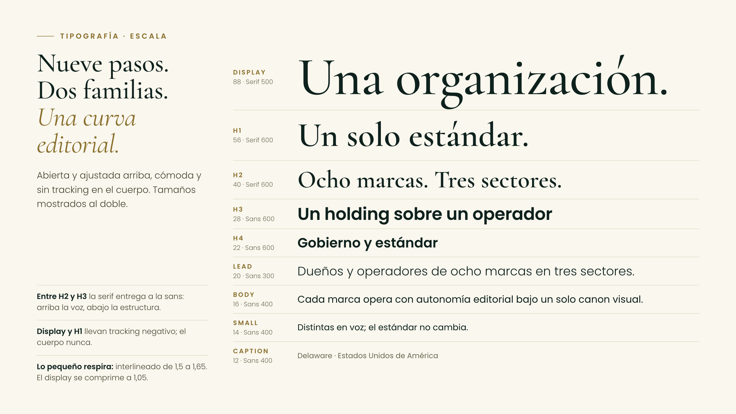
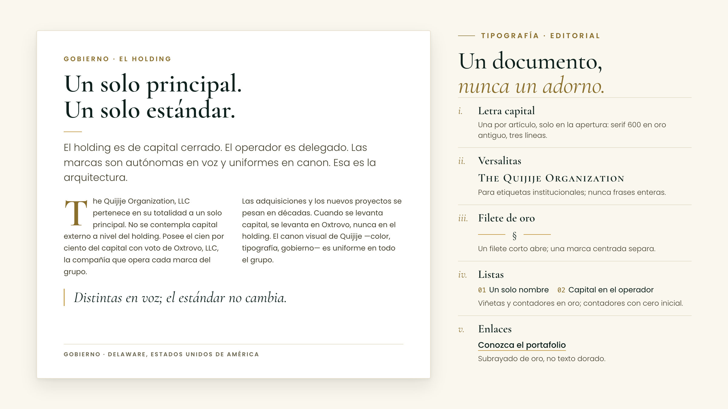
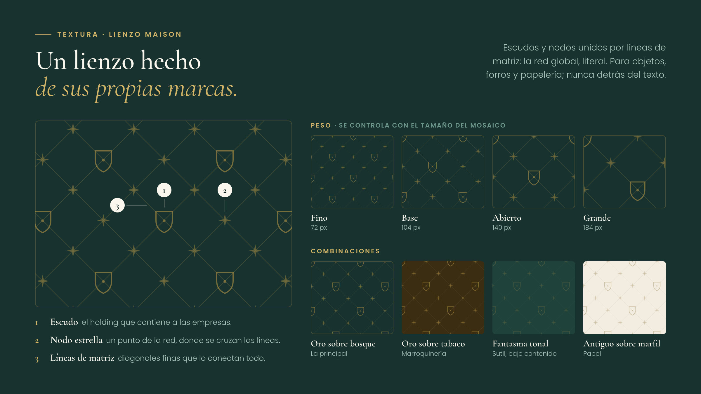
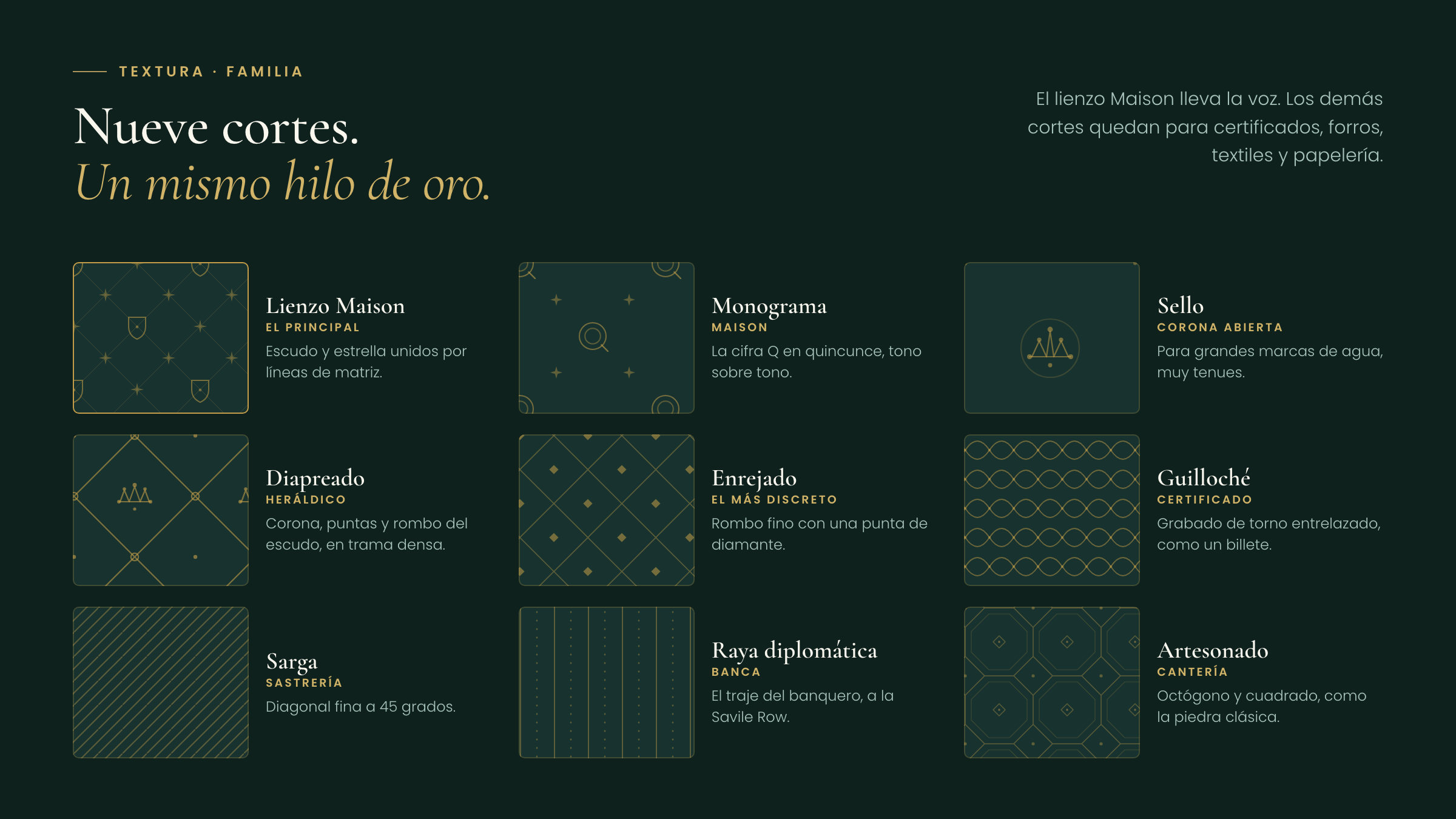
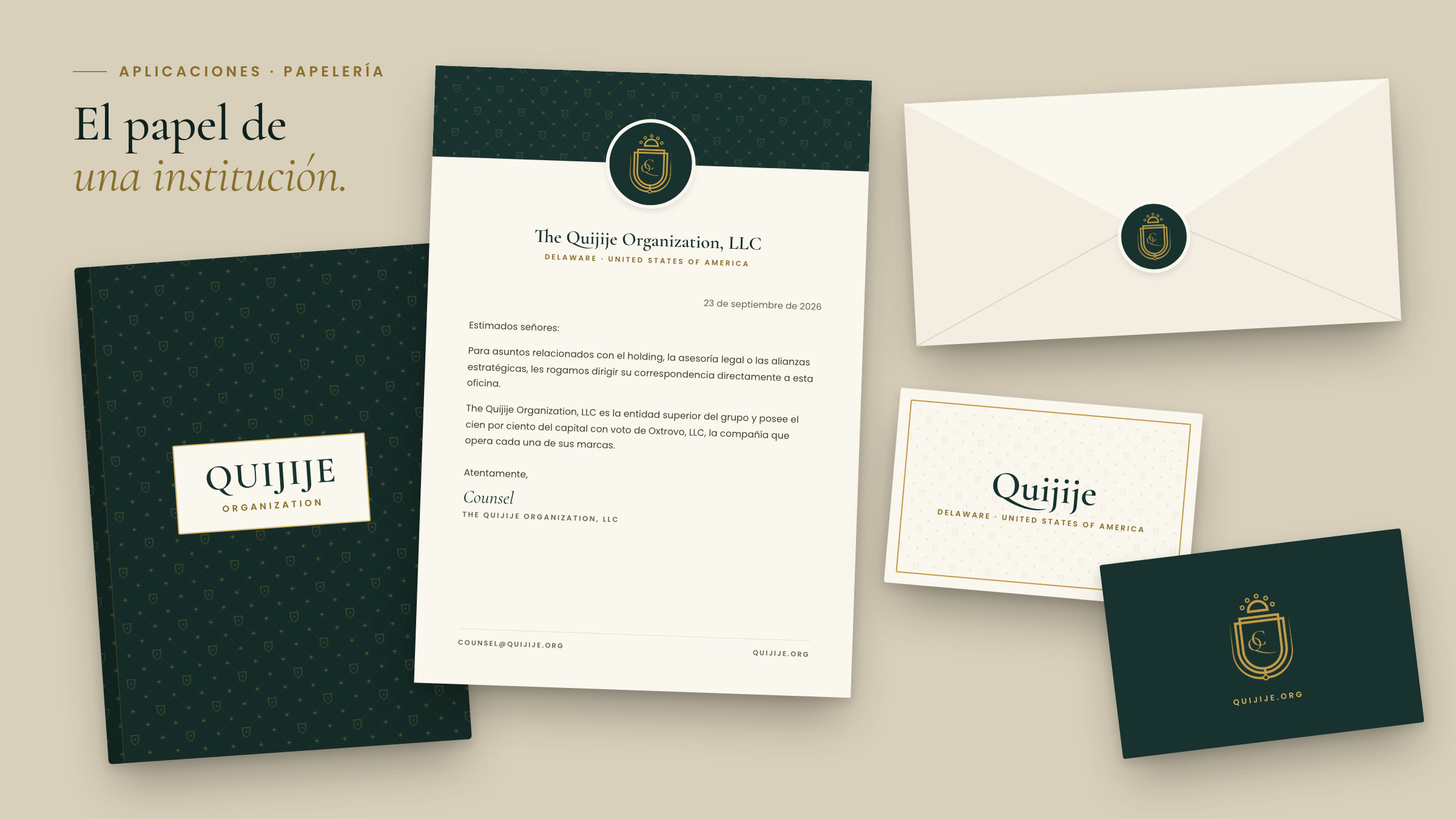
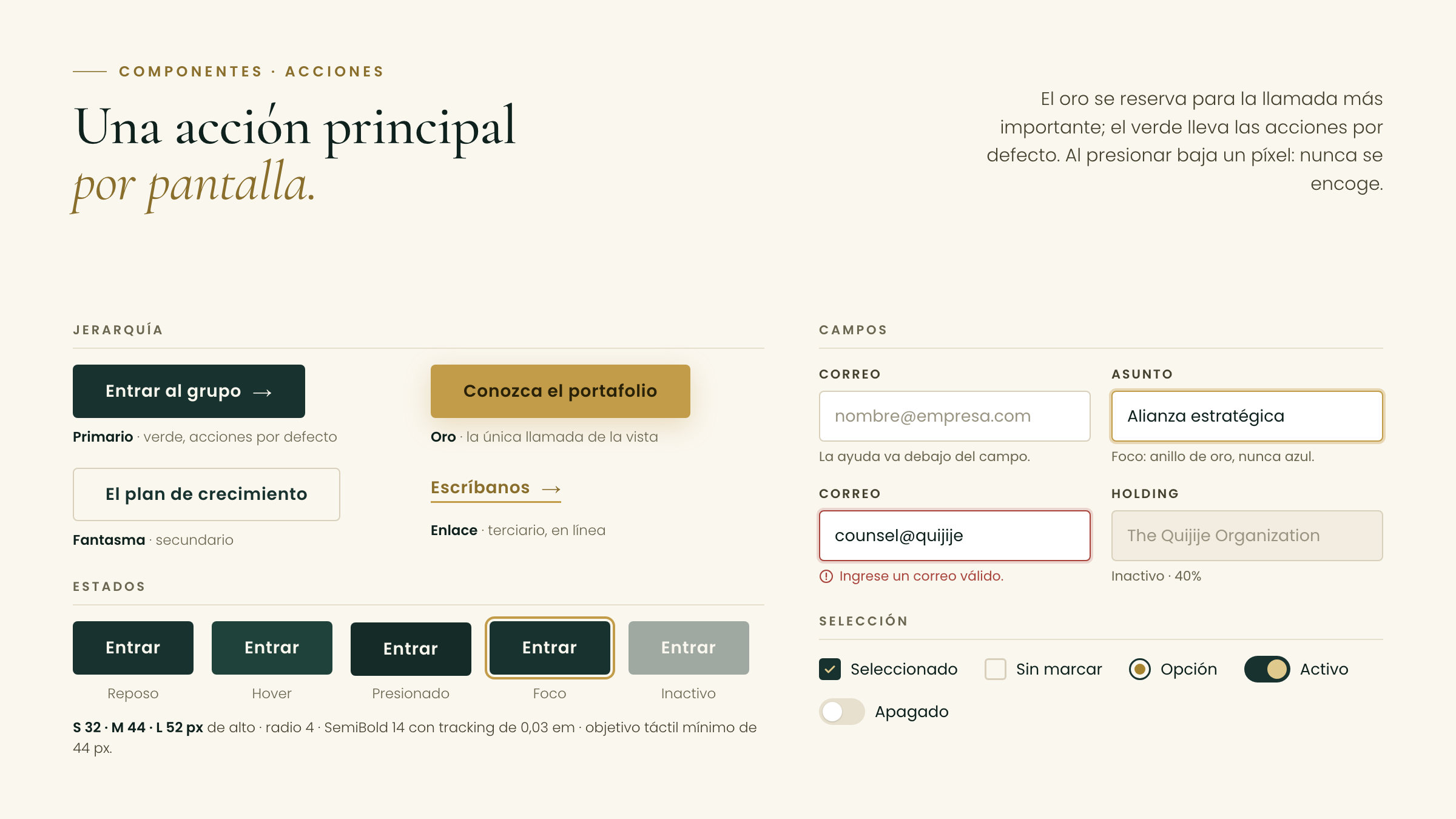
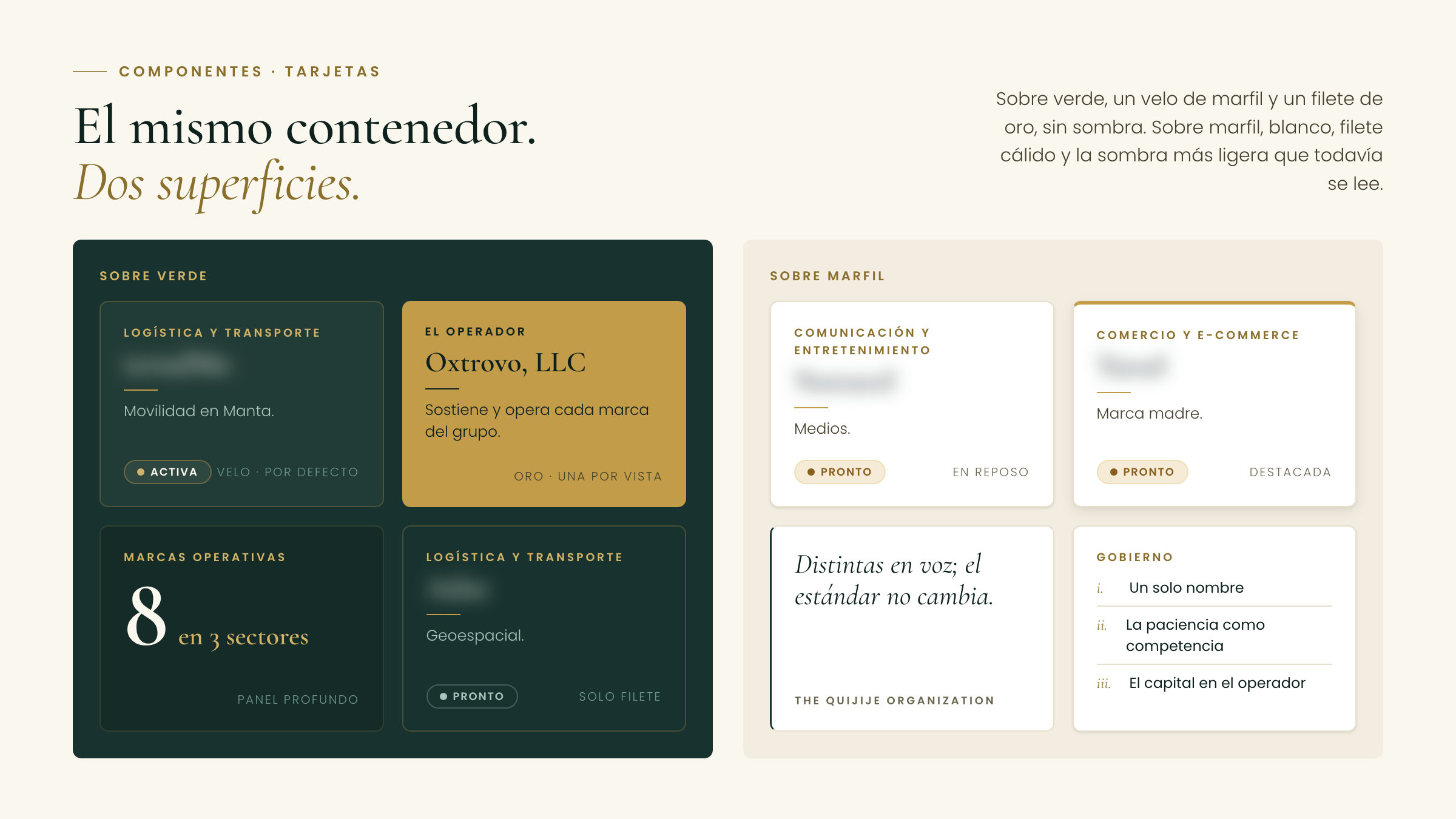
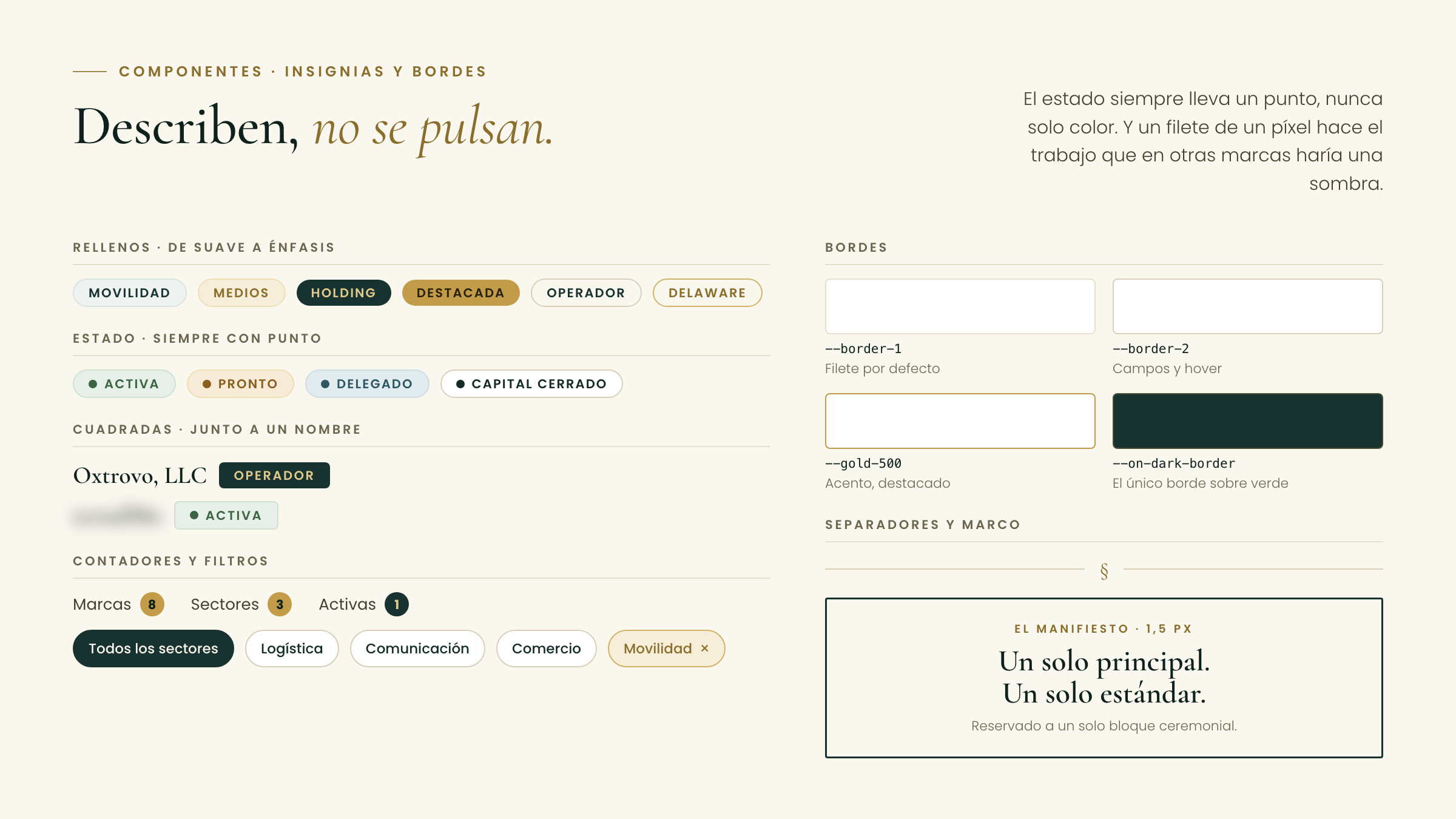
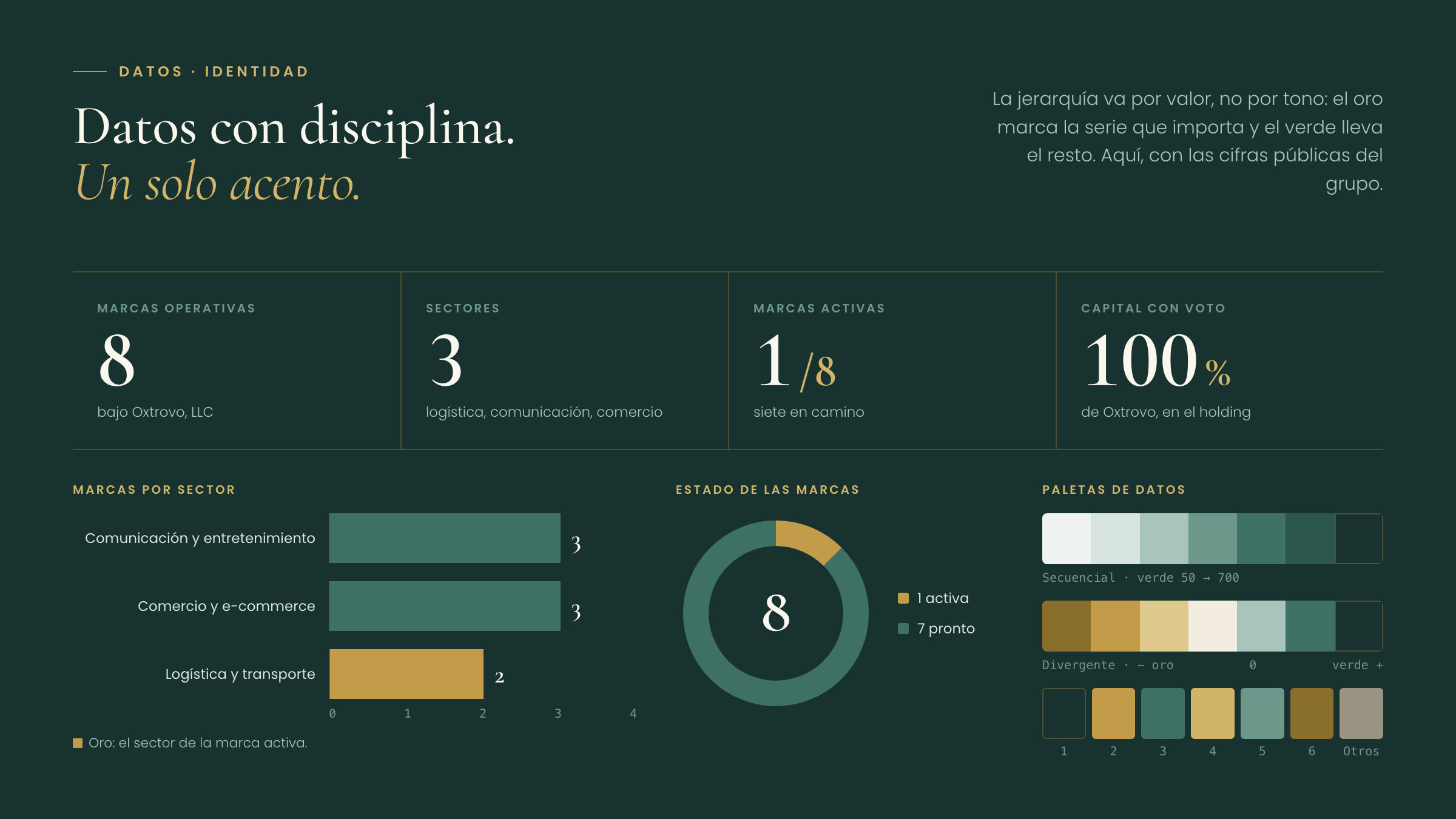
We started from the crest: a five-ring crown, three contours and the QC cipher. It anchors three signatures, each carrying its own green field, and a Maison canvas woven from the same marks, with eight more cuts for certificates, linings and stationery. The palette fits in three colours, forest green, heraldic gold and ivory, and gold is used like gilding: fine rules and a single call to action per view. Cormorant Garamond is the voice and Poppins the structure, with wide-tracked eyebrows that echo the spacing of ORGANIZATION in the wordmark.
The results
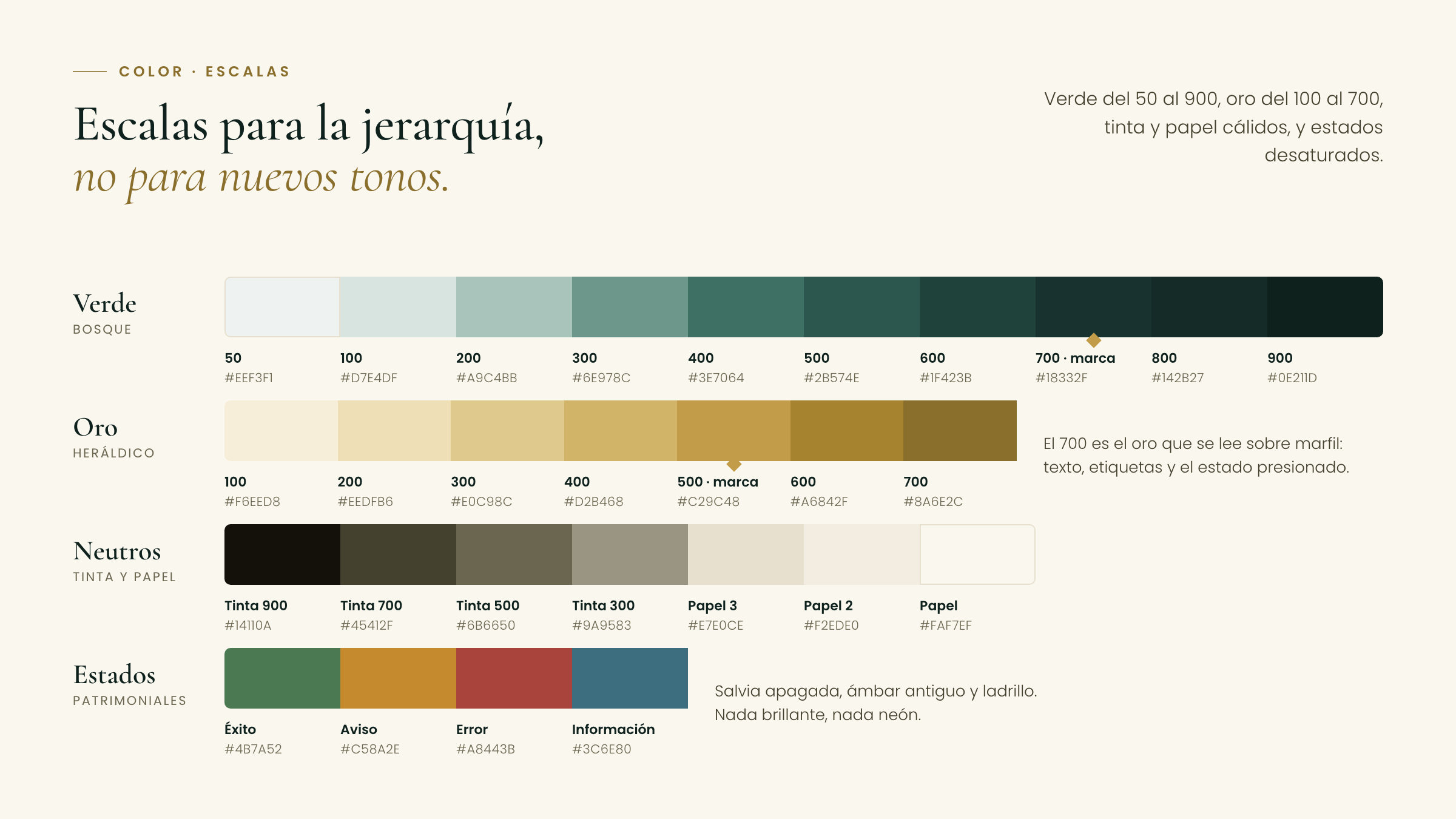
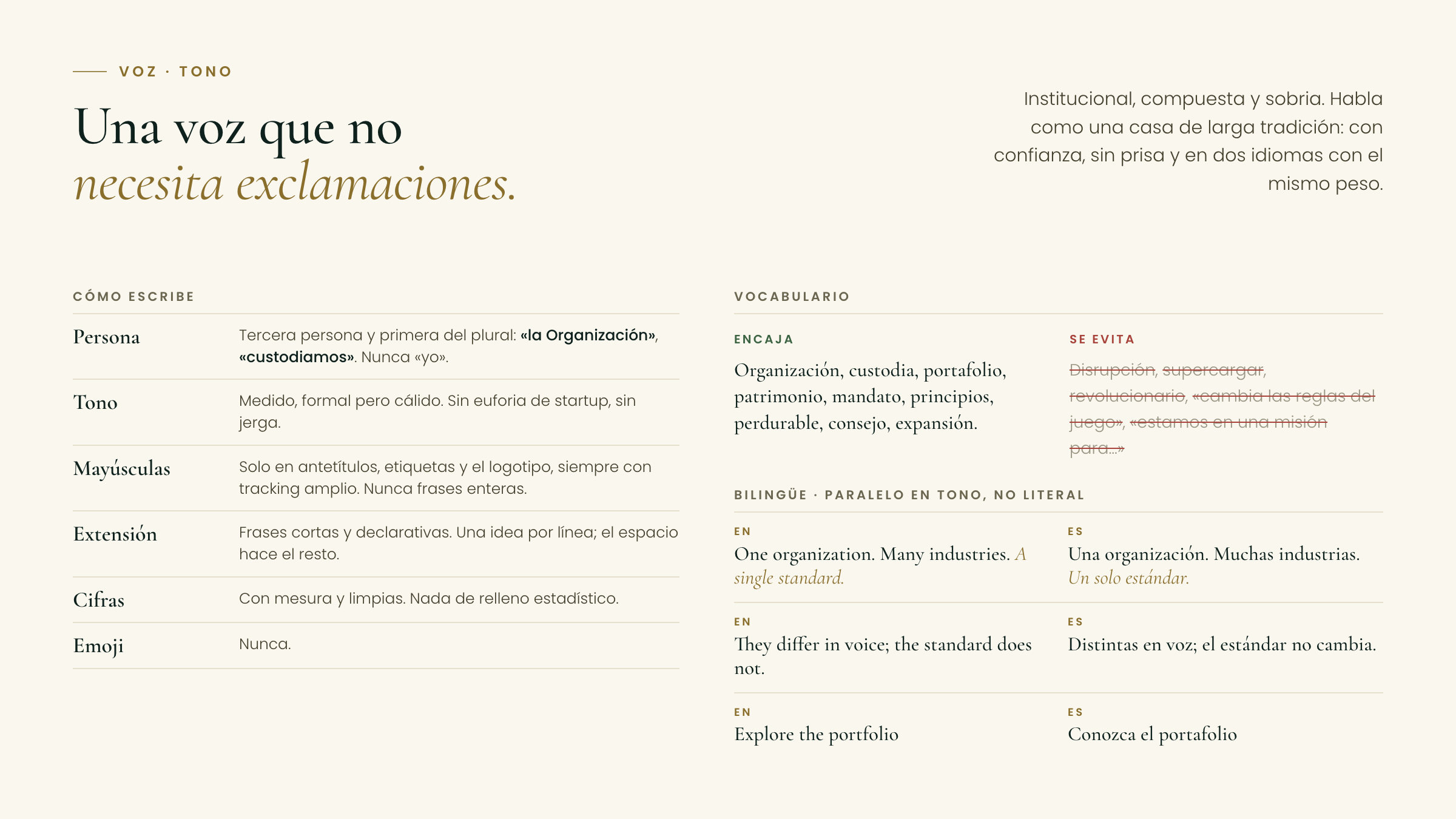
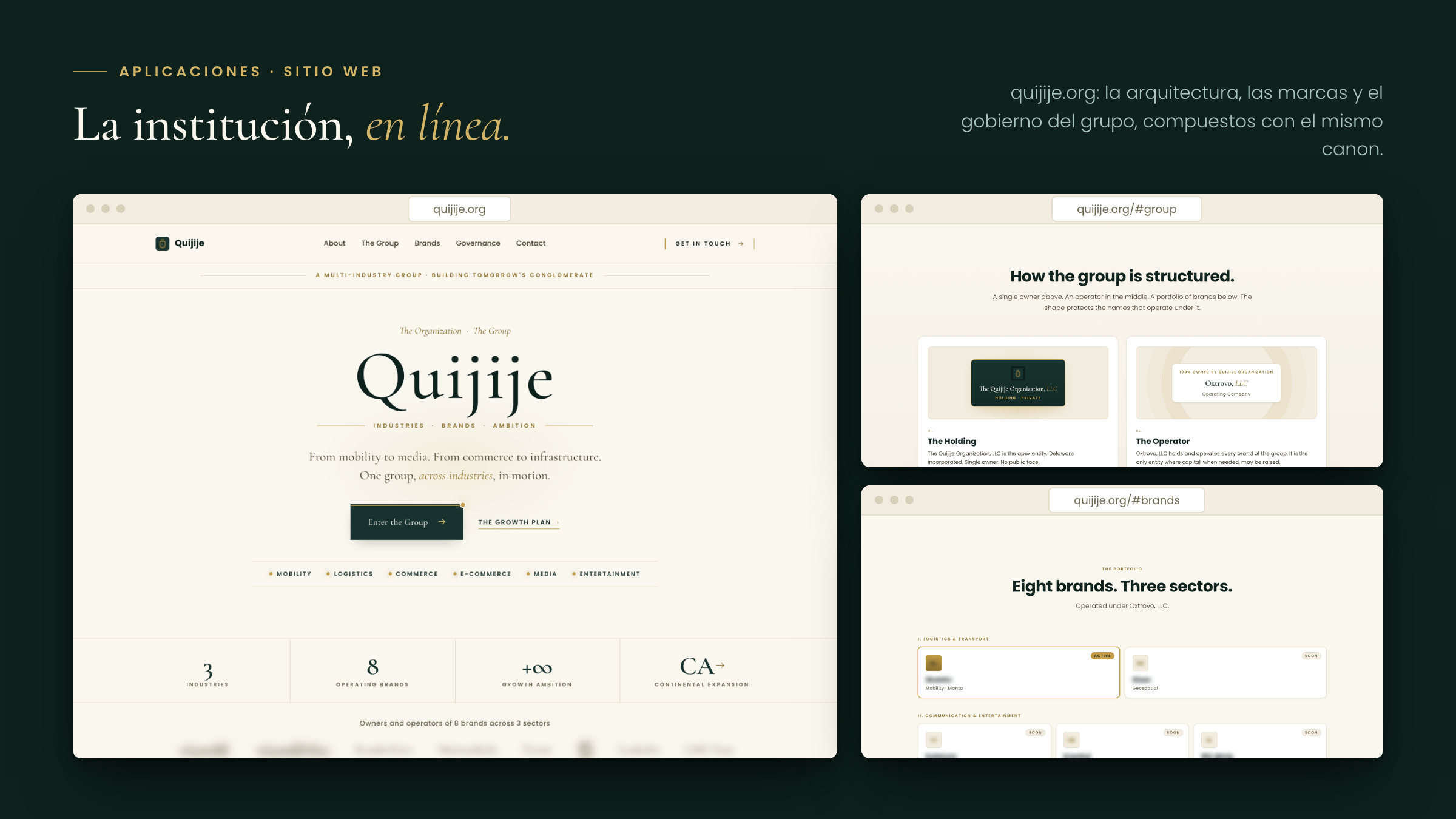
The result is a complete identity: three signatures with their rules, a three-colour palette with green, gold, ink and paper scales, two families on a nine-step scale, nine heraldic textures, and the interface and data components, documented in 37 specimens. It is the identity quijije.org presents today.