Leteare
Design system for Leteare, the AI social suite for planning, creating, scheduling, publishing and analysing content: from the brand to the interface.
The challenge
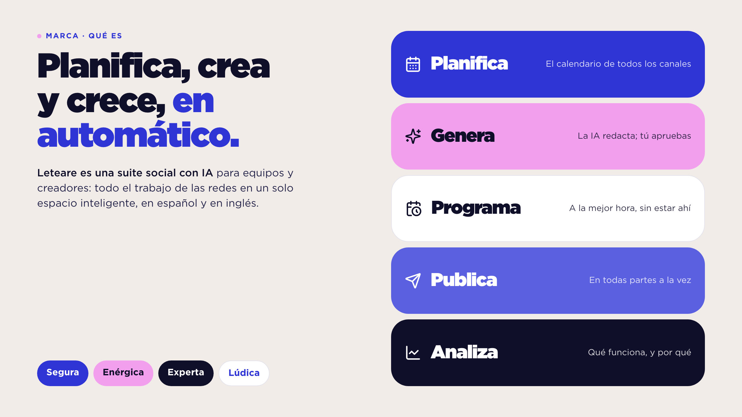
Leteare brings all of social media work into one AI workspace for teams and creators, in Spanish and English. It arrives in a category full of established tools, so it needed an identity recognisable at a glance and a product that feels easy from the first use. We started from the symbol, a colour sheet and the Gotham family; there was no prior interface.
The approach
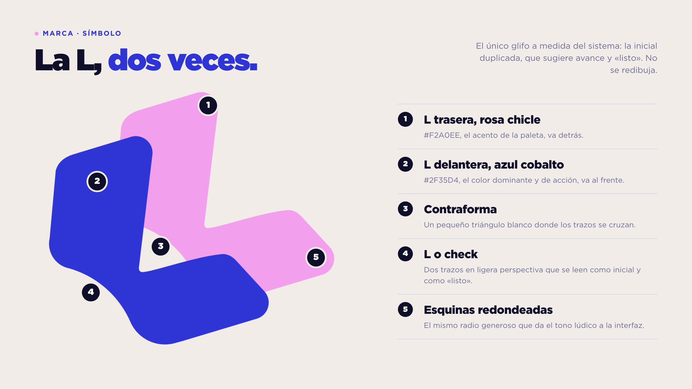
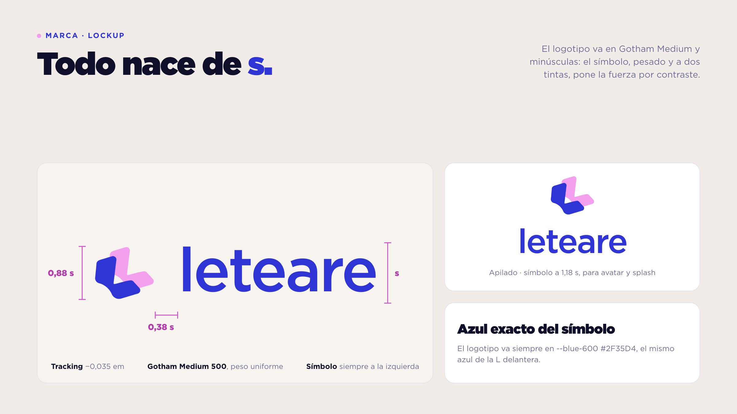
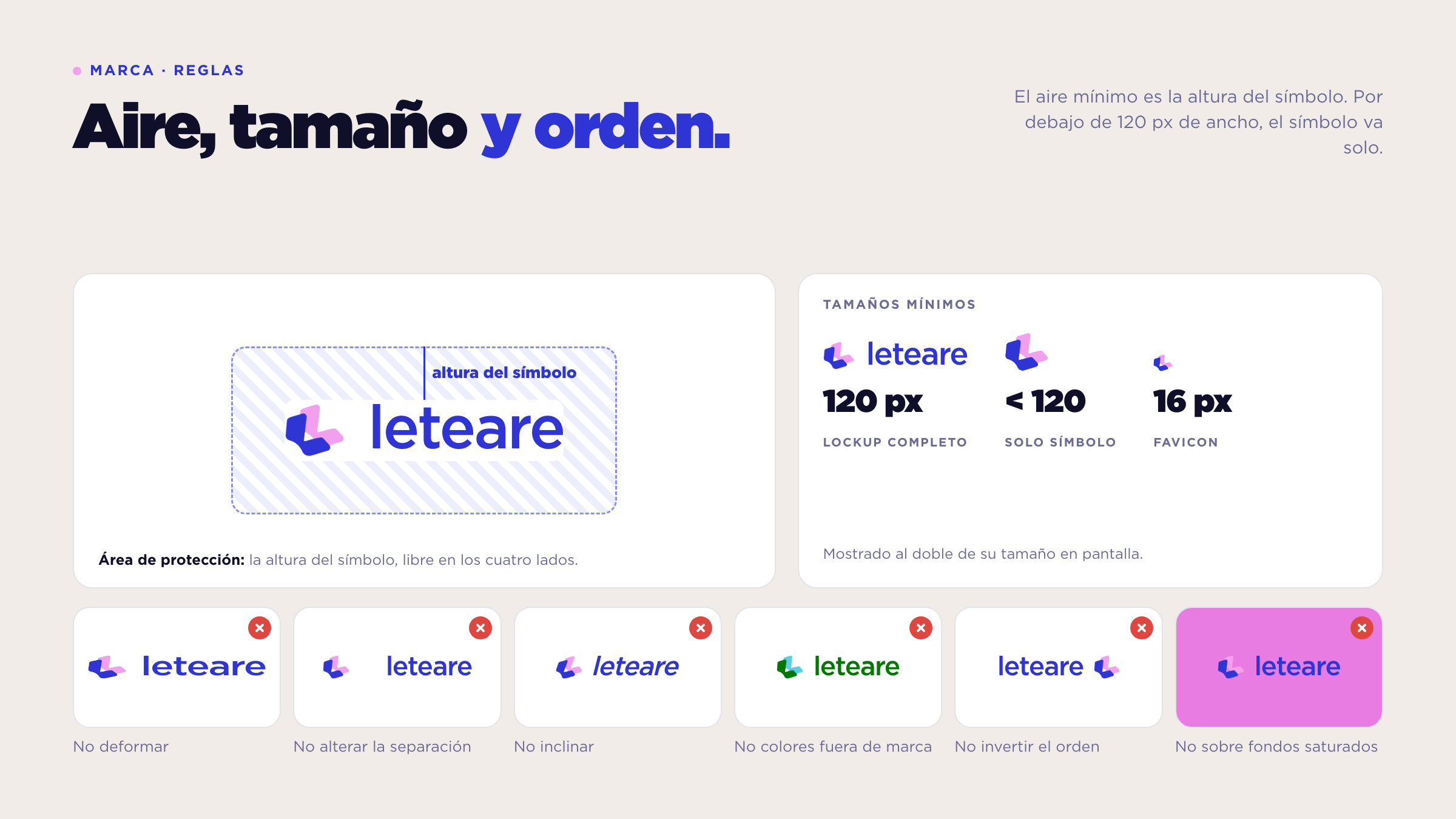
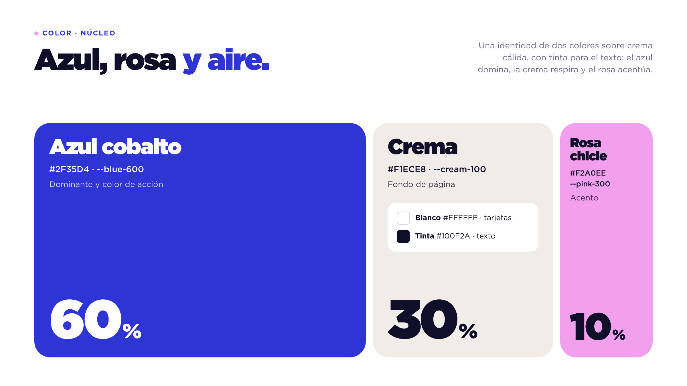
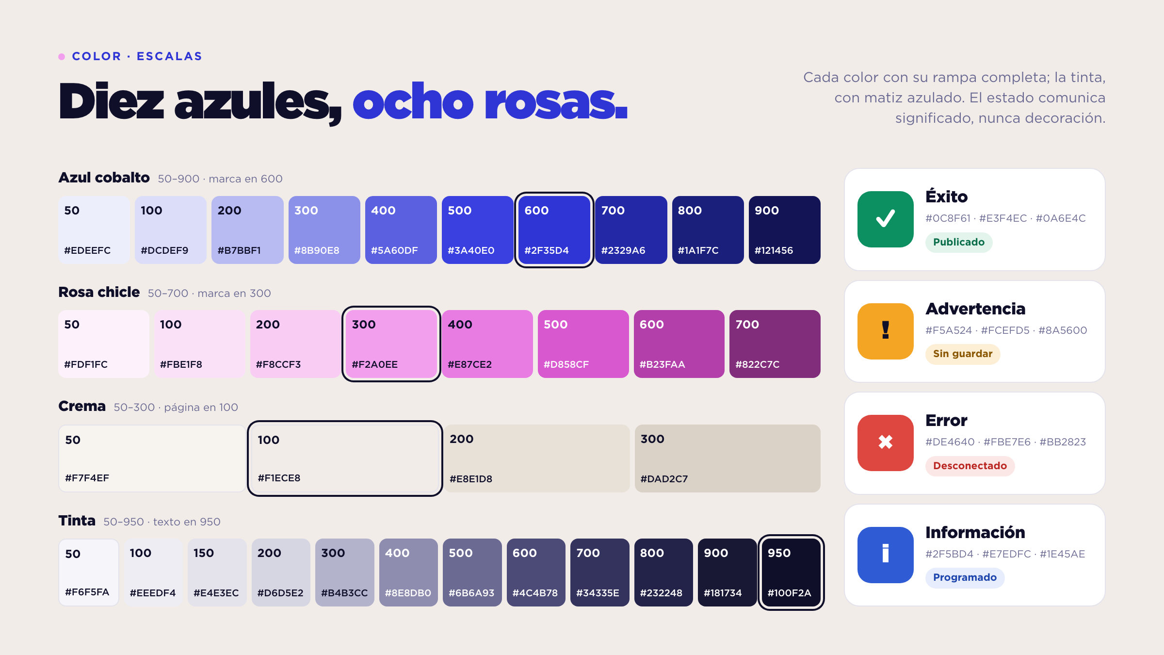
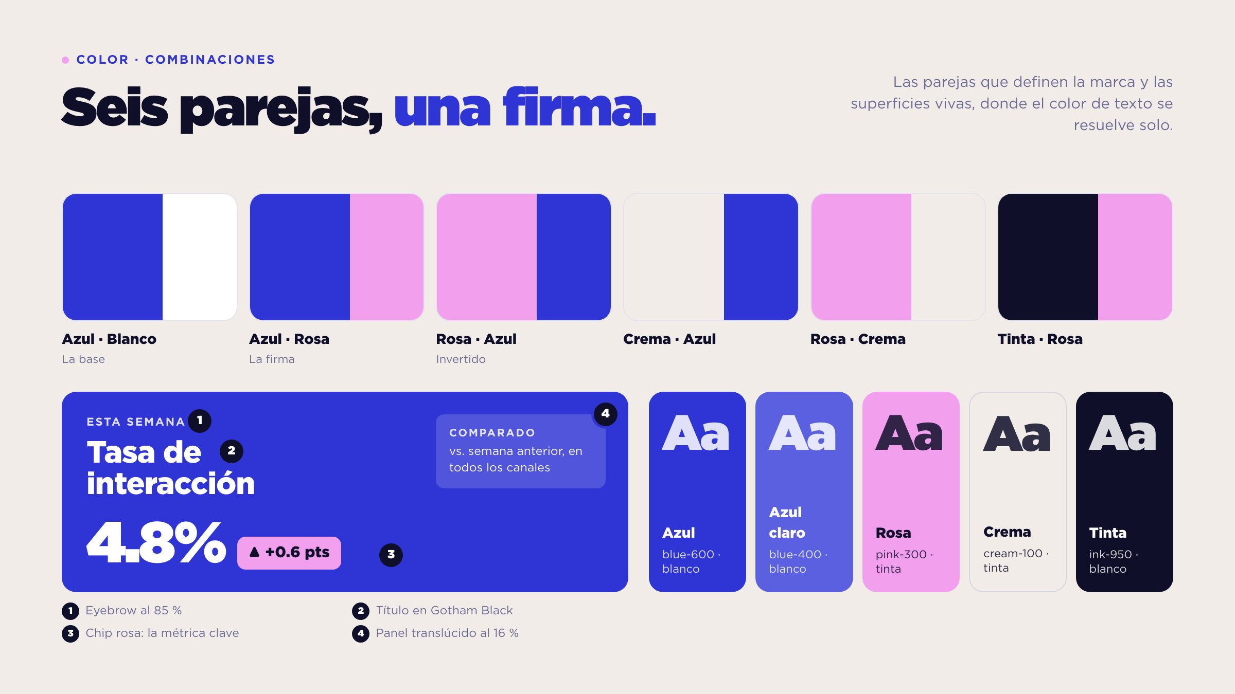
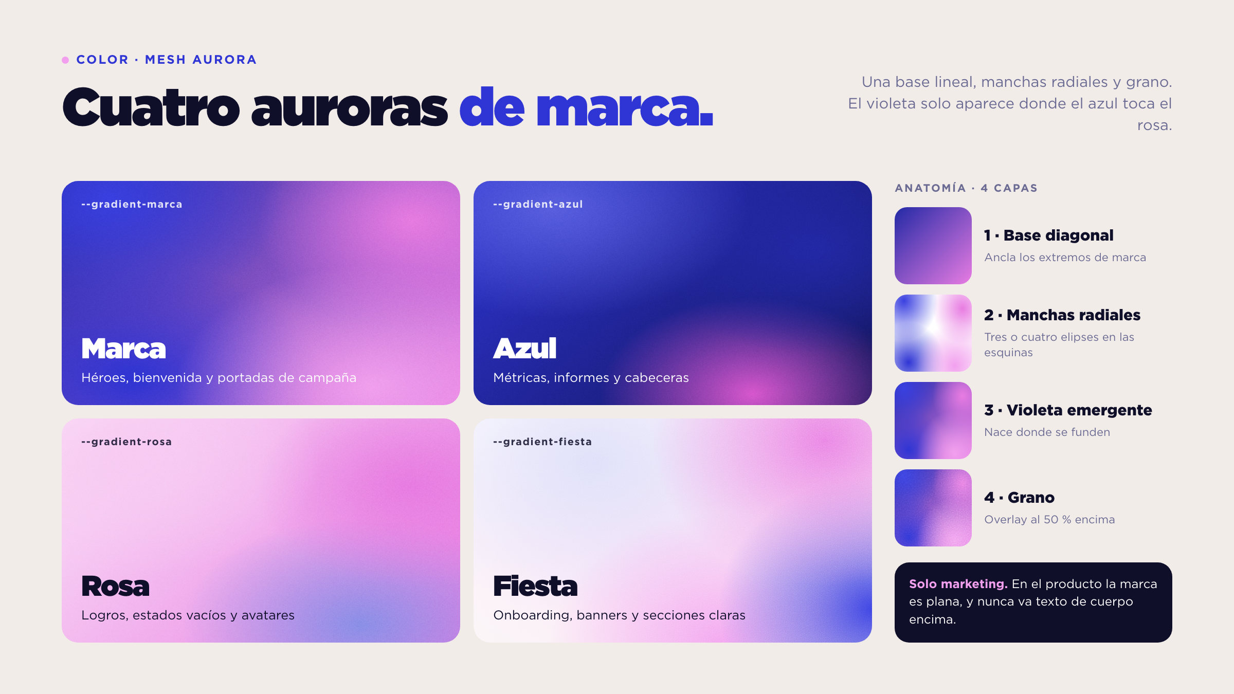
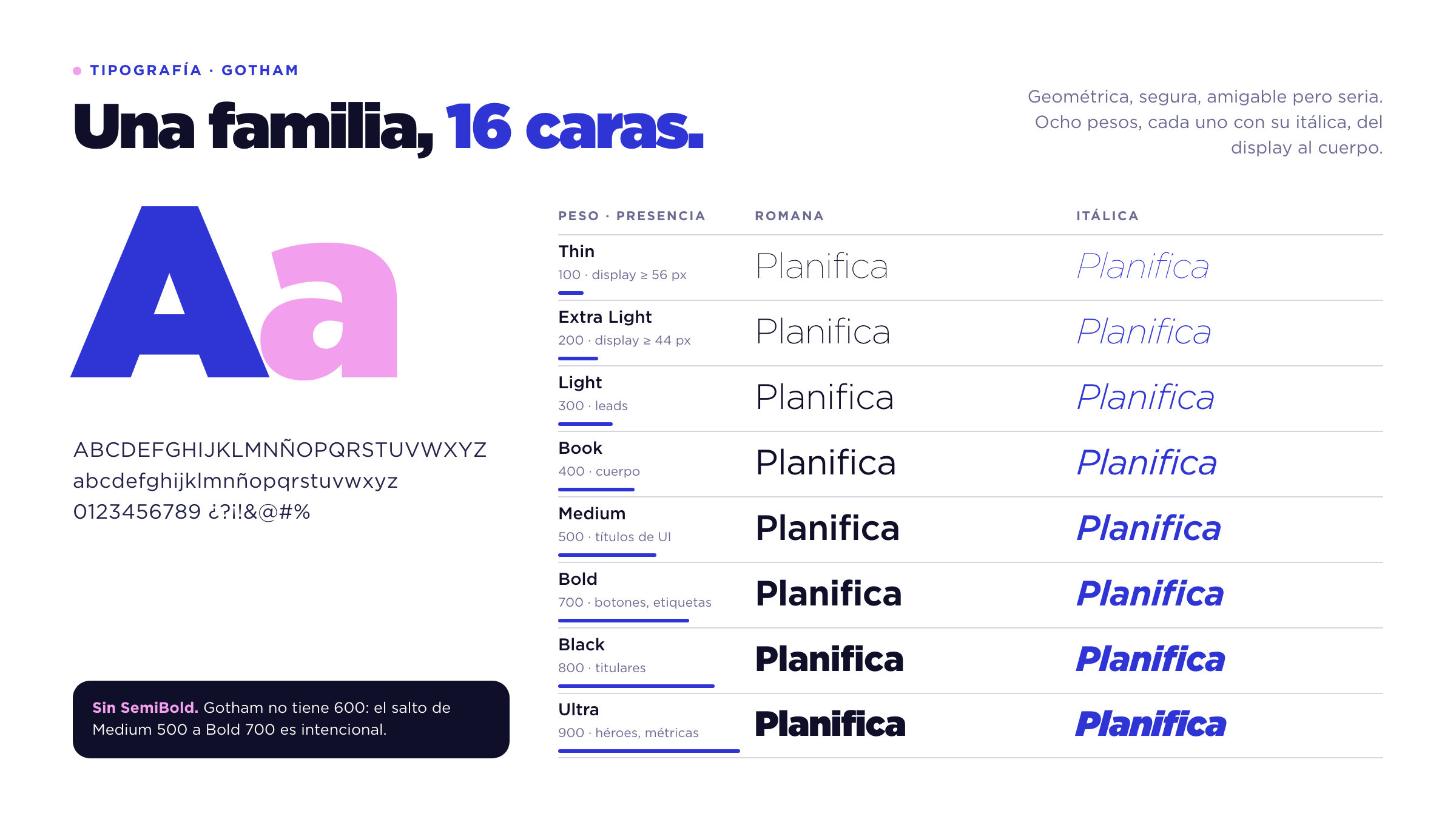
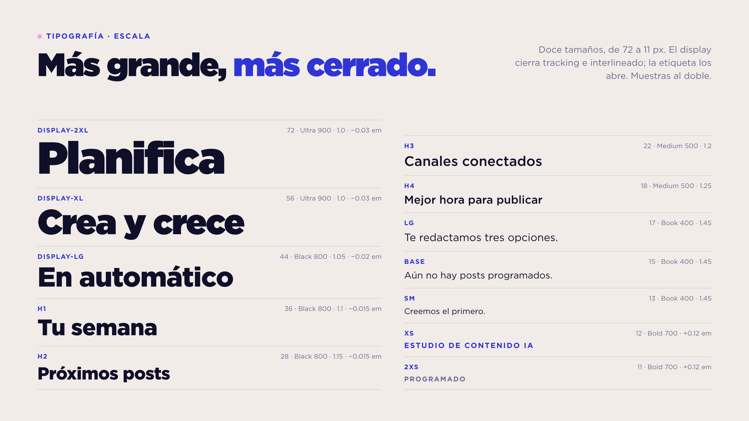
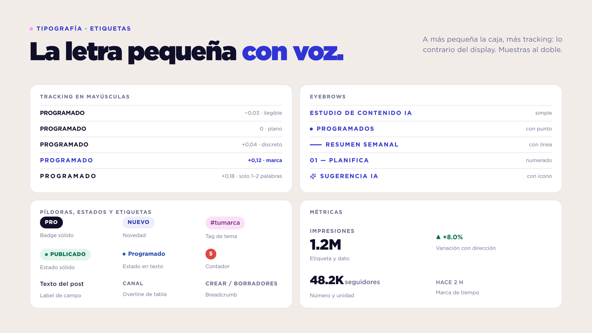
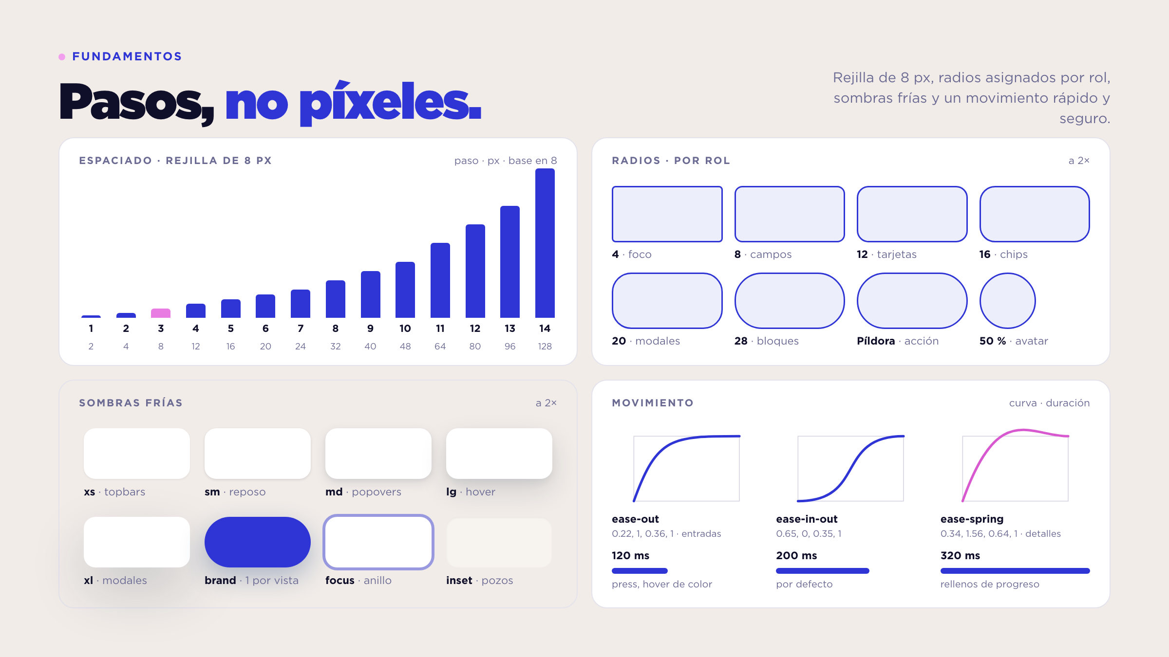
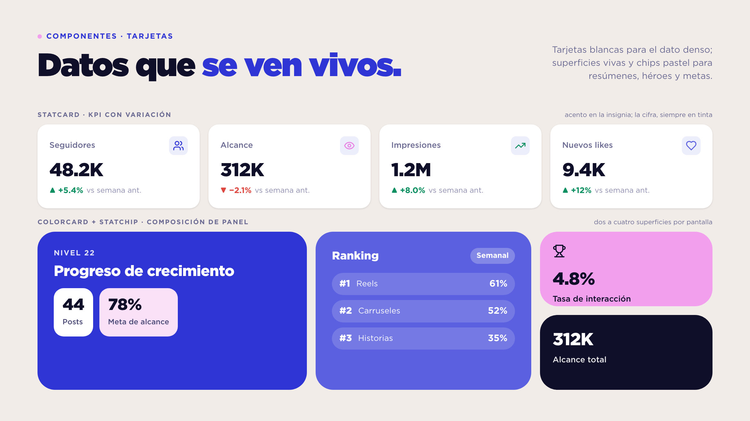
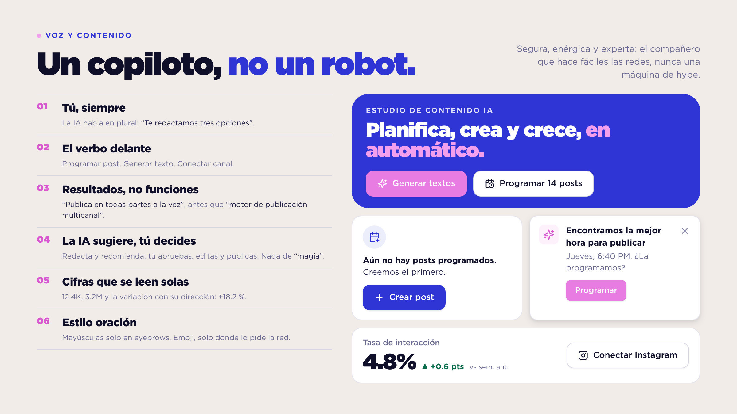
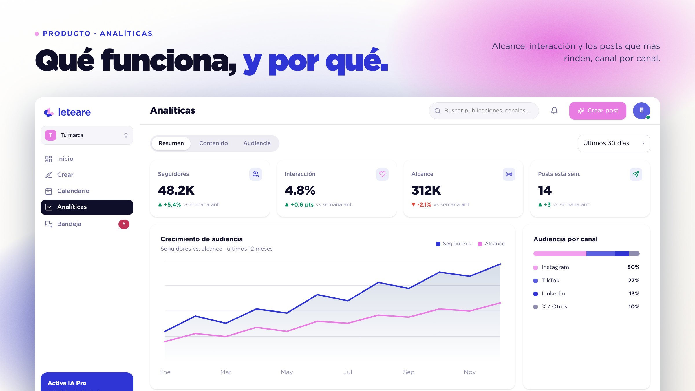
We built a two-colour identity: cobalt blue to lead and act, bubblegum pink to accent, on warm cream with ink for text, in a 60/30/10 proportion. The double L, the initial doubled so it reads as progress and as "done", signs next to a wordmark in Gotham Medium, and Gotham, in all sixteen faces, carries the whole voice. Generous corners, cool shadows, vivid surfaces for the numbers that matter and four gradient auroras kept for marketing, because the product is flat. The voice is a copilot's: the AI suggests, the person decides.
The results
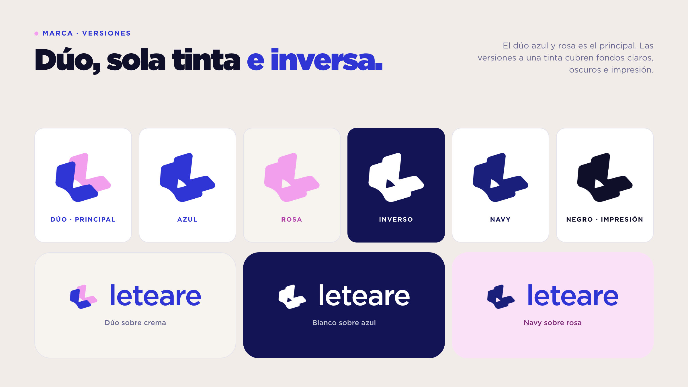
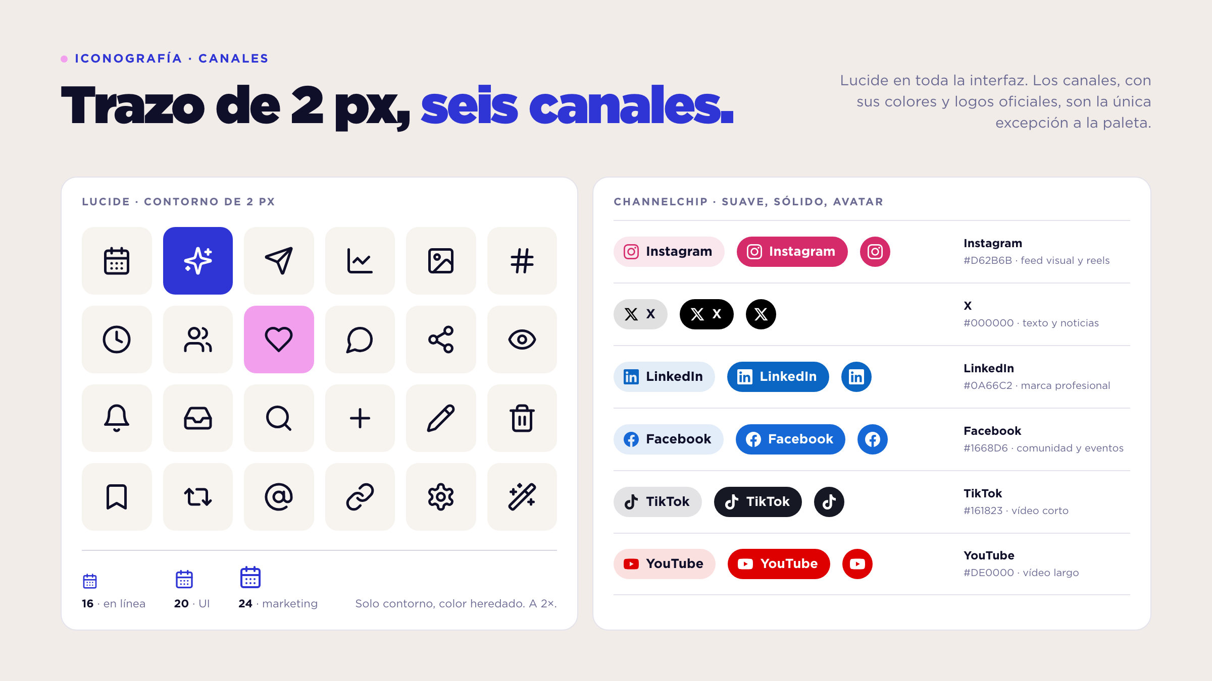
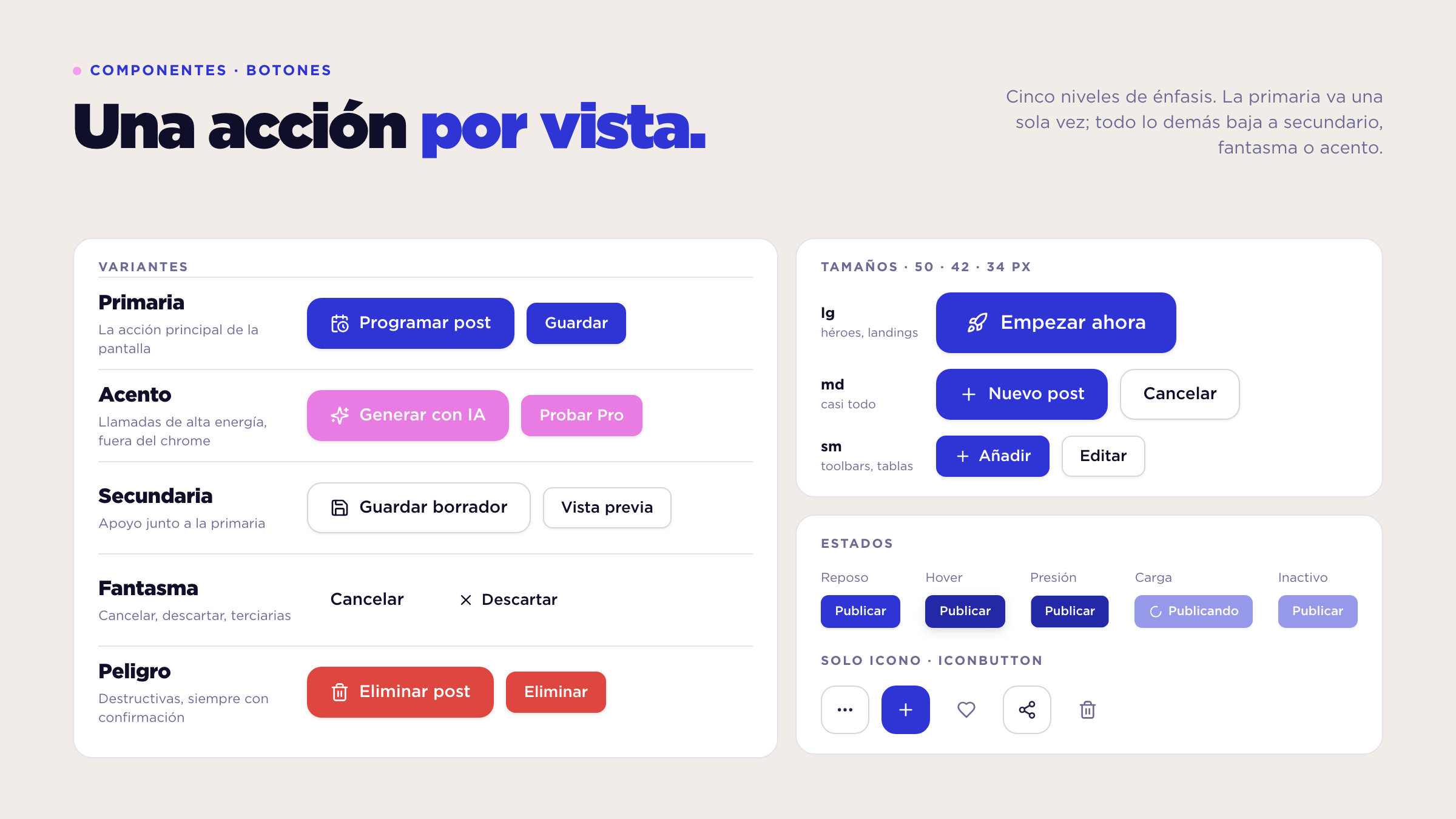
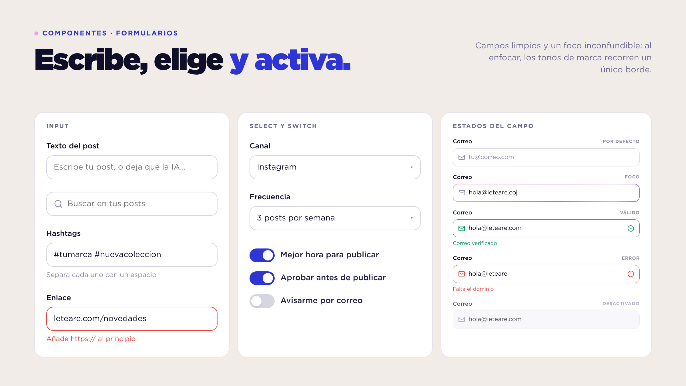
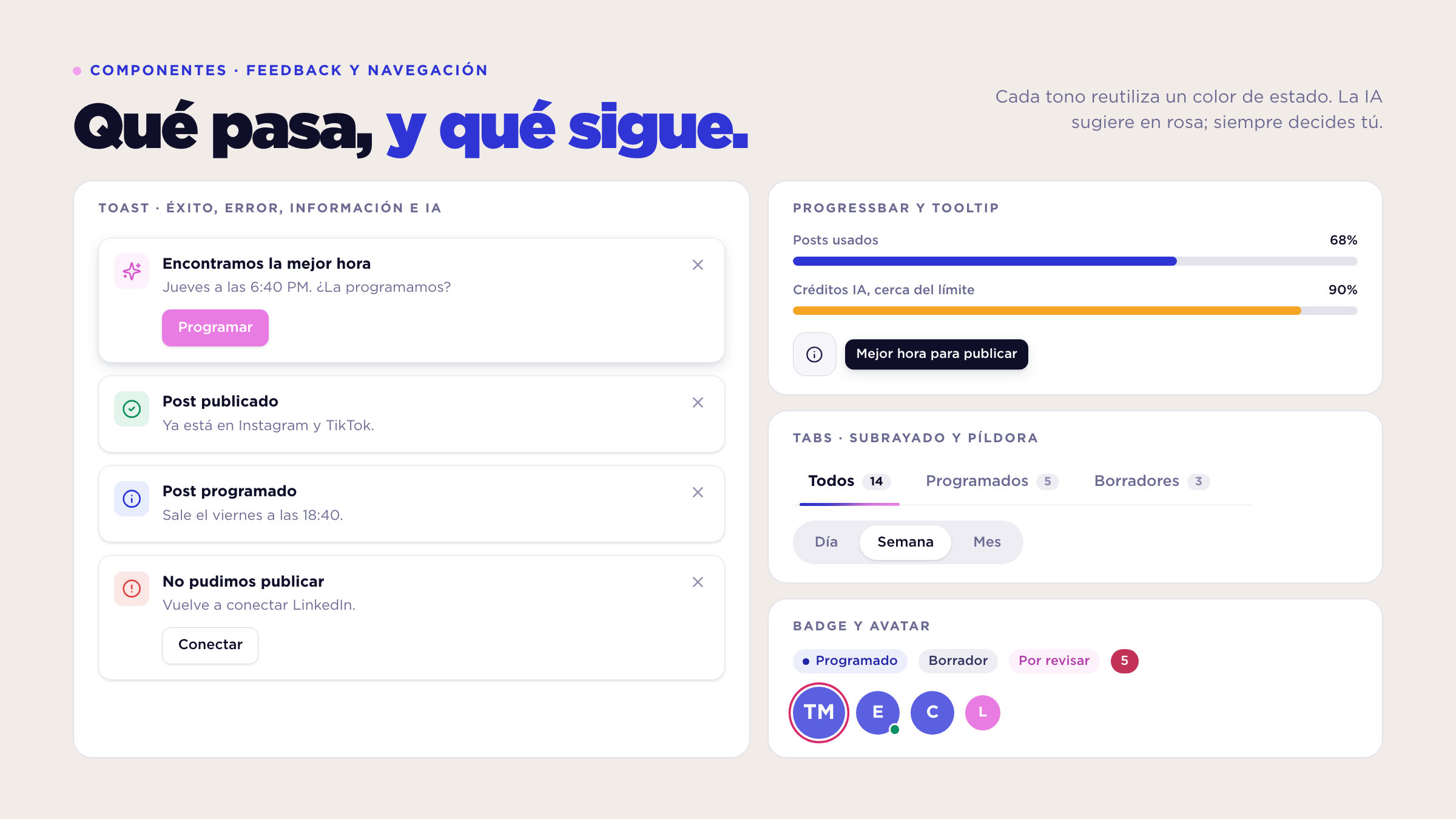
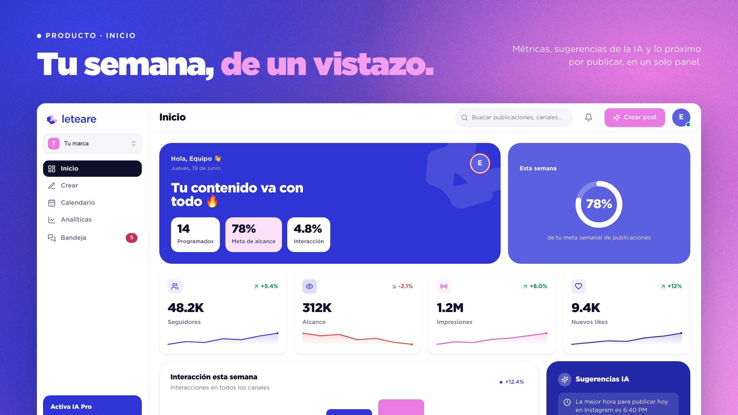
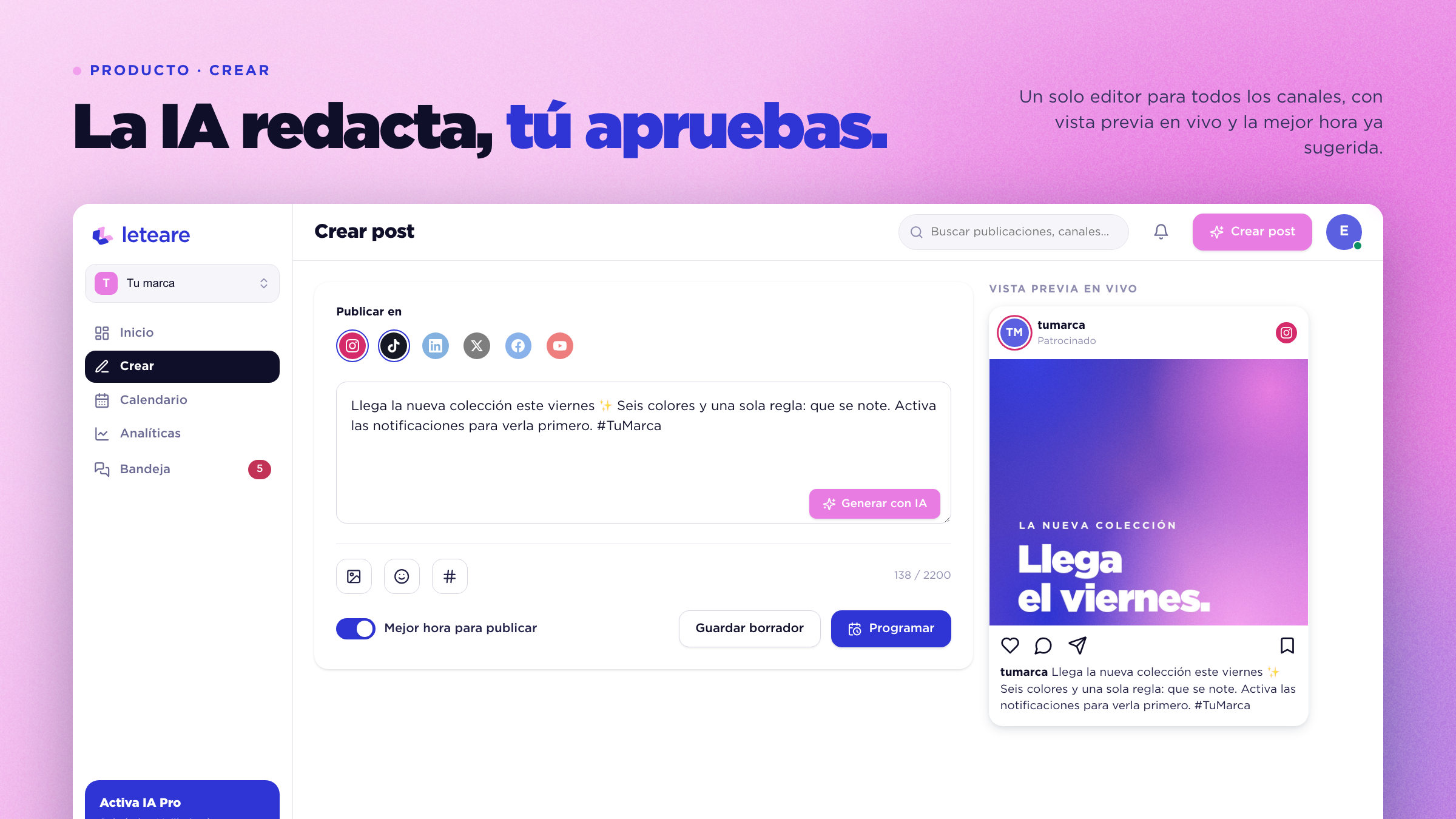
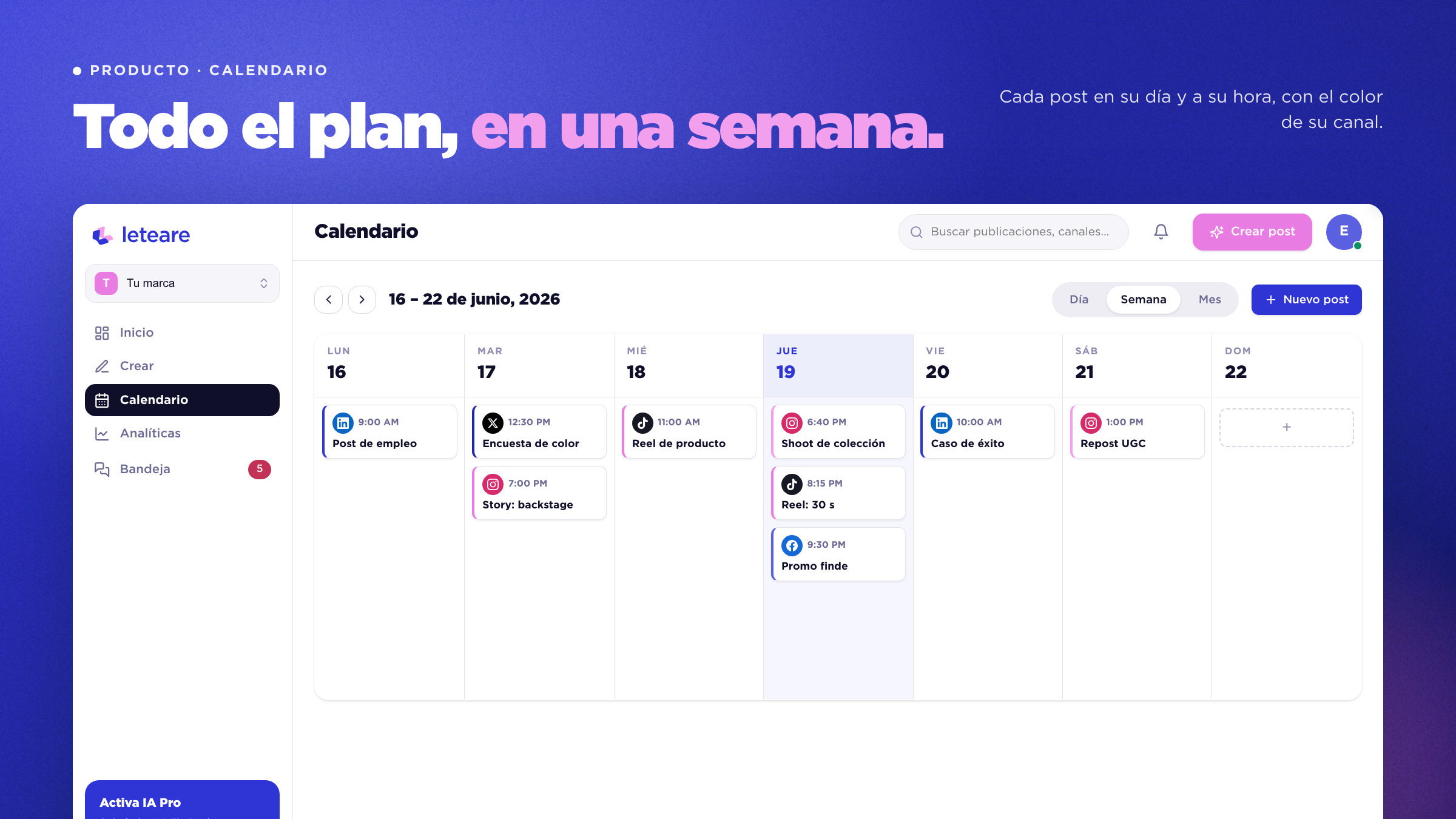
The result is a complete system: 16 React components, 6 symbol variants, 4 gradients exported as 12 wallpapers, and a UI kit with sign-in, home, AI creation, calendar and analytics. Everything comes from the same tokens, so the brand and the product speak alike.